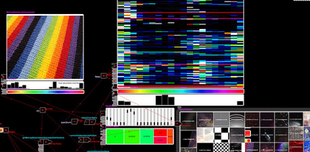
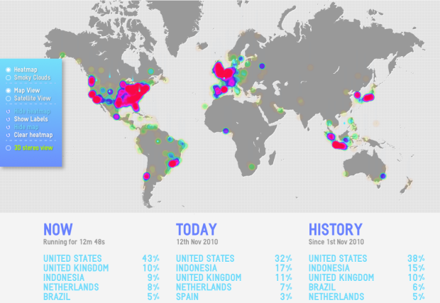
Programming can be tough in the beginning, which can make advanced visualization beyond the Excel spreadsheet hard to come by. Bestiario tries to make it easier with their most recent creation Impure:
Impure is a visual programming language aimed to gather, process and visualize information. With impure is possible to obtain information from very different sources; from user owned data to diverse feeds in internet, including social media data, real time or historical financial information, images, news, search queries and many more.
It’s not a plug-and-play application, but it’s not scripting in a text editor either. Think of it as somewhere in between that (hence the visual programming language). They’ve taken the logic behind code, and encapsulated them into modules or structures, and you can piece them together like a puzzle. The interface kind of reminds me of Yahoo Pipes.
Read More

 Visualize This: The FlowingData Guide to Design, Visualization, and Statistics (2nd Edition)


