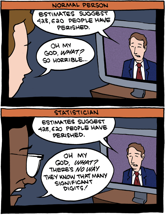
Saturday Morning Breakfast Cereal on significant digits and statisticians’ natural disbelief in numbers. Life is so hard. [Thanks, Michael]
Saturday Morning Breakfast Cereal on significant digits and statisticians’ natural disbelief in numbers. Life is so hard. [Thanks, Michael]
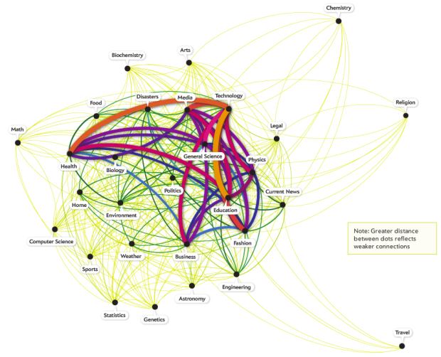
Hilary Mason, chief scientist at bitly, examined links to 600 science pages and the pages that those people visited next:
The results revealed which subjects were strongly and weakly associated. Chemistry was linked to almost no other science. Biology was linked to almost all of them. Health was tied more to business than to food. But why did fashion connect strongly to physics? And why was astronomy linked to genetics?
The interactive lets you poke around the data, looking at connections sorted from weakest (fewer links) to strongest (more links), and nodes are organized such that topics with more links between each other are closer together.
Natural next step: let me click on the nodes.
[Scientific American via @hmason]
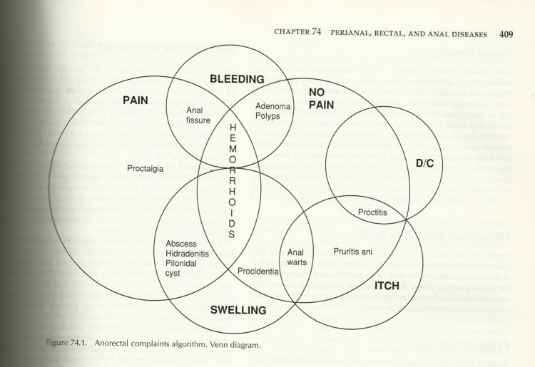
This past week I was shackled by a, um, condition where it was painful to move and difficult to concentrate, and Boost nutritional drinks were my friend, and solid foods were my enemy. (TMI?) I didn’t even know this was an issue for people under 30. My caring wife, the ER doctor, looked it up in her medical dictionary, Hardwood-Nuss’ Clinical Practice of Emergency Medicine, and this is what she found.
I guess venn diagrams are used for other things besides song lyrics and comics.
Take your fiber this Thanksgiving holiday. Thank me later.

As the Eurozone crisis develops, the BBC News has a look at what country owes what to whom:
Europe is struggling to find a way out of the eurozone crisis amid mounting debts, stalling growth and widespread market jitters. After Greece, Ireland, and Portugal were forced to seek bail-outs, Italy – approaching an unaffordable cost of borrowing – has been the latest focus of concern.
But, with global financial systems so interconnected, this is not just a eurozone problem and the repercussions extend beyond its borders.
Simply click on a country, whose arc length represents how much they owe, and arrows show debt.
[BBC News | Thanks, Eugene]
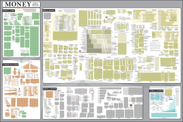
Randall Munroe of xkcd charts the things that money pays for, from the item off the dollar menu all the way up to the total estimated economic productivity of the human race. Following the same scheme to show relative scales that he used for his radiation chart, you get a big picture, a zoom for another big picture, and so on.
Read More
Ken Murphy installed a camera on top of the Exploratorium in San Francisco and set it to take a picture every ten seconds for a year. A History of the Sky is those pictures as a series of time-lapse movies where each day is represented with a grid. So what you see 360 skies at once:
Time-lapse movies are compelling because they give us a glimpse of events that are continually occurring around us, but at a rate normally far too slow to for us to observe directly. A History of the Sky enables the viewer to appreciate the rhythms of weather, the lengthening and shortening of days, and other atmospheric events on an immediate aesthetic level: the clouds, fog, wind, and rain form a rich visual texture, and sunrises and sunsets cascade across the screen.
Time-lapse: Yep, still fascinating.
[murphlab via Data Pointed]
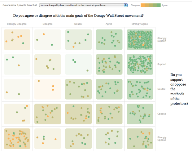
To get a gauge of public opinion and the Occupy movement, The New York Times asked readers what they they thought, placing their comments on a two-axis grid ranging from strongly disagree/oppose to strongly agree/support.
On the horizontal: “Do you agree or disagree with the main goals of the Occupy Wall Street movement?” On the vertical: “Do you support or oppose the methods of the protestors?” So comments on the top right are those who strongly agree with the goals of the movement and strongly approve of protestors’ methods. You can also color the dots and grid spots based on a range of disagree to agree for statements such as “Income inequality has contributed to the country’s problems.”
Then to bring it home, comments are listed on the bottom with a small grid showing where that person selected. Put it all together and it’s way more useful than just open threads elsewhere.
My many thanks to the FlowingData sponsors who help me keep the lights on around here. Check ’em out. They help you make sense of data.
Tableau Software — Helps people see and understand data. Ranked by Gartner in 2011 as the world’s fastest growing business intelligence company, Tableau helps anyone quickly and easily analyze, visualize and share information.
Column Five Media — Whether you are a startup that is just beginning to get the word out about your product, or a Fortune 500 company looking to be more social, they can help you create exciting visual content – and then ensure that people actually see it.
InstantAtlas — Enables information analysts and researchers to create highly-interactive online reporting solutions that combine statistics and map data to improve data visualization, enhance communication, and engage people in more informed decision making.
IDV Solutions Visual Fusion — Business intelligence software for building focused apps that unite data from virtually any data source in a visual, interactive context for better insight and understanding.
Want to sponsor FlowingData? Send interest to [email protected] for more details.

Overhauling his migration map from last year, Jon Bruner uses five year’s worth of IRS data to map county migration in America:
Each move had its own motivations, but in aggregate they reflect the geographical marketplace during the boom and bust of the last decade: Migrants flock to Las Vegas in 2005 in search of cheap, luxurious housing, then flee in 2009 as the city’s economy collapses; Miami beckons retirees from the North but offers little to its working-age residents, who leave for the West. Even fast-growing boomtowns like Charlotte, N.C., lose residents to their outlying counties as the demand for exurban tract-housing pushes workers ever outward.
Compared to last year’s map, this one is much improved. The colors are more subtle and more meaningful, and you can turn off the lines so that it’s easier to see highlighted counties when the selected county had a lot of traffic during a selected year. Speaking of which, you can see map the data for 2005 through 2009 via the simple bar graphs in the top right.
Update: Jon also explains how he built this map sans-Flash on his own blog.
 R, the favorite computing language of a growing number of statisticians, is friendly enough that you can get a lot done without being an expert programmer, because there are a lot of packages and built-in functions that can take care a lot of the grunt work for you. Learn how to use a function, prepare your data, and you get some output. However, as you use R more, whether it’s for analysis or just for graphics, there comes a point when there isn’t a package or function that does exactly what you want.
Norman Matloff’s Art of R Programming is for those who want to learn to write their own software in R. This is an R programming book that starts from the beginning — running R, vectors, lists — to the more advanced such as simulations, object-oriented programming, and debugging.
Read More
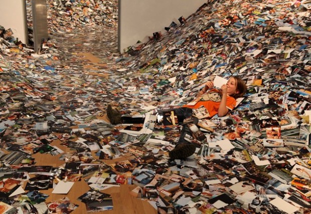
People upload thousands of pictures to Flickr every day, but the numbers and rates don’t give the picture count justice. For the Future of Photography Museum in Amsterdam, Erik Kessels printed 24 hours of Flickr photos:
As you might imagine, this results in a lot of images, that fill the gallery space in an avalanche of photos. “We’re exposed to an overload of images nowadays,” says Kessels. “This glut is in large part the result of image-sharing sites like Flickr, networking sites like Facebook, and picture-based search engines. Their content mingles public and private, with the very personal being openly and un-selfconsciously displayed. By printing all the images uploaded in a 24-hour period, I visualise the feeling of drowning in representations of other peoples’ experiences.”
[Creative Review via Waxy]
Beautiful time-lapse video using photographs from crew onboard the International Space Station. I think this one’s a hair ahead the Very Large Telescope. Watch in HD on Vimeo for extra flavor.
[Video Link via kottke]
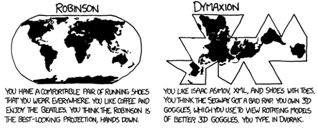
For the map nerds. xkcd says what your favorite map projection says about you. Mercator? “You’re not really into maps.”
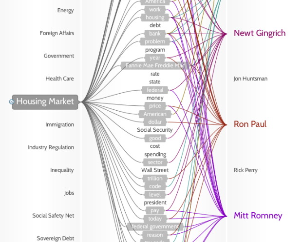
If you don’t watch the candidate debates — and let’s face it, that’s just about everyone — you pretty much miss everything, except for stuff like Rick Perry forgetting agency names. Politilines, by Periscopic, lets you see what the candidates talked about each night.
The left column lists top issues, the middle shows words used, and the right column shows candidates. Roll over any word or name to see who talked about what or what was talked about by whom.
The method:
We collected transcripts from the American Presidency Project at UCSB, categorized them by hand, then ranked lemmatized word-phrases (or n-grams) by their frequency of use. Word-phrases can be made of up to five words. Our ranking agorithm accounts for things such as exclusive word-phrases – meaning, it won’t count “United States” twice if it’s used in a higher n-gram such as “President of the United States.”
While still in beta, the mini-app is responsive and easy to use. The next challenge, I think, is to really show what everyone talked about. For example, click on education and you see Newt Gingrich, Ron Paul, and Rick Perry brought those up. Then roll over the names to see the words each candidate used related to that topic. You get some sense of content, but it’s still hard to decipher what each actually said about education.
 The November issue of Popular Science is a special on data. There are a couple of original graphics by Jer Thorp and Jan Willem Tulp, along with a handful of interesting articles. I also got to put together a gallery of some of favorite visualization projects over the past few years.
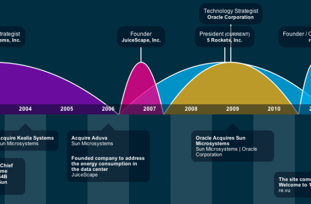
A couple of infographic résumé sites, vizualize.me and re.vu, sprouted up that use your LinkedIn data to show your career stats. Just create an account, connect it to LinkedIn, and you get some graphs that show when and where you worked. It’s a visual form of your LinkedIn profile with a goal to replace the “old” and “boring” résumé that uses just text.
Is this the best way to go though, if you’re applying for a job?
Read More
Designer Stefanie Posavec talks about her process of data collection, analysis, and design. There’s a lot of advantages to knowing how to program, but there can also be value in meticulous manual discovery if you’re willing to put in that extra time.
Read More
 Visualize This: The FlowingData Guide to Design, Visualization, and Statistics (2nd Edition)
New tools, refined process.


