The quantified self movement continues:
This may sound creepy, but tens of thousands of patients around the world are already sharing information about symptoms and treatments for hundreds of conditions on websites such as PatientsLikeMe and CureTogether. This has yielded valuable results, such as the finding that patients who suffered from vertigo during migraines were four times more likely to have painful side effects when using a particular migraine drug. The growing number of self-tracking devices now reaching the market will increase the scope for large-scale data collection, enabling users to analyse their own readings and aggregate them with those of other people.
Sure, it sounds nerdy and weird when you put it like that, but make it glow and call it fuel, and everyone goes nuts.
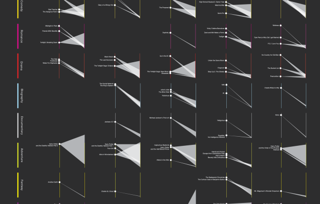

 Visualize This: The FlowingData Guide to Design, Visualization, and Statistics (2nd Edition)


