• Membership
  • Newsletter
  • Projects
  • Learning
  • About
  • Member Login
  • Words used in SOTU and Republican presidential candidates in debates

    January 24, 2012

    Topic

    Statistical Visualization  /  government, speech, words

    Jonathan Corum for The New York Times examines word usage by President Barack Obama in his State of the Union addresses and the words used by Republican candidates in their debates. Many of you will be happy to know that no word clouds were harmed in the making of this graphic.

    [New York Times]

  • In perspective: One hour of video uploaded to YouTube per second

    January 24, 2012

    Topic

    Infographics  /  interactive, YouTube

    YouTube surpassed the one hour of video uploaded per second threshold recently. To put that rate into perspective, they launched a fun illustration-based site, One Hour Per Second. Big team effort headed by Punk & Butler, illustrations by Alex Eben Meyer, animation by Justin Young, and development by Use All Five.
    Read More

  • Job growth at the best companies to work for

    January 24, 2012

    Topic

    Statistical Visualization  /  bubbles, jobs

    Nicolas Rapp and Anne Vandermey with a straightforward look at new jobs added at the top 100 companies to work for, according to Fortune.

    Fat paychecks, sweet perks, fun colleagues, and over 70,000 jobs ready to be filled — these employers offer dream workplaces. Like Google, which reclaims the top spot this year to become a three-time champion. Meet this year’s top 100, network with the winners on LinkedIn, and more.

    Number of new jobs added or lost is on the horizontal, and number of employees at the start of the year on the vertical. Bubble size represents number of job applicants.

    There were 7.6 million applicants to Starbucks last year. That’s insane.

    [Nicolas Rapp]

  • Geographic connectedness via Twitter locations

    January 24, 2012

    Topic

    Maps  /  Eric Fischer, Twitter

    Eric Fischer has mastered the art of making use of geotagged things from social sites like Twitter and Flickr. In his most recent set, Fischer maps connectedness via geotagged tweet density (using Dijkstra’s algorithm). I just got back from Berkeley a few hours ago, so the map of East Bay travels is of most interest to me.

    The main implication, as far as I am concerned, being that because of its traditional focus on downtown commuters, BART does not do a very good job of serving the most promising corridor in Berkeley and North Oakland, which would run approximately under San Pablo, University, the UC Berkeley campus, Telegraph, a jog over to College, Broadway, 40th/Linda, Grand, and some sort of route from the Grand-Lake district crossing Park Boulevard to near 14th and Foothill. Some of this, especially at the south end, would be difficult because of topography, but it could probably be approximated. Needless to say, if this were to be constructed, it would have to be pretty much entirely in subway to avoid tearing down the neighborhoods it would intend to serve.

    There are also maps for New York and Chicago.

  • Music listening trends and the news in 2011

    January 23, 2012

    Topic

    Infographics  /  Last.fm, music

    Anyone who uses a social music service like Rdio or last.fm has probably noticed an album’s sudden rise in popularity after certain events. For example, when Amy Winehouse died, her album received exponentially more plays than usual. Other times the increase in plays for a certain artist is simple, like the release of a new album. Last.fm takes a look at these patterns in 2011 through the lens of scrobbles, which is basically how last.fm users log what they’re listening to.

    Download the data here [zip file] and have a go yourself.

    [Last.fm | Thanks, @dwtkns]

  • SOPA opposition surges

    January 20, 2012

    Topic

    Infographics  /  government, interactive, ProPublica, SOPA

    ProPublica has been tracking members of Congress who oppose and support SOPA. You can view by party and chamber, and you can even sort by campaign contributions from movie, music, and television. Above shows the quick change from January 18 to 19.

    [ProPublica]

  • Where are the biggest box office movies (not) streaming?

    January 20, 2012

    Topic

    Projects  /  movies, netflix, streaming

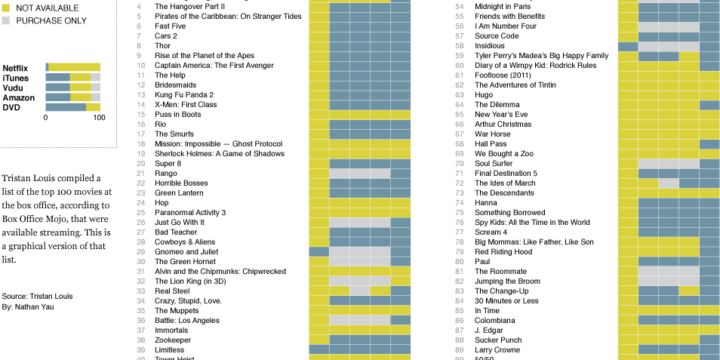
    After seeing Tristan Louis’ list that tallied the streaming availability of 2011’s top 100 box office hits, I was curious what it looked like graphically. So I put together this little number. Blue means available, yellow means not, and gray means it’s only available for purchase. The last column for DVD simply means it’s available (since DVDs are of course not streaming).

    Netflix streaming still isn’t a place to find the big movies (as any Netflix customer can tell you), with only five of the top 100 available. There is greater streaming availability from iTunes, Amazon, and Vudu, but those of course aren’t fair comparisons to Netflix, given that the latter is subscription-only.

    My main takeaway is that if you’re deciding between the non-subscription services, it looks like price is the main thing to look at, since there doesn’t seem to be much variability in availability (although it could be different for smaller movies). As for Netflix, subscribe for the television and for the movies less so.

    [Tristan Louis via Waxy]

  • Page 296 of 391
  • <
  • 1
  • ...
  • 293
  • 294
  • 295
  • 296
  • 297
  • 298
  • ...
  • 391
  • >

Analyze, visualize, and communicate data usefully, beyond the defaults.

Become a member →

Recently for Members

May 8, 2025
When the data is not what it seems

May 1, 2025
Finding the Right Charts

April 24, 2025
Visualization Tools, Datasets, and Resources – April 2025 Roundup

April 17, 2025
Breaking Out of Chart Software Defaults

April 15, 2025
Line Chart with Decorative Neon Accents

Browse by Chart Type See All →

Horizon Graph Packed Bubble Chart Baseline Chart Network Graph Parallel Coordinates Bump Chart Box Plot Surface Plot Area Chart Stacked Area Chart

Browse By Topic

  • Visualization

    Seeing data

  • Maps

    Seeing geographic data

  • Infographics

    Explaining data

  • Networks

    Connecting data

  • Statistics

    Analyzing data

  • Software

    Working with data

  • Sources

    Getting data

  • Design

    Making data readable

Get the Book

Visualize This: The FlowingData Guide to Design, Visualization, and Statistics

Available now.

Order: Amazon / Bookshop

Made by FlowingData

  • The Process

  • Data Underload

  • Chart Everything

  • Guides

  • Books

  • Shop

  • About
  • Contact
  • Newsletter
  • LinkedIn
  • Instagram
  • Bluesky
  • RSS
Copyright © 2007-Present FlowingData. All rights reserved.