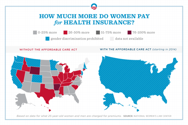
So the Obama campaign posted this yesterday. Discuss.
So the Obama campaign posted this yesterday. Discuss.
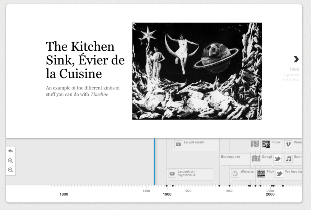
As a project of the Knight News Innovation Lab, Timeline by Verite is an open source project that lets you make and share interactive timelines. It’s simple and customizable. Plug in your own data as JSON, or use the Google Docs template for an even faster route, and you’re good to embed. It’s also easy to grab source material from sites like Vimeo, YouTube, and Flickr. Score.
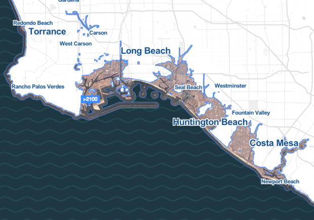
Stamen Design, in collaboration with Climate Central, shows major areas that could be affected by probable rising water levels in the not so far off future.
The context for this work is: while there are a great many papers, scientific studies, meteorological surveys and other things that fall under the rubric of things that normal people accept as true, there remains a persistent and nagging unreality to the idea that, in something like a normal human timescale, we’ll see and have to reckon with large-scale changes to the world as we know it. It’s one thing to say “the world is changing and all of us will have to deal with it.” It’s quite another to say “7.6% of the people and 9.1% of the homes may very well be underwater in Boston, and so you’ll need to start thinking about that pretty damn soon, is that cool?”
Boston, you better make friends with Kevin Costner. He is key to your survival.
Leave it to Robert Krulwich to bring us back to life in the world of personal data. In reference to Stephen Wolfram’s dive into emails, keystrokes, meetings, and phone calls:
“It’s amazing how much it’s possible to figure out by analyzing the various kinds of data I’ve kept,” Stephen Wolfram says. To which I say, “I’m looking at your data, and you know what’s amazing to me? How much of you is missing.”
This is the bit I struggle with when it comes to the whole quantified self thing. There are lot of people who collect data about themselves, and it’s all about optimization and trying to “fix” something. I’m more interested in how personal data collection relates to say, keeping a journal or scrapbooking. In this sense, it’s not about how much of your life is missing in your personal data stream. Instead it’s about how data can help you fill in the gaps.
By the way, if you’re not listening to Krulwich’s show slash podcast Radiolab, who he co-hosts with Jad Abumrad, you’re missing out on some fine storytelling.
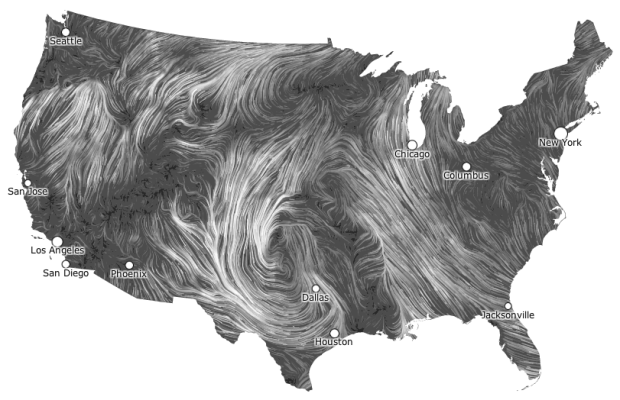
I get kind of giddy whenever I see a tweet from Martin Wattenberg and Fernanda Viegas. They rarely tweet, but when they do it’s usually because they’ve released a new project and they always announce it simultaneously. Their latest piece shows live wind patterns, based on data from the National Digital Forecast Database. It’s beautiful to look at.
The most impressive bit is that, despite all of the animation, it’s interactive. Roll over flows for wind speed and direction as well as zoom (with a double click) and pan to your area of interest.

Making use of data from the Federal Election Commission and The New York Times Campaign Finance API, ProPublica takes a closer look at where campaign contribution is going.
Many have been detailing the vast sums being raised by the presidential candidates and the super PACs supporting them. But where are all those millions being spent? Among other things, the answers can provide hints on potential improper coordination between campaigns and super PACs. Here are the 200 biggest recipients of spending by the major campaigns and most of the major super PACs.
It’s a sankey diagram with campaigns and Super PACs on one side and payees on the other. (I rotated the image above clockwise.) Select a campaign to see what they’ve spent their money on, or select a payee to see who’s paying them. As I browsed through payees, my next question was what these companies, organizations, and people do since $377,222 from Obama for America to a company called PDR II DBA Share Share doesn’t mean much to me. I haven’t looked at FEC data in a while, but I vaguely remember a way to categorize spending.
Find more information on the making of this graphic here.
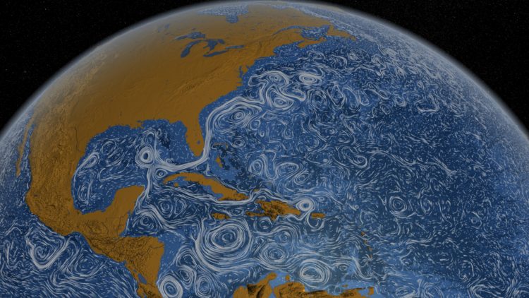
Using a computational model called Estimating the Circulation and Climate of the Ocean, Phase II (ECCO2), the NASA Goddard Space Flight Center Scientific Visualization Studio (I think NASA has a thing for long names.) visualizes surface currents around the world. This is beautiful science here. Make sure you turn on high-def and go full screen. [via @aaronkoblin]
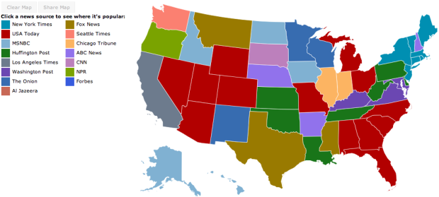
Jon Bruner of Forbes, in collaboration with Hilary Mason and Anna Smith of Bitly, maps the most popular news source by state.
Bitly’s dataset, wrangled by data scientists Hilary Mason and Anna Smith, consists of every click on every Bitly link on the Web. Bitly makes its data available publicly—just add ‘+’ to the end of any Bitly link to see how many clicks it’s gotten. For Bitly’s collaboration with Forbes, Smith and Mason looked for news sources and individual articles that were unusually popular in certain states compared to national averages. The interactive map starts by showing which news source dominates in each state by this measure: the Washington Post in Virginia and Maryland, the Chicago Tribune in Illinois, and so on.
You can also select news sources to their click distributions across the country.
I like how The Onion leads in Minnesota, Wisconsin, and New Mexico, although I’d be interested to know what other news sources the states read. A color scale might be informative, too.
 Visualize This: The FlowingData Guide to Design, Visualization, and Statistics (2nd Edition)
New tools, refined process.


