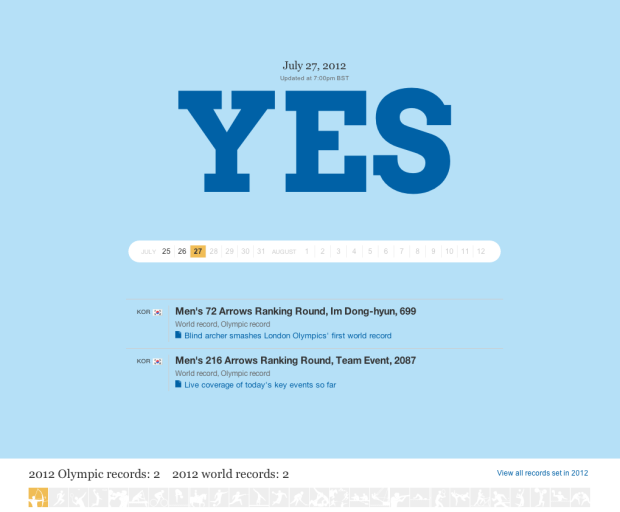
From the Guardian US, a simple site that tells you if a record was broken today, and if so, what records. It was pieced together with Google Docs and github, and uses the New York Times Olympics API. [via]
From the Guardian US, a simple site that tells you if a record was broken today, and if so, what records. It was pieced together with Google Docs and github, and uses the New York Times Olympics API. [via]

No doubt there is going to be a lot of tweeting about the Olympics during the next couple of weeks, but sometimes it’s hard to get a sense of what people are talking about because of the high volume. Emoto, a team effort by Drew Hemment, Moritz Stefaner, and Studio NAND, is a Twitter tracker that aggregates sentiment around topics.
Read More
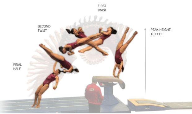
A lot of Olympic events are over and done with in a few minutes (or seconds), so the difference between winning and losing can be something really tiny. As the games in London get started, The New York Times put together a great series on the tiny details that athletes try to hone in on as they jump over hurdles, twist over the vault, and hand off the baton.
The feature was surprisingly sort of buried in a lot of other Olympic coverage, but hopefully they put together more of them. The combination of graphics and insight from athletes is uber interesting.
Update: The butterfly was just added, and cycling is up next.

Lee Drutman, a Senior Fellow at the Sunlight Foundation, compared the tax returns of previous presidents against that of Mitt Romney.
This scatter plot highlights two things: First, the two highest income years we observe are Romney 2011 ($21.6 million) and Romney 2010 ($20.9 million). Nobody else comes close. The next closest are Obama 2009 ($5.5 million) and Obama 2007 ($4.1 million).
Second, the two lowest effective tax rates we observe also belong to Romney. The 2012 Republican candidate paid an effective tax rate of 13.9% in 2010 and 15.4% in 2011. Next lowest is George H.W. Bush, who paid a 15.5% rate in 1991. By contrast, in Obama’s two highest earning years, he paid a rate of 32.6% (2009) and 33.7% (2007).
Of course the difference is there because most of Romney’s income comes from investments, but wow, what a contrast.
[Thanks, Chris]
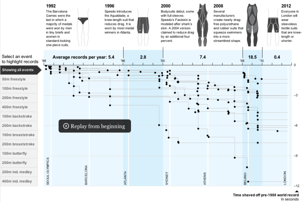
The Washington Post has a fine graphic on swimming world records and the changing swimsuit, from speedo to full rubber body suit.
Read More
Carnegie Mellon statistics professor Cosma Shalizi considers the differences and similarities between statistics and data science.
If people want to call those who do such jobs “data scientists” rather than “statisticians” because it sounds more dignified, or gets them more money, or makes them easier to hire, then more power to them. If they want to avoid the suggestion that you need a statistics degree to do this work, they have a point but it seems a clumsy way to make it. If, however, the name “statistician” is avoided because that connotes not a powerful discipline which transforms profound ideas about learning from experience into practical tools, but rather, a meaningless conglomeration of rituals better conducted with twenty-sided dice, then we as a profession have failed ourselves and, more importantly, the public, and the blame lies with us. Since what we have to offer is really quite wonderful, we should not let that happen.
Some time during the past couple of years, statistics became data science’s older, more boring sibling that always plays by the rules. There are a lot of statisticians who now call themselves data scientists. I still call myself a statistician.
But I think we’re getting closer to that part in the movie when the older, more stuffy character learns from the young whipper snapper that loosening up could be a good thing, and when the young one realizes that some elbow grease and tradition can go a long way.
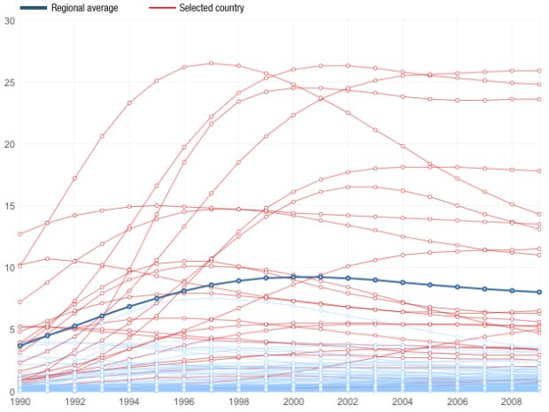
Adam Cole and Nelson Hsu for NPR plotted the percentage of people, ages 15 to 49, living with HIV from 1990 to 2009.
By 1990, the world had a pandemic on its hands. In 1997, the peak of the epidemic, more than 3 million people became newly infected with HIV.
Then science struck back. Drugs approved for HIV treatment in the mid-1990s proved profoundly effective, transforming AIDS from a death sentence to a chronic illness. Those treatments, combined with an international commitment to manage the disease by providing access to free drug therapy, led to a steep drop in new HIV infections.
The countries in middle, eastern, and southern Africa stand out in the chart, like Swaziland with a whopping 25.9%, but most areas cluster well below five percent. Although the drop-down filters help some with country selection, the data probably would’ve benefitted from a chart that had a self-updating vertical axis.
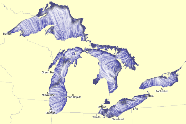
Using the same tech Martin Wattenberg and Fernanda Viegas created to show wind flow, the NOAA Great Lakes Environmental Research Laboratory mapped water flow in the Great Lakes, based on forecasting simulations.
The “Latest” and “3hrs Previous” visualizations depict water motion corresponding to a snapshot of lake currents at the present time and three hours previous to the present time. Lake currents can change rapidly with changing wind conditions.
Surface currents tend to follow the wind direction more closely than currents at depth. Depth-averaged currents represent the average water motion from surface to bottom and tend to follow shoreline and bottom contours.
The default map is semi-live, but you can also see flows for previous months. For example, the patterns during February 2011 are kinda cool, with a lot of swirling and well-defined currents.
If you want to learn visualization, you should learn data. To learn data, you should learn statistics. Where to begin? The free analysis courses offered on Coursera, by Johns Hopkins professors is probably a good place to start. Currently available: Computing for Data Analysis with biostatistics professor Roger D. Peng and Data Analysis with Jeff Leek, also a biostatistics professor.
There’s also a handful of data-related courses from other university professors that might be worth a look.
 Visualize This: The FlowingData Guide to Design, Visualization, and Statistics (2nd Edition)
New tools, refined process.


