
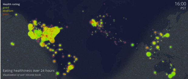
The Eatery app by Massive Health lets people snap pictures of their food and rate the healthiness. The premise is that you don’t have to carefully count calories to lose weight. You just need to be more aware of what you eat. Using 7.68 million ratings over a five-month span, Massive Health maps eating healthiness over an aggregated 24-hour time window.
Mouse back and forth over the map slowly to see the changes. It’s interesting that as night falls, desserts and midnight snacks make themselves known and then the green comes back in the morning.
[Thanks, Thomas]

 I listen to a lot of podcasts. They make my workouts much more enjoyable. For the most part though, I only listen to ones about sports and more general podcasts about design, technology, and working from home. However, a couple of months ago,
 Visualize This: The FlowingData Guide to Design, Visualization, and Statistics (2nd Edition)


