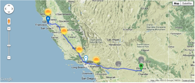
• Membership
  • Books
  • Projects
  • Learning
  • About
  • Member Login
  • Is the filibuster unconstitutional?

    Posted by Kim Rees
    May 18, 2012

    Topic

    Infographics  /  cloture, filibuster, wapo
    US Filibuster

    Washington Post’s Ezra Klein busts on the filibuster. Gone are the days of Mr. Smith when invoking the filibuster was seen to serve a greater purpose. The filibuster has its roots in Ancient Rome, and apparently even then it had its critics.

    This chart is a great example of providing a lot of information in a concise area. All of these data points are relevant to the topic and helps us inform our opinion about the matter.

    [via @hfairfield]

  • The Facebook Offering: How It Compares

    Posted by Kim Rees
    May 18, 2012

    Topic

    Visualization  /  facebook, Google, IPO, NYT
    Facebook IPO

    The New York Times does it again with this succinct look at tech IPOs. It begins with looking at everything through the lens of when Google’s IPO in 2004, which, at the time, was considered huge. The next screen adds Facebook to the mix which dwarfs everything prior. It continues on to show the first day of trading pop and where things landed long term (3 years post-IPO).

    It’s a very interesting view of IPOs and could actually be a good financial analysis tool with a few more features.

  • Montana can’t sleep

    Posted by Kim Rees
    May 17, 2012

    Topic

    Maps  /  health, pharma, sleep
    What's Wrong US?

    Help is a drug company that offers you less. Less active ingredients, less waste, less confusion, less greed. Its tongue-in-cheek website has a map of its latest sales data called “What’s wrong U.S.?” A bar chart for each state shows how many people are buying products for particular maladies.

    So why are the inner northwest states having problems sleeping? My guess they’re up late worrying about gay marriage.

  • Why are so many men pregnant?

    Posted by Kim Rees
    May 17, 2012

    Topic

    Mistaken Data  /  BMJ, men, pregnant

    Garbage in, garbage out the old adage goes. Nigel Hawkes, Director of Straight Statistics, describes a sort of statistical whistleblowing letter to the British Medical Journal.

    A team from Imperial College found that in 2009-10, nearly 20,000 adults were coded as having attended paediatric outpatient services, and 3,000 patients under 19 were apparently treated in geriatric clinics. Even more striking, between 15,000 and 20,000 men have been admitted to obstetric wards each year since 2003, and almost 10,000 to gynaecology wards.

    It’s hard to put your faith in analysis, visualization, policy, and anything else that comes out of data with reports like these. With human error being a known issue, we have to find better ways of inputting and double-checking data. Unfortunate mistakes at the outset only lead to bigger problems down the line.

  • The Descriptive Camera

    Posted by Kim Rees
    May 16, 2012

    Topic

    Data Art  /  camera, photograph, text
    descriptive camera output

    The unassuming little Descriptive Camera made me rethink data. This project by Matt Richardson was on display at the ITP Spring Show. The basic premise is that you take a photo and the camera spits out a textual description of what it sees. The results are remarkably accurate, detailed, and humorous.
    Read More

  • What is missing?

    Posted by Kim Rees
    May 16, 2012

    Topic

    Maps  /  extinction, Maya Lin, species
    What is missing

    What is Missing? by Maya Lin seeks to raise awareness about the mass extinction of species. It has a beautiful interface. The world map is black on a sea of black. Your mouse acts as a sort of flashlight layered between land and water, showing you glimpses of familiar coastlines and allowing you to select dots that tell the stories of extinction.
    Read More

  • How to Visualize and Compare Distributions in R

    Single data points from a large dataset can make it more relatable, but those individual numbers don’t mean much without something to compare to. That’s where distributions come in.

  • ITP Spring Show: Iraq war and diabetes visualizations

    Posted by Kim Rees
    May 15, 2012

    Topic

    Infographics  /  diabetes, Iraq, quantified self

    Yesterday I visited the ever popular NYU ITP bi-annual show which is a showcase of the students’ experimental and ingenious interactive work.

    I stopped to talk to data visualization student and self-tracker, Doug Kanter, about his work. His first and smaller piece was about the war in Iraq. The image above depicts the number of wounded US soldiers by state (and territory) using the red stripes. The stars show the number of soldiers killed. I’m sure we could quibble about labels and where the bar chart starts, but to me, the tattered appearance of the flag created by data about war is very arresting.
    Read More

  • Welcome Kim Rees

    May 15, 2012

    Topic

    Site News  /  Kim Rees

    I’m going to be away for a couple of weeks, with little to no Internet access most of the time, so I’ve asked Kim Rees to step in while I’m gone. She’s the co-founder of Periscopic, one of my favorite information visualization firms, and she was the technical editor for Visualize This. You’re in good hands.

    You can follow her at @krees.

    Be good, and see you all when I get back.

    She’s all yours, Kim.

  • Global shipping network

    May 14, 2012

    Topic

    Maps  /  Fortune Magazine, Nicolas Rapp, shipping, world

    Nicolas Rapp dives into the patterns and growth of worldwide shipping in a six-page spread for Fortune Magazine.

    Nearly 90% of all goods traded across borders travel, in part, by sea. Typically a ship will undertake six voyages a year. The fastest-growing routes are between ports in Asia, while goods moving out of that continent account for 43% of all maritime trade, according to IHS Global, an economic forecasting firm. Today the most heavily trafficked sea route is between China and the West Coast of the U.S. The total value of goods that travel from China to the U.S. is four times that of those on the return trip—a clear symbol of America’s trade deficit.

    Despite a gap of a few centuries, the routes today still look a lot like the ones from the 18th century.

  • Page 280 of 393
  • <
  • 1
  • ...
  • 277
  • 278
  • 279
  • 280
  • 281
  • 282
  • ...
  • 393
  • >

Analyze, visualize, and communicate data usefully, beyond the defaults.

Become a member →

Recently for Members

June 5, 2025
Caring Data

May 29, 2025
Visualization Tools and Resources, May 2025 Roundup

May 22, 2025
Conflicting points of view over the same data

May 15, 2025
Step Chart, Enhanced

May 8, 2025
When the data is not what it seems

Second Edition

Visualize This: The FlowingData Guide to Design, Visualization, and Statistics (2nd Edition)

New tools, refined process.

Order: Amazon / Bookshop

Browse by Chart Type See All →

Bump Chart Pie Chart Strip Plot Area Chart Heatmap Variable Width Bar Chart Horizon Graph Cartogram Small Multiples

Browse By Topic

  • Visualization

    Seeing data

  • Maps

    Seeing geographic data

  • Infographics

    Explaining data

  • Networks

    Connecting data

  • Statistics

    Analyzing data

  • Software

    Working with data

  • Sources

    Getting data

  • Design

    Making data readable

Made by FlowingData

  • The Process

  • Data Underload

  • Chart Everything

  • Guides

  • Books

  • Shop

  • About
  • Contact
  • Newsletter
  • LinkedIn
  • Instagram
  • Bluesky
  • RSS
Copyright © 2007-Present FlowingData. All rights reserved.