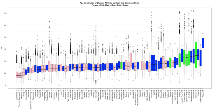
• I get kind of giddy whenever I see a tweet from Martin Wattenberg and Fernanda Viegas. They rarely tweet, but when they do it’s usually because they’ve released a new project and they always announce it simultaneously. Their latest piece shows live wind patterns, based on data from the National Digital Forecast Database. It’s beautiful to look at.

    The most impressive bit is that, despite all of the animation, it’s interactive. Roll over flows for wind speed and direction as well as zoom (with a double click) and pan to your area of interest.

  • Making use of data from the Federal Election Commission and The New York Times Campaign Finance API, ProPublica takes a closer look at where campaign contribution is going.

    Many have been detailing the vast sums being raised by the presidential candidates and the super PACs supporting them. But where are all those millions being spent? Among other things, the answers can provide hints on potential improper coordination between campaigns and super PACs. Here are the 200 biggest recipients of spending by the major campaigns and most of the major super PACs.

    It’s a sankey diagram with campaigns and Super PACs on one side and payees on the other. (I rotated the image above clockwise.) Select a campaign to see what they’ve spent their money on, or select a payee to see who’s paying them. As I browsed through payees, my next question was what these companies, organizations, and people do since $377,222 from Obama for America to a company called PDR II DBA Share Share doesn’t mean much to me. I haven’t looked at FEC data in a while, but I vaguely remember a way to categorize spending.

    Find more information on the making of this graphic here.

  • Using a computational model called Estimating the Circulation and Climate of the Ocean, Phase II (ECCO2), the NASA Goddard Space Flight Center Scientific Visualization Studio (I think NASA has a thing for long names.) visualizes surface currents around the world. This is beautiful science here. Make sure you turn on high-def and go full screen. [via @aaronkoblin]

  • Jon Bruner of Forbes, in collaboration with Hilary Mason and Anna Smith of Bitly, maps the most popular news source by state.

    Bitly’s dataset, wrangled by data scientists Hilary Mason and Anna Smith, consists of every click on every Bitly link on the Web. Bitly makes its data available publicly—just add ‘+’ to the end of any Bitly link to see how many clicks it’s gotten. For Bitly’s collaboration with Forbes, Smith and Mason looked for news sources and individual articles that were unusually popular in certain states compared to national averages. The interactive map starts by showing which news source dominates in each state by this measure: the Washington Post in Virginia and Maryland, the Chicago Tribune in Illinois, and so on.

    You can also select news sources to their click distributions across the country.

    I like how The Onion leads in Minnesota, Wisconsin, and New Mexico, although I’d be interested to know what other news sources the states read. A color scale might be informative, too.

  • Just choose the location you want via the Google Maps interface, pick what materials you want, and Woodcut Maps puts your map through the laser cutter and assembles and packs your map by hand. Great gift idea or a nice little something to set on your desk.

  • Designer Matt Dempsey explains the storyline of Inception in this fun experiment. There were a few flowcharts that came out when the movie did, including one from Christopher Nolan, but this one takes the cake. Just keep on scrolling down to move through levels, and people (the colored circles) disappear and reappear as people go in and out of dreams and limbo.

  • Adam Savage of Mythbusters gives a short talk on simple ideas leading to complex findings. Good. “Just thought a little bit harder” and “were a bit more curious.”