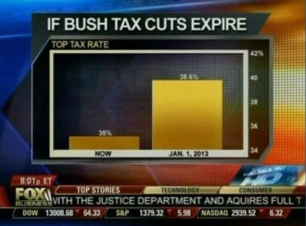
• Membership
  • Newsletter
  • Projects
  • Learning
  • About
  • Member Login
  • Guides  /  R, resources

    Resources for Getting Started with R

    R, the open source statistical software environment, is powerful but can be a…

    Read More
  • Tennis racket mountain range chart

    June 1, 2012

    Topic

    Miscellaneous  /  humor

    By Dan Piraro of Bizarro Comics. This is what happens when you don’t label your axes. Also this. [via Laughing Squid]

  • How a Virus Changes the World

    June 1, 2012

    Topic

    Infographics  /  motion graphics, virus

    From Take Part, a short video on how a virus spreads and its possible global effects. Apparently one million deaths could be prevented every year if people would just wash their hands regularly. Too bad there’s that temporary allergy to soap and water people get after doing their business in public restrooms.

    [via Brain Pickings]

  • Tasty Tweets makes smoothies based on trending fruits

    June 1, 2012

    Topic

    Data Art  /  smoothie, Twitter

    During a one-week visualization course at the Copenhagen Institute of Interaction Design, Kat Zorina, Ruben van der Vleuten, and Kostantinos Frantzis put together a working prototype that makes smoothies based on mentions of fruit on Twitter.

    Using the Twitter API, it collects tweets containing mentions of specific fruits such as blueberry, pineapple, apple and carrot and creates a smoothie that represents the blend. The smoothie is created based on the same proportions of fruits collected from the tweets. Because twitter trends change quickly, each smoothie has a unique palette of flavors.

    Next steps: a blender that provides variable consistency like chunky versus completely blended, a scoop of sherbet, and free energy boost. Oh, the possibilities.

    [via @golan]

  • Reverse engineering targeted emails from 2012 Campaign

    May 31, 2012

    Topic

    Statistics  /  email, government, ProPublica

    After noticing the Obama campaign was sending variations of an email to voters, ProPublica identified six distinct types with certain demographics and showed the differences. It was called the Message Machine. Now ProPublica is taking it a step further, hoping to dissect every email from all 2012 campaigns.

    Today, we are relaunching the Message Machine, and expanding it from handling just one mailing to handling every email from all of the campaigns in the 2012 election. It will seek a broad understanding in real time of the new and sophisticated ways modern campaigns are targeting voters.

    It’s a big puzzle, and to solve it, we need a big sample of political emails, and an understanding of who received them. That’s where you come in.

    If you get campaign emails on any subject — donation, get-out-the-vote, volunteering, events, etc. — just forward them to [email protected] using your email program’s standard forwarding feature. Nothing fancier than that needed.

    Way cool. Although I bet there will be a lot of noise, especially from the smaller, less data-savvy campaigns.

  • Typewriter installation remembers killed journalists

    May 31, 2012

    Topic

    Data Art  /  journalism, typewriter

    Julian Koschwitz uses a typewriter linked to data from the Committee to Protect Journalists to generate stories about those who have fallen doing their jobs.

    The typewriter installation On Journalism #2 Typewriter writes generatively constructed stories about all journalist who have been killed worldwide between 1992 and today based on the existing data of their lives as well as their published work. The individual stories are connected through common fields of coverage, places, professions and many other aspects. Besides the text the typewriter creates also images e.g. flags which are heavier distorted the more journalists got killed in that particular country.

  • America Revealed on PBS

    May 30, 2012

    Topic

    Maps  /  PBS, show

    I’m not sure how I missed this, but PBS’s America Revealed, which has apparently been running since last month, is the American version of the popular Britain From Above. Four episodes have aired so far on transportation, electricity, and manufacturing, along with a making-of episode. Here’s a clip from the transportation episode.

    The series airs on Wednesdays at 10/9c. Although it looks like the full series ran already. It wouldn’t make much sense to go over the making-of in the middle. On the upside, four episodes are available online.

    Had I known this existed, maybe I wouldn’t have subjected myself to the monstrosity of a show in United Stats of America.

  • Page 275 of 392
  • <
  • 1
  • ...
  • 272
  • 273
  • 274
  • 275
  • 276
  • 277
  • ...
  • 392
  • >

Analyze, visualize, and communicate data usefully, beyond the defaults.

Become a member →

Recently for Members

May 8, 2025
When the data is not what it seems

May 1, 2025
Finding the Right Charts

April 24, 2025
Visualization Tools, Datasets, and Resources – April 2025 Roundup

April 17, 2025
Breaking Out of Chart Software Defaults

April 15, 2025
Line Chart with Decorative Neon Accents

Browse by Chart Type See All →

Surface Plot Timeline Parallel Sets Sankey Diagram Stacked Area Chart Dot Map Spiral Chart Gantt Chart Dot Plot Mosaic Plot

Browse By Topic

  • Visualization

    Seeing data

  • Maps

    Seeing geographic data

  • Infographics

    Explaining data

  • Networks

    Connecting data

  • Statistics

    Analyzing data

  • Software

    Working with data

  • Sources

    Getting data

  • Design

    Making data readable

Get the Book

Visualize This: The FlowingData Guide to Design, Visualization, and Statistics

Available now.

Order: Amazon / Bookshop

Made by FlowingData

  • The Process

  • Data Underload

  • Chart Everything

  • Guides

  • Books

  • Shop

  • About
  • Contact
  • Newsletter
  • LinkedIn
  • Instagram
  • Bluesky
  • RSS
Copyright © 2007-Present FlowingData. All rights reserved.