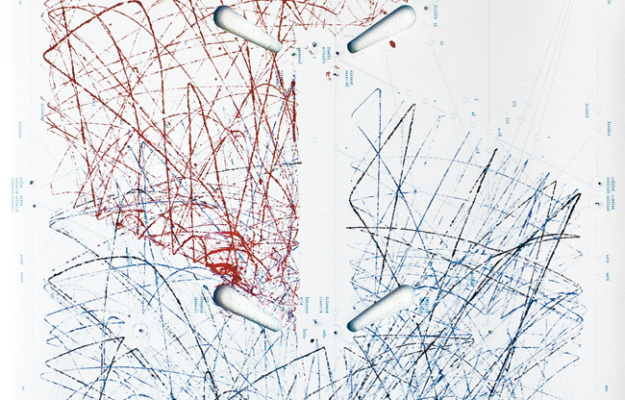
In 1979, Atari released Lunar Lander, a game whose object was to land a module safely on the moon. Digital artist Seb Lee-Delisle turned the game into an installation in which you play the game, and your paths are drawn on a wall by a hanging robot. The result, a unique trace of players’ paths in the game, is quite nice.
I’m surprised we haven’t seen more video game-based pieces likes this. The only one that comes to mind is the Just Cause 2 point cloud, which showed 11 million player deaths. It revealed terrain and gameplay mechanics. There’s also this graphic that shows what buttons to push to beat Super Mario Brothers 3, but that doesn’t really count. It’d be fun to see the direct path of a Mario expert versus a novice path that doubles back and ends early. Pac-Man might be a fun one to see, too. Yeah, let’s do that.






 Visualize This: The FlowingData Guide to Design, Visualization, and Statistics (2nd Edition)


