• Last week, the Washington Post compared the ages of Olympians, but it only focused on range, so you couldn’t see the variation in between. For example, Dara Torres was 41 at her last Olympics so the bar was stretched to the right even though there were no other swimmers near that age. Plus the Post piece was US-only. So Gregory Matthews took the statistician’s route and box plotted the age of all olympians from all countries.

    This barebones layout of course sacrifices the relatability of the first, but it’s easier to see the distributions of each sport and to spot the outliers. Apparently there was an 11-year-old swimmer Yip Tsz Wa at the 2004 games in Athens. Wha?

  • Kevin Drum on data is or data are:

    Now, I know that lots of people continue to foolishly disagree with me about this, but I’m curious how far they’re willing to push things. If you had, say, five bits of information, would you say I only have five data? If you really, truly believe that data is a plural noun, you’d have no problem with this. But does anyone actually do it?

    This was in response to the Wall Street Journal’s style guy saying that they can go either way, as the word as has evolved to also mean a singular collection of numbers.

    Here’s what the New York Times style guide has to say about it:

    [D]ata is acceptable as a singular term for information: The data was persuasive. In its traditional sense, meaning a collection of facts and figures, the noun can still be plural: They tabulate the data, which arrive from bookstores nationwide. (In this sense, the singular is datum, a word both stilted and deservedly obscure.)

    I say data is. The plural version sounds weird to me.

  • Rebecca Rosen for The Atlantic on why maps aren’t the best interface all of the time:

    Think of it this way. In the days before online trip planners and GPS, if you wanted to know how to get from point A to point B, you would look at a map and trace out a route. But these days few people would use a map that way (I still do just because I enjoy the process but I think I’m in the minority). Instead, they would plug in their request and an algorithm would spit out a route for them. The route would appear on the map, but the map is no longer the tool for finding that answer.

    In other words, just because the data has latitude and longitude attached to it, which seems like everything these days, you don’t need to automatically assume that you should throw it on a map.

  • Nicolas Rapp, for Fortune Magazine, mapped the underwater cables that make the global Internet possible.

    If the internet is a global phenomenon, it’s because there are fiber-optic cables underneath the ocean. Light goes in on one shore and comes out the other, making these tubes the fundamental conduit of information throughout the global village. To make the light travel enormous distances, thousands of volts of electricity are sent through the cable’s copper sleeve to power repeaters, each the size and roughly the shape of a 600-pound bluefin tuna.

  • I think the theme of this year’s Olympic graphics is how you relate to athletes. In this interactive by the BBC (in Spanish), height and weight of medal winners from the last Olympics in Beijing are plotted against each other. The more red, the more athletes with that weight-height combination, and you can click on a square to see the corresponding athlete(s). The twist is that you can enter your own height and weight to see where you are in the mix.

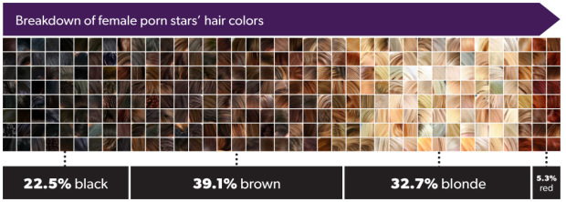
    Combine this with the recent age piece from the Washington Post, and you’ve got a more complete picture. Why stop there though? I want country, gender, and hair color breakdowns. [Thanks, Ben]

  • Artist Bard Edlund sonified the goals during the 2012 Stanley Cup.

    The goals tally cumulative scoring for each team (rather than goals against). When a puck crosses the goal line, a musical note plays. There’s one instrument sound for Western Conference teams, and another for Eastern Conference teams. Higher-seeded teams are assigned a higher pitch. This means you can actually hear whether higher- or lower-seeded teams are scoring more, and if Western or Eastern Conference teams are producing more goals.

    The beat in the background almost makes it sound like an actual song.

  • Edwin Chen, a data scientist at Twitter, explored the geographic differences in language usage of soda, pop, and coke. We’ve seen this before, so it shouldn’t be surprising to see that in the United States soda is dominant on the coasts, pop in the midwest, and coke in the southeast. The global view is new, with coke basically penetrating almost all of Europe.

    What I think is most interesting though is the idea of tweets and status updates as data that represents cultures. There are applications that keep track of tweet volume, number of replies, and when the best time to share a link is, but in ten years none of that will matter. These miniature data time capsules on the other hand will be worth another look.

  • Animator and illustrator Rufus Blacklock animated 60 years of Formula One race car design. The outline of each year’s car morphs from design to design, the engine shifts location, and the steering wheel changes shape. The video as a whole is pretty sexy.

    He also took a look at just the steering wheel’s evolution. I’m almost certain the next iteration will be non-existent in the future, where only robots race. Speaking of which, whatever happened to Robot Wars? That was good entertainment.

    [via Revolutions]