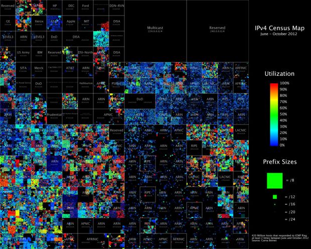
Upon discovering hundreds of thousands open embedded devices on the Internet, an anonymous researcher conducted a Census of the Internet, mapping 460 million IP addresses around the world.
While playing around with the Nmap Scripting Engine (NSE) we discovered an amazing number of open embedded devices on the Internet. Many of them are based on Linux and allow login to standard BusyBox with empty or default credentials. We used these devices to build a distributed port scanner to scan all IPv4 addresses. These scans include service probes for the most common ports, ICMP ping, reverse DNS and SYN scans. We analyzed some of the data to get an estimation of the IP address usage.
It’s a pretty thorough analysis, but the conclusion interested me most:
The why is also simple: I did not want to ask myself for the rest of my life how much fun it could have been or if the infrastructure I imagined in my head would have worked as expected. I saw the chance to really work on an Internet scale, command hundred thousands of devices with a click of my mouse, portscan and map the whole Internet in a way nobody had done before, basically have fun with computers and the Internet in a way very few people ever will. I decided it would be worth my time.
It makes me feel…uneasy. [Thanks, Roger]

 It wasn’t long ago that sensors and personal tracking
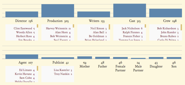


 Visualize This: The FlowingData Guide to Design, Visualization, and Statistics (2nd Edition)


