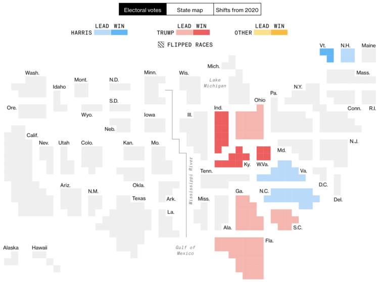
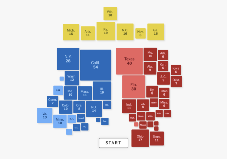
The major news outlets all have electoral vote cartograms, but I appreciate Bloomberg’s version that is extra Tetris-like. I think it’s the spacing and extra thin grid lines.
The major news outlets all have electoral vote cartograms, but I appreciate Bloomberg’s version that is extra Tetris-like. I think it’s the spacing and extra thin grid lines.
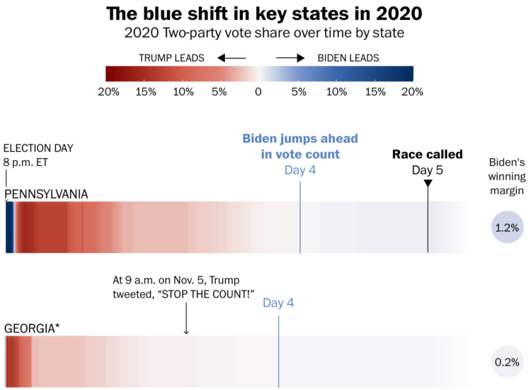
Some might wonder why early results lean towards a party and then shift decisively over time. The mistake comes when one assumes that results are about the same everywhere in a state, regardless of voting method. For the Washington Post, Bonnie Berkowitz, Szu Yu Chen, and Mark Berman illustrate what’s happening through the lens of the 2020 election.
In short, suburban counties usually get their counts in first, and they tend towards Republican. City centers and mail-in ballots come in later, and they tend towards Democrat.
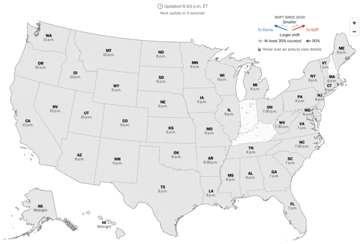
The Washington Post has a live county map that shows the shift towards Democrat or Republican compared to the 2020 election. It updates every 30 seconds.
Angled arrows show the magnitude and direction of the shift. A larger arrow represents a larger shift and a left or right direction represents a shift to Democrat or Republican, respectively. Color reinforces the direction.
They also have these pendulums to show the swings in broader categories:

I like the metaphor.
As of this writing, it’s still early, so there’s not much to see yet, but it could be interesting to watch as more polls close.
The Onion gained access to the most granular election data yet. Technology sure has come a long way.

You’ve seen the voting tendencies among standard demographic groups, but there is so much more to explore. For YouGov, David Montgomery has the breakdown for less standard groups.
It is so dumb yet so necessary.
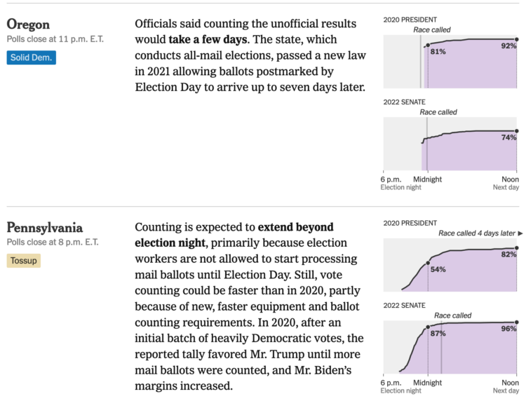
Some states count quickly, whereas others can take days. For NYT, Alicia Parlapiano and Lazaro Gamio show how long it took states to call elections in 2020 and 2022 for an idea of what to expect tonight. Instant gratification is probably not on the way.

For The New York Times, June Kim, Leanne Abraham, and Maggie Astor provide a reference for when the polls close this election day. A series of maps show the status in each state for the hours between 4:00pm and 11:00pm Mountain Time, with half-hour maps at 5:30pm and 6:30pm, as some polls close earlier.
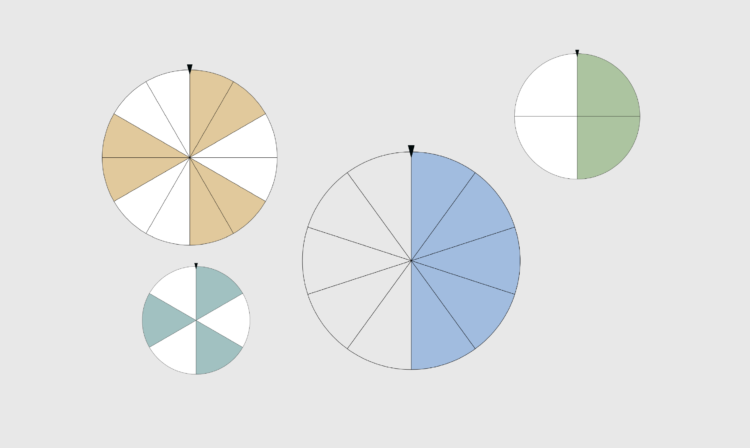
For no particular reason on this particular day, here are spinners to try your hand at random everyday things with even odds. Good luck.
For The New York Times, Lily Boyce, Jon Huang, and Blacki Migliozzi made a game-like interactive that lets you explore the possibilities of winning the Electoral College. Simply drag a state towards one candidate or the other to see what else the candidate needs to win.

NPR reports on the drying Central Asia water sources. The Aral Sea has been drying for the past 60 years, and if its source rivers dry up too, much of the region will become uninhabitable. A combination of satellite imagery, photographs, and maps help tell the story.

Here is the good stuff for October.
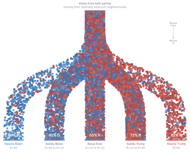
For NYT Upshot, Ronda Kaysen and Ethan Singer compared current voter registration data against 2020 data to estimate how people moved away from politically balanced neighborhoods. Those who voted for a given party were much more likely to move to places that were similar politically.
Particle-based flow charts are used to show the movements. They initially show Democrat and Republican moves separately, which provide percentage breakdowns between levels of political leanings. The percentages in the combined view above are less clear though. Are they the percentages of people who are affiliated with a party in those areas now?
In any case, the increased polarization doesn’t seem great for the country.
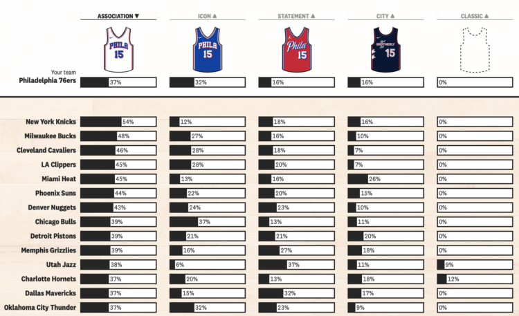
In NBA basketball, the home team used to almost always wear a white uniform and the away team would wear a non-white uniform that matched one of their team colors. Now it’s kind of all over the place. I assume it’s because Nike wanted to sell more jerseys. For The Pudding, Tyler Machado quantified the shift by manually counting uniform usage during the 2013-14 season and comparing it against data from last season collected via NBA LockerVision.
Select your team to see the changes, unless your team is the Chicago Bulls, in which case, not much has changed.
I’m so glad the basketball season is back.

For NYT Opinion, Gus Wezerek compared ad views per household:
To figure out which party won this election’s ad war, Times Opinion dug into data on 3.7 million political ad airings on broadcast TV from Aug. 1 to Oct. 25. We combined those records, provided by AdImpact, with TV viewership estimates from Comscore to calculate how many households saw each ad.
The inner semicircles represent views for presidential ads, and the less prominent outer semicircles represent views for other ads from the respective party.
I could’ve sworn I’ve seen this view for something election-related years ago, but I could not find it. The closest I could find was word usage during national conventions with vertically sliced circles and election ad topics with slice squares. Please let me know if you remember, as it will be lurking at the back of my mind until I do.

By now you’ve seen or chosen to ignore forecasts that provide probabilities for a presidential candidate winning the election. Run enough elections with a given probability and the results converge. On the other hand, individual outcomes are a lot less certain.

Early voting isn’t coming in as hot as in 2020, but there are still a lot. For the Washington Post, Alyssa Fowers and Hannah Recht are using estimates from Associated Press to keep a running tally nationally and by state. There are 46.4 million early votes as of October 28.
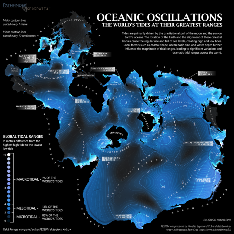
From Dave Taylor, this world map shows tidal ranges, from microtidal to macrotidal:
Created using FES2014 data from Aviso+, this map displays maximum tidal ranges (the difference between the lowest low tide and highest high tide) around the world. As tides are primarily an ocean phenomenon, the data is presented in an ocean-centric Spilhaus projection.
It’s soothing, almost like staring out at the ocean. In case you’re unfamiliar with the Spilhaus projection like I was, here’s more information. It emphasizes the connectedness of the large bodies of water surrounded by land instead of the other way around.
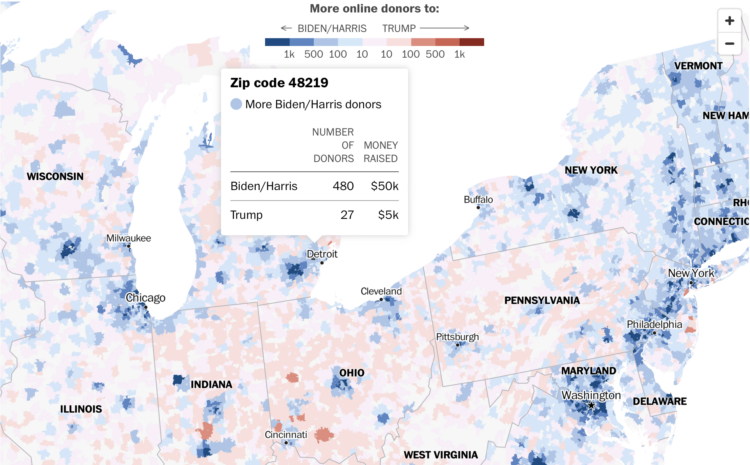
Using a combination of Federal Election Commission filings and voter registration, the Washington Post shows which presidential campaign has received more money from donors from each ZIP code. It’s only online donations, so it’s just a subset of where the money is coming from, but I imagine offline donations are tightly correlated.

This week we imagine what we would do if the tool we relied on the most were to disappear.
 Visualize This: The FlowingData Guide to Design, Visualization, and Statistics (2nd Edition)
New tools, refined process.