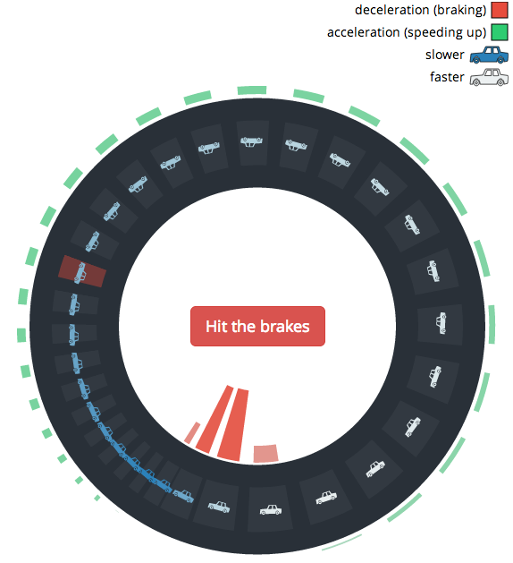
• What is your effective tax rate now versus years past? Ritchie King made an interactive to show you.

    Having not been alive in the ’50s or ’60s, let alone filing taxes, I was struck by the high top income tax rate—exactly double the highest tax rate today. It made me wonder: what would my income tax be if I had earned the equivalent of what I earn now several decades ago—or even in 1913, when the current federal income tax program was first introduced? What would the history of income taxes look like through the collective eyes of people in my exact financial situation over the past 100 years?

    Just enter your taxable income and filing status, and you get a time series of what your tax rate would’ve been years ago. It’s kind of fun to mouse right to left to see your inflation-adjusted income.

    See also the New York Times piece from last month, which makes for an interesting contrast. Similar data was used, but the views are quite different.

  • Bonnie Berkowitz, Emily Chow and Todd Lindeman for the Washington Post plotted life expectancy against percentage of healthy years. Although life expectancy is increasing, the percentage of years living without disease isn’t quite keeping up.

    People are living longer lives, but the time they are gaining isn’t entirely time with good health. For every year of life expectancy added since 1990, about 9 1/2 months is time in good health. The rest is time in a diminished state — in pain, immobility, mental incapacity or medical support such as dialysis. For people who survive to age 50, the added time is “discounted” even further. For every added year they get, only seven months are healthy.

    On the other hand, total number of expected years in good health is still on the plus-side, and I think most people would choose years in poor health over fewer years. So it’s not all bad news.

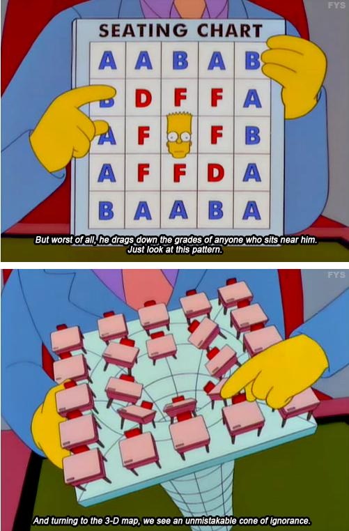
  • The New York Times mapped ratings for members of Congress, as given by the NRA.

    The National Rifle Association gives members of Congress a grade ranging from A to F that reflects their voting record on gun rights. But in response to the school shooting, some pro-gun Democrats have signaled an openness to new restrictions on guns, and the N.R.A. released a statement that said it was “prepared to offer meaningful contributions to help make sure this never happens again.”

  • A company grows, it shrinks, people come and go. Justin Matejka, a research scientist at Autodesk, visualized the changes for where he works.

    The OrgOrgChart (Organic Organization Chart) project looks at the evolution of a company’s structure over time. A snapshot of the Autodesk organizational hierarchy was taken each day between May 2007 and June 2011, a span of 1498 days.

    Each day the entire hierarchy of the company is constructed as a tree with each employee represented by a circle, and a line connecting each employee with his or her manager. Larger circles represent managers with more employees working under them. The tree is then laid out using a force-directed layout algorithm.

    Each second in the animation is about one week of activity, and acquisitions are most obvious when big clumps of people join the company. The long-term changes are a little harder to see, because the branches in the network fade into the background. Recomputing the layout each week might be good for the next round.

    [Thanks, Justin]

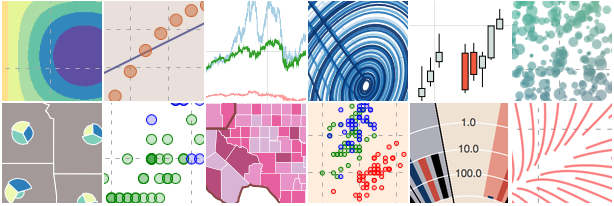
  • You get a lot of bang for the buck with R, charting-wise, but it can be confusing at first, especially if you’ve never written code. Here are some examples to get started.

  • As a teaser for a larger project on diagrams, Jane Nisselson describes how they exist in the real world.

    Diagrams are everywhere — from the established conventions of highway signs to the newly emerging visualizations appearing on social networking websites. Most people have a personal experience of diagrams whether drawing directions or figuring out how to operate a new computer. Yet very few people are familiar with how we read or construct diagrams.

    This short film introduces the language of diagrams and their role in visual thinking and communication. As only a film can do, it reveals the vocabulary “in the wild” and in the context of making and using diagrams.

    I’m looking forward to the rest if this is any indication of what’s to come.

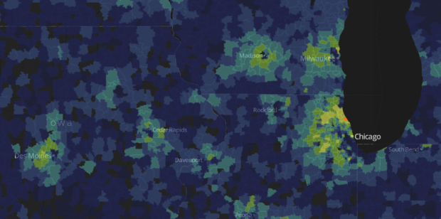
  • From businesses to demographics, there’s data for just about anywhere you are. Sitegeist, a mobile application by the Sunlight Foundation, puts the sources into perspective.

    Sitegeist is a mobile application that helps you to learn more about your surroundings in seconds. Drawing on publicly available information, the app presents solid data in a simple at-a-glance format to help you tap into the pulse of your location. From demographics about people and housing to the latest popular spots or weather, Sitegeist presents localized information visually so you can get back to enjoying the neighborhood. The application draws on free APIs such as the U.S. Census, Yelp! and others to showcase what’s possible with access to data.

    Available for free on both Android and iPhone. Data just a flick and a scroll away. [Thanks, Nicko]

  • Thessaly La Force, with illustrator Jane Mount, recently published My Ideal Bookshelf, which is a look into the books that some people of interest, including Judd Apatow, Chuck Klosterman, and Tony Hawk, would like to have on their ideal bookshelf. La Force’s boyfriend took a more data-centric look at the collections.

    In the network above, each node is a person who listed their ideal books, and connections represent people who named the same books. Those in the center of the network had more book similarities than those on the edges. For example, James Franco named a ton of books and as you might expect has a bunch of connections. [via @shiffman]

  • By now, everyone’s heard of Moneyball. Applying statistics to baseball to build the best team for the buck. Naturally, there’s a lot of interest these days in applying the same data-based philosophy to other sports. Jennifer Fewell and Dieter Armbruster used network analysis to model gameplay in basketball.

    To analyze basketball plays, Fewell and Armbruster used a technique called network analysis, which turns teammates into nodes and exchanges — passes — into paths. From there, they created a flowchart of sorts that showed ball movement, mapping game progression pass by pass: Every time one player sent the ball to another, the flowchart lines accumulated, creating larger and larger and arrows.

    Using data from the 2010 playoffs, Fewell and Armbruster’s team mapped the ball movement of every play. Using the most frequent transactions — the inbound pass to shot-on-basket — they analyzed the typical paths the ball took around the court.

    The challenge with basketball is that play is continuous, whereas baseball events are discrete, so you can’t apply the same methods. But if you can model the game properly, you know where to optimize and areas that need work.

  • As 2013 nears, let the recaps, reviews, and best ofs begin. Twitter put up their 2012 year in review of top tweets, trends, and such, which is mostly pictures and lists, but in collaboration with Vizify, they also have a section to visualize your own tweets. Click on the “View year on Twitter” button in the top right. Here’s mine, for example. (Surprise, I mention maps, data, and charts often.)

    It’s a word frequency chart that shows usage over the year. Scroll left to right or mouse over bubbles to see specific tweets. Mostly, it’s just fun to look back. [Thanks, Todd]