In her 2012 piece Stranger Visions, Heather Dewey-Hagborg used DNA found in public left in chewed gum, cigarette butts, and hair to construct estimated face busts.
Read More
-
-
By Emily McDowell, this recounting of dates initiated by the internet is funny. Fittingly posted on Valentine’s Day, a sample:
Estimated percentage of profiles containing the description “fun-loving”: 80
Estimated percentage of people who do not actually love fun: 0
Estimated percentage of single people in Los Angeles who both work and play hard: 85
Estimated number of times I rewrote my profile: 7
Estimated number of times I wore the same dress on first dates: 28
Estimated number of times I switched my own “body type” check box: 12
-
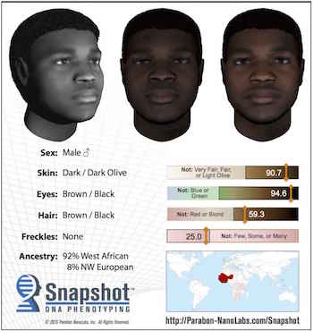 Parabon NanoLabs is working on a service that provides face estimates using DNA found at crime scenes. Pretty cool.
 But, before anyone gets too excited, keep in mind that the estimates are still really rough.
Greytak agrees Snapshot is not super-precise, nor is the science ready for it to be. “Our goal is not to produce a profile that is perfectly accurate and there is only one person you’ve ever seen who could match that profile,” she says. “Really our goal is to produce something that will look similar enough to a person that it will jog a memory and, at the same time, make it clear which people it is not.”
There was an art project a few years ago that was something like this. The artist used DNA in gum and hair that she found in public spaces, and I could’ve sworn I shared it. Anyone know what I’m talking about? Update: It was Stranger Visions. (Thanks, Thomas.)
-
I think there are people who still go to the Department of Motor Vehicles without an appointment. Because who doesn’t like a good session of waiting in line? Lucky for you, Gene Ekster put together a simple time series that shows the average wait time throughout the day.
Read More -
The R site has a new face. It looked dated for years — maybe decades — so I’m glad it got a refresh (with further updates in the coming months I assume). I felt like the old look was such a turn off that I had to reassure newcomers that even though the site looks like crap, the computing language itself is in fact not crap.
Read More -
How to Make and Use Bar Charts in R
The chart type seems simple enough, but there sure are a lot of bad ones out there. Get yourself out of default mode.
-
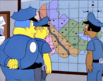 A heat map is a grid of numbers colored by value. I wrote a quick tutorial on how to make the now common statistical visualization. But at some point in the past few years, a heat map came to mean a geographic map with stuff on it. Cartographer Kenneth Field explains what these maps with stuff on it actually are and provides you with the “more established, more accurate and perfectly good terms.”
Extra point for incorporating The Simpsons:
Heat maps have become a popularist way to label a surface representation of data that occurs at discrete points. On one hand the search for a better way of showing point based data which avoids death by push-pin is a sound cartographic approach. Imagine simply looking at a map of points and trying to make sense of the patterns. Chief Clarence ‘Clancy’ Wiggum would certainly struggle to make sense of the pattern of crime in Springfield just from coloured dots.
-
Placement of Daily Double clues, from season 1 to 31. Watch them play out.
-
In football video game Madden, NFL players are scored based on skill, which determines how they play in the game. Neil Paine, with graphics by Reuben Fischer-Baum, describes more than you ever thought you wanted to know about the scoring process in an in-depth look for FiveThirtyEight. At the heart of the process is Donny Moore, who is in charged of most of the (subjective) number assignments.
Read More -
Inspired by the Python libraries RoboBrowser and BeautifulSoup, the rvest package by Hadley Wickham helps you scrape web data via R in a similar way.
Parse tables into data frames, navigate around a website, and of course, extract bits from a page. I’ll stick to BeautifulSoup, but I’m saving this for later. I’m sure it’ll come in handy sooner rather than later.
-
Planet Money goes back to a 1984 article by Steven Levy that discusses this new thing called a spreadsheet. It was taking the place of the paper version that accountants manually edited, added to, and taped together.
Read More -
Software engineer Chris Beaumont visualized the strength of opponent hands in Texas hold ’em, given any other hand. This is based on counting about 1.3 trillion possible combinations.
Read More -
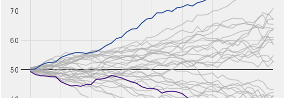
Michael Beuoy’s win probability model plotted on FiveThirtyEight starts all NBA teams at a 50% chance of winning. Then the probability of winning a game increases and decreases from there. However, practically speaking, we know something about the teams before each game, and we don’t give even chances to the worst and best team at the zero-minute mark.
So Todd Schneider took a different approach to minute-by-minute win probability — from a gambling perspective. Each line in the time series starts closer to the end probability as gamblers wager based on what they think the final outcome will be.
Read More -
Michael Beuoy made a win probability model for NBA teams and games, based on play-by-play data from 2000 to 2012. The basic calculator lets you punch in the game state, such as time left and the score difference, and it spits out the probability of a win.
Or, for a team-centric view, you can see the chart from Beuoy and Allison McCann for FiveThirtyEight, which plots the average probability using the same model. Steady rise means a steady pull towards a win, whereas spikes and steeper, positive slopes mean a tendency towards scoring spurts.
-
Jonathan Dushoff had issues with students in his population biology class cheating on his exams. One year there was suspicious behavior, but Dushoff and the proctors weren’t able to prove the students cheated as it happened. So he looked closely at the test results to find the guilty students.
Read More -
Bayes’ theorem is covered in introduction to statistics and probability courses, but I think a lot of people starting out don’t understand it conceptually. They see a formula that you plug numbers into. Here’s an example using LEGO bricks that clarifies the confusion, hopefully.
-
Did you hear the news? The White House officially appointed DJ Patil as the federal government’s first ever Chief Data Scientist. Awesome.
Here’s Patil, with an introduction by President Barack Obama, on what’s in store and a recruitment note for the US Digital Services.
Read More -
Artist Alberto Frigo took a picture of every object he used with his right hand for the past 11 years. Averaging 76 photos per day, the project — Images of the artifact used by the main hand — is low-tech, with just a small, hand-held camera. No internet connection, tagging, or documentation. Just a stream of photos.
Frigo aims to do this until age 60, so he has only 25 more years to go. Yep.
-
Quoctrung Bui for Planet Money plotted average income for the top one percent of earners against the average income of the bottom 90%, from 1920 to 2012. Through the 1970s, the animation shows rising income for the bottom and relatively static for the top and then vice versa after that.
Read More -
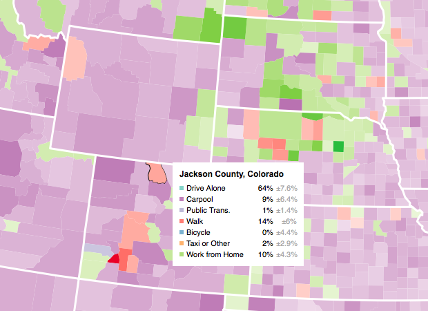
Making an Interactive Map with Category Filters
Let readers focus on the regions they care about to make their own comparisons and conclusions.




 Visualize This: The FlowingData Guide to Design, Visualization, and Statistics (2nd Edition)


