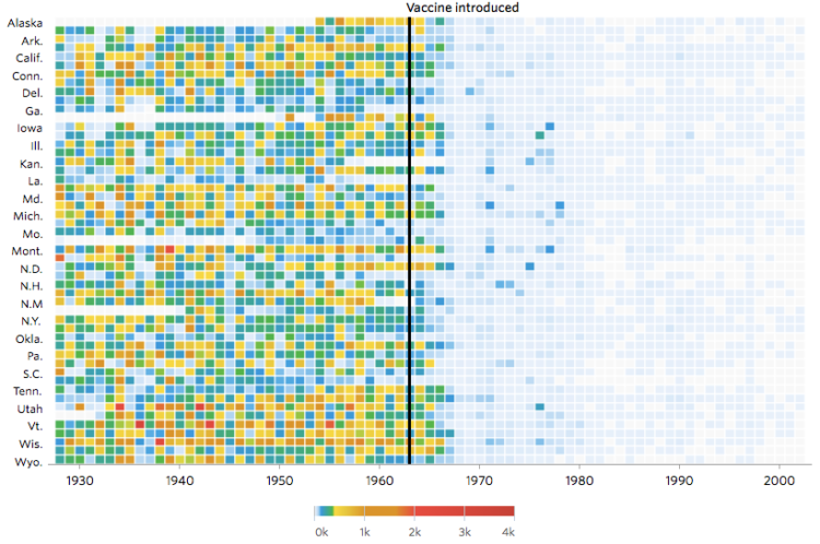
Not that anyone who does not vaccinate their kids cares, but Tynan DeBold and Dov Friedman for the Wall Street Journal show the change in number of cases for various diseases after a vaccination is introduced.
Read More
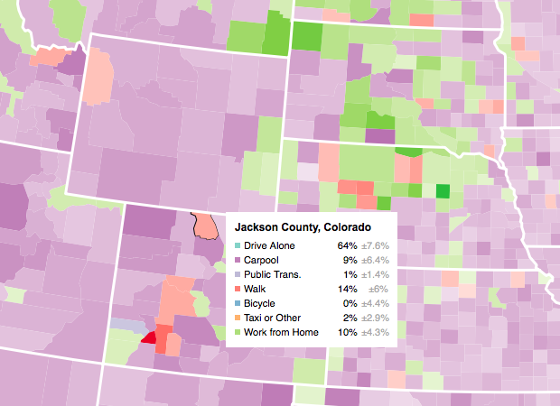
Let readers focus on the regions they care about to make their own comparisons and conclusions.
Not that anyone who does not vaccinate their kids cares, but Tynan DeBold and Dov Friedman for the Wall Street Journal show the change in number of cases for various diseases after a vaccination is introduced.
Read More
It might not be sexy, but you have to load your data and get it in the right format before you can visualize it. Here are the basics, which might be all you need.
Because using Tinder takes up oh so much time swiping, swiping, and swiping, Justin Long made a bot that swipes and starts conversations for him. Step 1: Use his existing preferences to create two Eigenfaces, commonly used in face recognition, that represent a yes and a no. Step 2: Automate everything else with the Tinder API.
Read More

Watch one bird fly around, and it’s hard to make out its flight pattern. Time shift multiple copies of that bird, creating an echo effect, and it’s easy. Parker Paul did this with seagulls flapping around at the beach and After Effects.
Read More
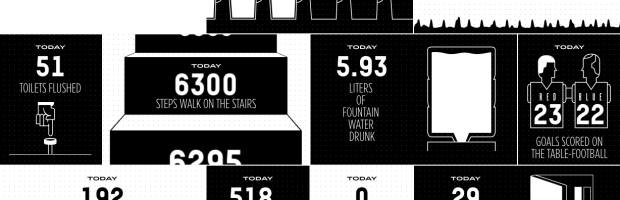
The Sid Lee agency in Paris has Arduino-powered sensors hooked up throughout their office, and they brought the data together in a single dashboard. The result is a fun look into the inner workings of the agency in real-time.
Read More
Audio Landscape is a novel music visualizer that constructs a landscape based on the MP3 that you give it. As you fly overhead, you can see the mountains constructed in the distance. (You probably want to open Chrome for this one. Safari kind of buckled for me.)
There is no more reason to expect one graph to “tell all” than to expect one number to do the same.
—John Tukey, Exploratory Data Analysis, 1977.

In the first song of his music experiment Data-Driven DJ, visual artist Brian Foo used median household income data to create a song that represents a ride on a New York subway.
Read More
In a discussion of context and visualization, Jen Christiansen pulls out a good snippet from Jacob Bronowski’s The Observer (1952) on design constraints.
Read More
The most recent episode of RadioLab is on social experimentation and social networks. More specifically, Facebook and their timeline tinkering.
Read More

Mosaic provides a simple comparison of brain size in a handful of animals so that you can compare to the average human. Select among several measures such as actual weigh, percent of body mass, or number of neurons. These measures don’t seem to say much about smarts.
Absolute brain size clearly isn’t what really matters, otherwise people would be cognitive pygmies compared to whales and elephants. But brain size relative to body size doesn’t seem to be a particularly informative measure either. Marmosets — diminutive monkeys that are not thought to be among the brightest of primates — have brains that tip the scales at around 2.7 per cent of body mass, easily beating our own 2.0 per cent.
The ghosts in Pac-Man have different personalities represented by their search technique. For example, Pinky tries to predict where you will be in four moves. I had no idea. Game/Show provides an overview of the in-depth details covered by The Pac-Man Dossier by Jamey Pittman.
Read More
Andrew Van Dam and Renee Lightner for the Wall Street Journal provide a couple of useful linked views of unemployment and job gains and losses. The former comes as a grid where each cell represents the unemployment rate, and the standard time series is shown below that.
Read More
The New York Times mapped the vaccination rate for every kindergarten in California. Bubbles are sized by enrollment and colored by rate, where red represents under 60 percent and blue represents at or above the rate recommended by the CDC for herd immunity.
Glad the Times was able to get this data together. Important.
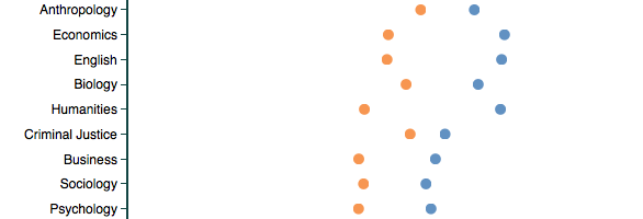
Based on about 14 million reviews on RateMyProfessor, this tool by Ben Schmidt lets you compare words used to describe professors, categorized by gender and discipline. For example, the above is the usage rate of “smart” in reviews, and you see lower rates with professors who are women than for men, for every discipline. This is true when you look at all reviews at once, just positive ones, or just negative ones.
Telling. And just the beginning. Do your own search and find out more about the data and models on Schmidt’s FAQ.
A handy chart by Andrew M.H. Alexander. Treemap conversion from one gallon, down to a teaspoon.
The Upshot has a detailed, chart-filled summary of the shrinking middle class, categorized by age, education, race, and family status.
Read More

You’ve probably heard about herd immunity by now. Vaccinations help the individual and the community, especially those who are unable to receive vaccinations for various reasons. The Guardian simulated what happens at various vaccination rates.
Luckily, the measles vaccine — administered in the form of the MMR for measles, mumps and rubella — is very effective. If delivered fully (two doses), it will protect 99% of people against the disease. But, like all vaccines, it’s not perfect: 1% of cases are likely to result in vaccine failure, meaning recipients won’t develop an immune response to the given disease, leaving them vulnerable. Even with perfect vaccination, one of every 100 people would be susceptible to measles, but that’s much better than the alternative.
If you’re still unsure, please consult this flowchart to decide.
 Visualize This: The FlowingData Guide to Design, Visualization, and Statistics (2nd Edition)
New tools, refined process.