From the Upshot, A Quick Puzzle to Test Your Problem Solving. Play it. Read the results. Learn.
-
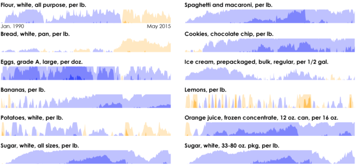
The rarely used chart type for time series data is actually quite nice, once you get the hang of it. Although it does have its limitations.
-
David Leonhardt and Alicia Parlapiano compared public opinion over time for various social issues, based on estimates from the Pew Research Center and Gallup. The issues fall into two categories.
Read More -
-
Spoiler alert for Inside Out. At the climax of the movie, we see that emotions can combine for deeper, more complex feelings, and it’s these combinations that get Riley through a tough time. Christophe Haubursin for Vox provides the matrix of emotions if you combine each.
-
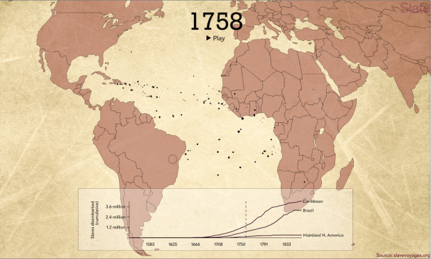
The Trans-Atlantic Slave Trade Database provides records for thousands of voyages between the 16th and 19th centuries. Andrew Kahn for Slate mapped about 20,000 of them. Portugal and Spain are most prevalent at first, and then other countries come into the picture.
Read More -

Technology continues to advance quickly, but the social questions are lagging a bit. Radiolab explores the topic of we-can-but-should-we from the perspective of a surveillance system that watches an entire city twenty-four-seven.
Listen to the podcast -
Visualization tends to rest in the realm of efficiency and accuracy. From a research perspective, these are easier things to measure than say, emotion and connection to the data that a visualization represents. In decision-making and well, just overall opinion about the world we live in, social aspects of data play a significant role. The Creators Project interviewed data artists who work on this fuzzier side of insight.
Watch the video -
-
The Supreme Court legalized gay marriage today. NPR shows before and after the ruling for each state using their new favorite hexagon grid.
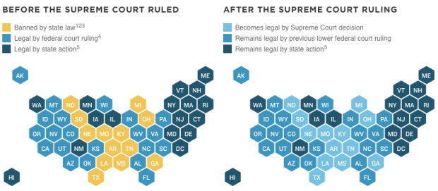
[via @onyxfish]
-
Thomas Suh Lauder for the Los Angeles Times provides you with a way to see how the water district near you is doing relative to the rest of the state. Look up a location. Get a report card.
Read More -
Amanda Cox from the New York Times was on the Data Stories podcast. You should listen. She talks about how she uses R, workflow at the New York Times, and some of her favorite projects.
I listened while picking up my son from daycare. I hope some of it seeps into his consciousness through osmosis.
One note. In the beginning Amanda talks a little bit about how she got started. She was a statistics graduate student getting tired of the theory side of things. Her program didn’t look at a ton of data in the first year, which led her to the New York Times, a placed aimed at practicality.
However, no surprise, it varies a lot by program. For example, the UCLA and Berkeley statistics departments get you looking at data early on. I haven’t taken a course in years and am far removed from academics, but I only imagine it’s more true with the whole data science field evolving into a real thing.
-
There’s the unspoken agreement between two people who walk directly towards each other. You each shift a little bit to get out of the other’s way, but some people don’t like that agreement.
New York resident Cathy O’Neil noticed a certain pattern in this collision course. So she collected data implicitly by playing chicken with people who weren’t up for shifting.
Read More -
According to estimates recently released by the United Nations, about 14 million left their home countries because of conflict or persecution. Sergio Pecanha and Tim Wallace for the New York Times mapped the migrations.
Read More -

The exhibit From Aaaaa! to ZZZap! opened last week with a hit of the start button. Michael Mandiberg wrote a script to upload the Wikipedia corpus to print-on-demand service Lulu over the course of a couple of weeks. The work comes from his larger project Print Wikipedia.
Read More -
John Nelson from IDV Solutions explains how he uses a Microsoft Excel hack to make geographic cell maps.
Read More -
-
As the Michael LaCour brouhaha settles into the archives of the Internet and figures itself out in the real world, Adam Marcus and Ivan Oransky for the Verge take a brief look at how statistics plays a role in finding scientific fraud.
Fake résumé scandals will still cripple lots of careers — and rest assured we’ll cover those stories. But relatively simple data analysis is a much more robust solution to weeding out fraud. Bring on the geeks.
I approve of this message.
-
In parallel to the Google Trends release, the Google News Lab produced a video interviewing a bunch of data journalism folks about the importance of data in storytelling. It’s mostly fluffy fluffy, but there’s quite a few important people in there who produce a lot of good stuff, so kind of a fun four-minute watch.
Watch the video -
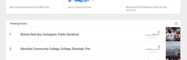
Google Trends used to be a place where you looked up trends for historical searches, over the span of several years. You can still do that, but they recently shifted to a focus on more current search activity. Get a list of “trending stories”, maps of where the searches occur, and the familiar time series plots that show search over time. Select a trend, and you get a page with news story links along with charts.
Pretty nifty. I’m surprised we’re only now just seeing this from Google.
Oh, and you can download data for some of the trends if you so please. Too bad it’s not for all searches.
Recently for Members
Second Edition
 Visualize This: The FlowingData Guide to Design, Visualization, and Statistics (2nd Edition)
 Visualize This: The FlowingData Guide to Design, Visualization, and Statistics (2nd Edition)
New tools, refined process.
Browse by Chart Type See All →


