Color in visualization can be a finicky process. You want colors to correspond with the topic at hand, you must make sure that readers can actually see the palette you choose, and people must decode appropriate differences between shades.
So here’s a game to help hone your skills.
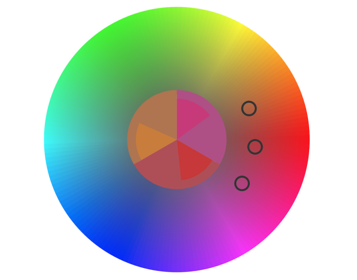
The straightforward game by Method of Action shows you a color palette, and the goal is simply to match. Each stage gets a bit more difficult and surprisingly more challenging.


 Visualize This: The FlowingData Guide to Design, Visualization, and Statistics (2nd Edition)


