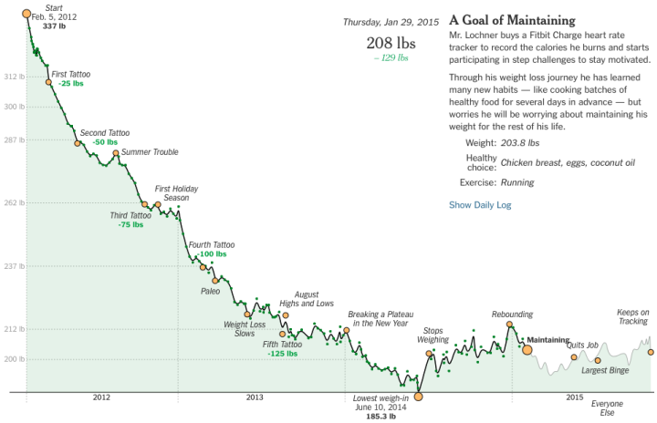
• Membership
  • Newsletter
  • Projects
  • Learning
  • About
  • Member Login
  • Game tests your color-matching skills

    August 18, 2015

    Topic

    Design  /  color, game

    Color in visualization can be a finicky process. You want colors to correspond with the topic at hand, you must make sure that readers can actually see the palette you choose, and people must decode appropriate differences between shades.

    So here’s a game to help hone your skills.

    The straightforward game by Method of Action shows you a color palette, and the goal is simply to match. Each stage gets a bit more difficult and surprisingly more challenging.

  • Surveillance selfie with cell phone metadata

    August 17, 2015

    Topic

    Self-surveillance  /  government, mobile, privacy

    How much can you find out from “just the metadata” about your cell phone? ABC News in Australia aims to find out.

    Australia’s new data retention laws mean phone and internet companies have to save this information for two years: that’s every time you call someone, where you call them from, which cell tower your phone pings every time it connects to the internet, and more.

    On a mission to find out what that data might reveal, ABC reporter Will Ockenden took a ‘surveillance selfie’: he got access to his own metadata, and now for the first time you can see what an individual Australian’s metadata actually looks like.

    They’ve started with a few summary interactives that show where Ockenden goes during the week through cell tower connections and who he communicates with through call logs. They’ll be going deeper in the coming weeks. Also, Ockenden’s data is available to download so that you can look for information too.

    The Paul Revere example came to mind. Just metadata?

  • Using Amazon’s $5 button for personal data collection

    August 14, 2015

    Topic

    Self-surveillance  /  Amazon, button

    Ted Benson used a straightforward hack to repurpose Amazon’s quick-order button. Its intended use is to automatically order an item from Amazon when you push the button. Benson avoided that part, and instead used a button press to trigger other things.

    A lot of people made fun of Dash Buttons when Amazon launched them on the day before April Fool’s Day. But regardless of what you think about Dash as a consumer product, it’s an undeniably compelling prototype of what the Internet of Things is going to look like.

    If you have the right setup, you could be up and running with a button data collector in about ten minutes.

  • Demographics of laughter on the web

    August 13, 2015

    Topic

    Statistics  /  facebook, laughing

    There are a handful of ways to express laughter online, and it appears there are subtle differences in demographics, based on what you use. After reading an anecdotal story in the New Yorker by Sarah Larson, Facebook Research looked at the data.
    Read More

  • Fitbit during sex

    August 13, 2015

    Topic

    Self-surveillance  /  Fitbit, humor

    Reddit user noveltysin wore a Fitbit during sex, and then posted a screenshot of her heart rate estimates.

    So yeah. There that is. See the reddit thread for a mature and academic discussion of the data, including a line-by-line adult parody of Eminem’s Lose Yourself.

    Doesn’t quite beat the marriage proposal heartbeat.

  • Statistical Atlas  /  government, United States

    The Statistical Atlas that Keeps On Going

    I already revived the first Statistical Atlas of the United States from 1870 with modern data, but there’s still more data to look at. So I kept on going.

    Read More
  • Guides  /  pitfalls, rules

    Real Chart Rules to Follow

    There are rules—usually for specific chart types meant to be read in a specific way—that you shouldn’t break. When they are, everyone loses. This is that small handful.

    Read More
  • The Price is Right winner and cancer survivor calculates the odds

    August 11, 2015

    Topic

    Statistics  /  cancer, game theory, probability, survival, The Price is Right

    Elisa Long, a professor in Decisions, Operations, and Technology Management at the University of California, Los Angeles, was diagnosed with breast cancer. The Price is Right films a breast cancer awareness episode every August. Long wanted to get on that show. So she watched episodes during her 6-hour chemotherapy sessions to familiarize herself with games and rules, and most importantly, to maximize her odds of winning.

    Long describes her thought process and probability calculations on her way to surviving cancer and winning it all on The Price is Right.

    My goal in going on “The Price Is Right” was to play the best I possibly could given tremendous uncertainty about the outcome. The same was true for my breast cancer. The stakes were just higher.

    Ah, the uncertainty of life.

  • Denver Broncos testing in-game analytics

    August 10, 2015

    Topic

    Statistics  /  football, sports

    Analytics continues its spread into the various facets of sports. Just recently, the Denver Broncos hired a director of analytics, Mitch Tanney, who will be available to coaches on the field to provide probabilities that inform in-game decisions.
    Read More

  • Disappearing Arctic reflected in National Geographic maps

    August 10, 2015

    Topic

    Maps  /  Arctic, global warming, National Geographic

    In the most recent update to their atlas coming in September, National Geographic explains the shrinking Arctic through the lens of previous atlas maps. It’s not looking good.
    Read More

  • Data cleaning tips

    August 7, 2015

    Topic

    Statistics  /  cleaning

    When you first learn statistics, visualization, or any data-related subject, the data usually is given to you in a ready-to-use format. This is so that you can spend most of your time on the topic of interest. But once you step outside the learning bubble, data rarely comes in the format you want.

    Marc Bellemare, an associate professor in the Department of Applied Economics at the University of Minnesota, provides some practical tips on how to deal with this. Bellemare’s parting advice:

    Really, there is no big secret to cleaning data other than “Document everything” and to save everything in different files and in different locations (i.e., your computer, Dropbox, Google Drive), and there is no other way to learn data cleaning than by doing it.

    Yep.

    Some of the tips are in the context of specific software environment, but you can easily apply them to more general situations.

  • Extract data from PDF files and export to CSV

    August 7, 2015

    Topic

    Software  /  csv, PDF

    Tabula, available for Windows and Mac, lets you extract data from PDF files, and it just got an update. The user interface got an overhaul and it’s now easier to grab data from multiple pages. I wrote about Tabula last year, but orgs continue to publish data in PDF files, and sometimes PDF is just all there is. So this is definitely a good thing.

    Keep it in your toolbox.

  • Why government sites are outdated and very much not fun to use

    August 6, 2015

    Topic

    Software  /  government, Reply All

    Government data sites are typically sluggish and a pain to use. So many forms. So slow. So much cruft in the way of what you really want. We went over this.

    Reply All, one of my favorite podcasts, talked to technologist Clay Johnson about why government sites are like this. It’s not so much the people as it is the system that gets in the way of making things better.
    Listen to the podcast

  • Possible float routes for Malaysia Airlines Flight 370

    August 6, 2015

    Topic

    Maps  /  flights, New York Times

    Malaysia Airlines Flight 370 went down a year ago, and with recently found debris that is possibly from the flight, researchers have a few more bits of data to work from. The New York Times picked up on coverage of what’s going on, and in the latest, they provide an animated map that shows possible routes the debris could have taken. This is based on computer models from the Commonwealth Scientific and Industrial Research Organisation, and suggests a search area.

  • Exploding nation of poverty

    August 5, 2015

    Topic

    Maps  /  poverty

    Poverty is on the rise. Justin Palmer mapped it for major cities in the United States.
    Read More

  • Criminal sentencing and a stat lesson on probabilities and uncertainty

    August 4, 2015

    Topic

    Statistics  /  crime, FiveThirtyEight, Marshall Project, simulation, uncertainty

    Pennsylvania is considering the use of risk assessment — the chances that someone will commit a crime in the future — in criminal sentencing. Risk assessment is already used in every state to some regard, so why not extend the concept? FiveThirtyEight and The Marshall Project look at the WTF-ness of this question.
    Read More

  • Tufte style charts in R

    August 4, 2015

    Topic

    Coding  /  custom, Edward Tufte, R

    Lukasz Piwek is chipping away at a collection of Tufte-style charts using R, along with the code snippets. Fittingly, the project is called Tufte in R. The Tufte stuff is nice and all, but that’s not why I like this project. Two reasons.
    Read More

  • How to Map and Use GeoTIFF Files in R

    It’s like working with a bunch of tiny dots, and oh look, all of sudden patterns emerge.

  • Page 193 of 392
  • <
  • 1
  • ...
  • 190
  • 191
  • 192
  • 193
  • 194
  • 195
  • ...
  • 392
  • >

Analyze, visualize, and communicate data usefully, beyond the defaults.

Become a member →

Recently for Members

May 8, 2025
When the data is not what it seems

May 1, 2025
Finding the Right Charts

April 24, 2025
Visualization Tools, Datasets, and Resources – April 2025 Roundup

April 17, 2025
Breaking Out of Chart Software Defaults

April 15, 2025
Line Chart with Decorative Neon Accents

Browse by Chart Type See All →

Dot Plot Square Pie Chart Choropleth Map Organogram Area Chart Parallel Coordinates Donut Chart Moving Bubbles Beeswarm Packed Bubble Chart

Browse By Topic

  • Visualization

    Seeing data

  • Maps

    Seeing geographic data

  • Infographics

    Explaining data

  • Networks

    Connecting data

  • Statistics

    Analyzing data

  • Software

    Working with data

  • Sources

    Getting data

  • Design

    Making data readable

Get the Book

Visualize This: The FlowingData Guide to Design, Visualization, and Statistics

Available now.

Order: Amazon / Bookshop

Made by FlowingData

  • The Process

  • Data Underload

  • Chart Everything

  • Guides

  • Books

  • Shop

  • About
  • Contact
  • Newsletter
  • LinkedIn
  • Instagram
  • Bluesky
  • RSS
Copyright © 2007-Present FlowingData. All rights reserved.