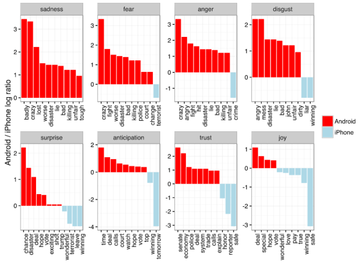
The Online Star Register takes you through a delightful view of a million stars. You can browse and gaze the sky, but be sure to “take a tour” via the button on the top. It starts on the ground at Earth, beams you out far out and then back again.
-
Remember when xkcd charted character interactions for fictional stories? Inspired by that and the upcoming Star Wars movie, Katie Franklin, Simon Elvery and Ben Spraggon made interaction charts for every episode of the galactic space opera.
The one above is for Return of the Jedi. The horizontal axis represents time, and each line represents a character. The vertical bars show when the corresponding characters appear together.
-
Mathematician Katie Steckles shows logical solutions to wrapping variously shaped presents.
I could’ve used this a few days ago. At some point in the wrapping process I wondered if it’d be better if I just haphazardly threw a bunch of paper scraps onto the gift and covered it in tape.
-
-
-
I wanted to see how daily patterns emerge at the individual level and how a person’s entire day plays out. So I simulated 1,000 of them.
-
Take all the guesswork out of finding “love” on Tinder, and let the True Love Tinder Robot by Nicole He swipe for you. Sensors measure your palm sweat and the robotic hand acts accordingly.
The True Love Tinder Robot will find you love, guaranteed. With Tinder open, you put your phone down front of the robot hand. Then you place your own human hands on the sensors. As you are looking at each Tinder profile, the robot will read your true heart’s desire through the sensors and decide whether or not you are a good match with that person based on how your body reacts. If it determines that you’re attracted to that person, it will swipe right. If not, it will swipe left. Throughout the process, it will make commentary on your involuntary decisions.
-
Enter the real world of data and statistics, and you find that files aren’t always neatly wrapped with a bow and delimited fields. Christopher Groskopf, who recently joined Quartz, provides an “exhaustive reference” to deal with the real stuff.
Most of these problems can be solved. Some of them can’t be solved and that means you should not use the data. Others can’t be solved, but with precautions you can continue using the data. In order to allow for these ambiguities, this guide is organized by who is best equipped to solve the problem: you, your source, an expert, etc. In the description of each problem you may also find suggestions for what to do if that person can’t help you.
The guide is aimed at journalists but easily applies to general data meanderings. I think we can all easily relate to problems such as missing data (“Where did the rest go?”), sample bias (“The population is who?”), and data in a difficult-to-manage format (“They gave you how many PDF files?”).
Bookmark it, read it, and keep it in your digital pocket.
-
As the saying goes, “All roads lead to Rome.” Folks at the moovel lab were curious about how true this statement is, so they tested it out. They laid a grid on top of Europe, and then algorithmically found a route from each cell in the grid to Rome, resulting in about half a million routes total. Yep, there seems to be a way from Rome from every point.
Above is the map of these routes. Road segments used more frequently were drawn thicker, and as you might expect you get what looks like a root system through the continent. I’m guessing thicker lines are highways and freeways.
Moovel did the same with cities named Rome in the United States and the state capitals. Pretty sweet.
-
Getting to 100 percent renewable energy seems like such a far away goal at this point in time – which is why Mark Jacobson has a plan.
Mark Jacobson, a Stanford engineering professor, believes the world can eliminate fossil fuels and rely on 100 percent renewable energy. Following up on his state-by-state road map for the United States, he has now released data on plans for how 139 countries could wean themselves from coal, oil, natural gas, and nuclear power.
The plan provides an energy breakdown for each country, and the National Geographic graphic shows how that compares to other countries incorporated in the plan.
See also the state-by-state plan for the United States, which shows breakdowns in the same fashion.
-
NASA mapped the annual cycle of all plant life on the planet in this animated map.
Satellite instruments reveal the yearly cycle of plant life on the land and in the water. On land, the images represent the density of plant growth, while in the oceans they show the chlorophyll concentration from tiny, plant-like organisms called phytoplankton. From December to February, during the northern hemisphere winter, plant life in the higher latitudes is minimal and receives little sunlight.
See also John Nelson’s breathing earth that used satellite imagery.
-
With recent events, you’ve likely seen the articles and graphics that get into the number of mass shootings this year and further into the past. You might have noticed that the numbers seem to vary depending on where you look, and the difference likely stems from how “mass shooting” is defined by the author.
Kevin Schaul for the Washington Post provides a straightforward interactive that uses a shootings dataset from Reddit, but shows how the count quickly changes depending on how your definition.
-
Does your vote matter? Aaron Bycoffe and David Wasserman for FiveThirtyEight provide an interactive that shows what states might switch sides if you changed turnout rate and party preference for various demographic groups.
There’s a dragger on the bottom for each group, where the vertical axis is the turnout rate and the horizontal is party preference. As you click and drag, states move back and forth accordingly.
The transition of states from one side to the other works well in this case, and as a whole, the interactive provides clarity to what I think might seem like a confusing statistical model.
-
In their annual survey that tests public perception against reality, Ipsos Mori asked people about their own country’s numbers. What’s the obesity rate in your country? What percentage of people in your country are immigrants? The Guardian setup the quiz so that you can see how your own perceptions compare against both reality and others’ in your country.
Read More -
How to Make an Interactive Bar Chart With a Slider
Provide a slider for the standard bar chart so that users can shift focus to a point of interest.
-
Forget temperature and rain weather forecasts. I want to know when the sunset will look really good in a picture. Good thing SunsetWx now exists. It predicts “sunset quality” based on a mix of meteorlogical factors.
[A]s a landscape photographer, there are certain variables I look for each evening before making the decision to take time out of my day and photograph the sunset. The most important factor I look for is sky cover, and more specifically, the existence of high clouds over the area. High clouds not only provide moisture to refract the sunlight, their ‘wispy’ formation also provides “texture” to the sky and are high enough in the atmosphere for the sun to scatter light below. Think of these as a movie theatre screen, in which light can be projected upon.
[via Slate]
-
Ant activity can seem mysterious at times. The pack seems to start out slow as a few head out in your house in search for food. Before you know it, the entire colony is en route to a few crumbs that your toddler dropped on the floor a few hours ago.
Such a pain — but at the same time kind of impressive.
Read More -
Everything — all two items — in the FlowingData shop is half off. Use the code HALFOFF at checkout for half off your order. Half off.
-
Typical time use varies by who you talk to. This interactive shows you the differences when you vary age and sex.
-
NeuralTalk2 uses neural networks to caption images quickly. To demonstrate, the video below shows a webcam feed that continuously updates with new image captions based on what the computer sees. It’s not perfect of course, but the performance is impressive.