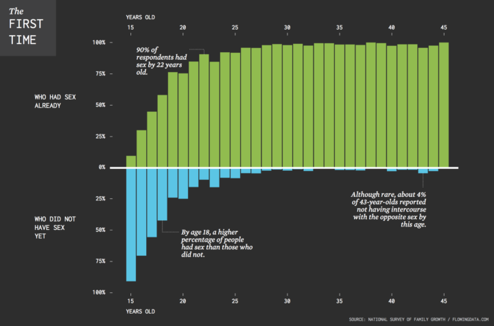
• Membership
  • Newsletter
  • Projects
  • Learning
  • About
  • Member Login
  • Composite photos of airplanes in flight

    October 20, 2016

    Topic

    Data Art  /  compositing, flights, photography

    Photographer Mike Kelley visited airports around the world, took pictures of airplanes leaving, and then pieced the photos together in a series of composite photos. The result was Airportraits.

    A bit about the arduous process:

    I often get asked exactly just how ‘real’ these images are. And on one hand, they are as real as they get. I’d sit in one place for an entire day, and take a burst of pictures of each plane as it crossed in front of me. I’d then take one of those captures, wherever I thought I’d like that plane to be, and put it on my base image. Every plane in every picture was actually right in front of me at that point in time, and they are all exactly where they were relative to other planes in the frame. If you went to some of these spots, you’d see the exact same thing that I saw.

    I want to buy a camera.

  • Data Underload  /  election, Twitter

    @HillaryClinton vs. @realDonaldTrump

    A comparison of the words unique to the candidates on Twitter.

    Read More
  • Using clustering to make a color scale

    October 19, 2016

    Topic

    Statistics  /  color, d3js

    Choice of color scale can make a big difference in how the data reads. A careless choice might make the data appear skewed too far low or too far high, so you need to look at the data and decide what’s right for the context. But, sometimes you just gotta make a lot of charts or maps. Or, you just don’t feel like manually picking the colors.

    David Schnurr describes a way to use clustering to pick the natural breaks in a more automatic fashion. The best part:

    In an effort to make it easier for anyone to use this technique in data visualizations, I’ve ported this new algorithm to JavaScript and created a custom d3 scale called d3-scale-cluster. You can find d3-scale-cluster on Github and npm–give it a try and shoot me a tweet @dschnr with your thoughts!

    More on GitHub.

    And I await for someone to make an R package.

  • Seeking solace in data

    October 18, 2016

    Topic

    Statistics  /  election, FiveThirtyEight, Wired

    I think many of us can relate to this during the odd election cycle. Marcus Wohlsen for Wired describes the constant visits and refreshes to FiveThirtyEight for new polls and projections.

    Evan is a poll obsessive, FiveThirtyEight strain—a subspecies I recognize because I’m one of them, too. When he wakes up in the morning, he doesn’t shower or eat breakfast before checking the Nate Silver-founded site’s presidential election forecast (sounds about right). He keeps a tab open to FiveThirtyEight’s latest poll list; a new poll means new odds in the forecast (yup). He get push alerts on his phone when the forecast changes (check). He follows the 538 Forecast Bot, a Twitter account that tweets every time the forecast changes (same). In all, Evan says he checks in hourly, at least while he’s awake (I plead the Fifth).

    This was me for a while, and no matter what the forecasts say, I never feel good about what I see. Because there’s always a chance.

  • Visions penned by the 18th century king of Prussia

    October 18, 2016

    Topic

    Infographics  /  documents, sketches

    Past Visions, a visual archive of Frederick William IV’s, shows thousands of drawings penned by the Prussian king.

    Frederick William IV of Prussia (1795 – 1861) left a collection of drawings behind. They bear witness to historical events such as wars and revolutions, literary influences or personal obsessions with the devil. Numerous sheets reveal the planning eye of the King in the form of architectural visions and dreamy drafts.

    Quickly browse the drawings by time and by category, all in high resolution. Nice.

  • Data Underload  /  unemployment

    Unemployment in America, Mapped Over Time

    Watch the regional changes across the country from 1990 to 2016.

    Read More
  • Tron-style slippy map

    October 14, 2016

    Topic

    Maps  /  Mapzen, Tron

    Mapzen just released a Tron-style slippy map.

    Today we introduce TRON version 2 as a fully realized Mapzen house style, rebuilt from the ground up to take advantage of the latest features of the Tangram graphics engine and Tangram blocks. With this new version, visual forms and elements transform per zoom, revealing new cartographic details and a deep exploration of scale transformations.

    It’s slick. Be sure to zoom in.

  • How one man shifts national polls

    October 14, 2016

    Topic

    Statistics  /  election, polling, Upshot

    I love the statistics lessons coming out of the Upshot, in the context of the upcoming election. In their most recent, Nate Cohn goes into varying statistical weights and how just one man can unknowingly shift the polls.

    Our Trump-supporting friend in Illinois is a surprisingly big part of the reason. In some polls, he’s weighted as much as 30 times more than the average respondent, and as much as 300 times more than the least-weighted respondent.

    Alone, he has been enough to put Mr. Trump in double digits of support among black voters. He can improve Mr. Trump’s margin by 1 point in the survey, even though he is one of around 3,000 panelists.

    He also put Hillary Clinton ahead recently, because he wasn’t in the sample.

  • Tilegrams in R

    October 13, 2016

    Topic

    Software  /  cartogram, R

    Last month Pitch Interactive launched an online tool for tiled cartograms, or tilegrams for short. Upload your state-by-state data, and it does the rest. Now you can make them in R, thanks to Bhaskar Karambelkar, since I know you’re just itching to make your own election maps.

  • All the Harry Potter spells, when they were used

    October 12, 2016

    Topic

    Statistical Visualization  /  fiction, Harry Potter

    I often stare far into the distance and ponder world’s greatest questions — like when specific spells were used in the Harry Potter books. No longer. This straightforward chart by Skyler Johnson pinpoints when each spell was explicitly said in the books and what each does.

  • Deep fried data

    October 11, 2016

    Topic

    Statistics  /  archive, machine learning, privacy

    Maciej Ceglowski, the creator of bookmarking site Pinboard, spoke at the Library of Congress a couple of weeks ago about deep-fried data.

    In our case, the deep-fryer is a toolbox of statistical techniques. The names keep changing—it used to be unsupervised learning, now it’s called big data or deep learning or AI. Next year it will be called something else. But the core ideas don’t change. You train a computer on lots of data, and it learns to recognize structure.

    These techniques are effective, but the fact that the same generic approach works across a wide range of domains should make you suspicious about how much insight it’s adding.

    And in any deep frying situation, a good question to ask is: what is this stuff being fried in?

    Deep fried food is often delicious, regardless of what’s inside the golden breading. But deep inside — or really right there in the front of our minds — we know it’s not good for us. Moderation. Or at least make sure you go to the good food stand at the carnival that uses the clean oil.

    See the talk and many others here.

  • Century of Florida hurricanes

    October 10, 2016

    Topic

    Maps  /  Florida, hurricane, weather

    Florida has seen a lot of hurricanes come and go. Lazaro Gamio for the Washington Post looks at all the hurricanes that made their way towards the state over the past 100 years.

    The thought of a hurricane freaks me out. This must be how non-Californians feel about earthquakes.

  • Doctors’ political leanings

    October 7, 2016

    Topic

    Statistical Visualization  /  medicine, politics, Upshot

    Based on data from researchers at Yale, the Upshot charts party registration by medical profession. Surgery and anesthesiology lean Republican, whereas psychiatry and infectious disease leans Democrat. As Margot Sanger-Katz notes, income between specialties likely plays a role. [Thanks, Bea]

  • Learning R Versus d3.js for Visualization

    October 7, 2016

    Topic

    Guides  /  d3js, R

    For those who work with R and d3.js, the differences between the two are obvious. But for those who are brand new to this world, the names might as well be gibberish. This quick primer is for the latter group.
    Read More

  • Hurricane Matthew en route

    October 6, 2016

    Topic

    Maps  /  hurricane, weather

    Stay safe, Florida.

  • An analysis of The Simpsons

    October 6, 2016

    Topic

    Statistics  /  television, The Simpsons

    The Simpsons is in its 27th season. That’s a lot of d’ohs. Todd W. Schneider had a look at the dialogue over the years, prominent characters, and declining ratings.

    Did I mention 27 seasons? How is that even possible?

  • Classical music visualized

    October 5, 2016

    Topic

    Data Art  /  music

    Artist Nicholas Rouguex visualized some musical scores in his project Off the Staff.

    I can’t read music but I can parse it. The talent of reading music has always escaped me which is a little ironic considering I grew up in a musical family. However, I’ve always enjoyed how sheet music looks so I took a shot at visualizing the notes from musical scores and the result is this series of posters.

    Notes were placed in a circular layout, evenly spaced. Each colored circle represents a note, and the size of the circle represents the length of the note. Colors represent instruments. Put it all together, and you get these diagrams that look like tie dye.

  • Map shows two-party presidential shifts since 1920

    October 5, 2016

    Topic

    Maps  /  election, politics

    In an update to his two-party map, political scientist David Sparks shows the evolution of the two-party system across the country, since 1920. Red and blue. Keeps on moving.

    [arve url=”https://youtu.be/I9aLRsMTk_o”]

  • Finding the biggest busts and steals from NBA drafts past

    October 4, 2016

    Topic

    Statistical Visualization  /  basketball, Polygraph, sports

    Picking basketball players for a professional team is no easy task. College and high school players picked high in the draft might end up average in the NBA, and those picked low might actually be fine professional players. Russell Goldenberg for Polygraph dives into 20 years of NBA draft picks to find the biggest busts, the biggest steals, and convergence to the mean.

  • Trending #TrumpWon didn’t start in Russia

    October 3, 2016

    Topic

    Statistics  /  election, Twitter

    After the first presidential debate, #TrumpWon was a trending topic on Twitter, which led many to believe that there were bots involved — maybe from Russia. It didn’t help that a fake map of Saint Petersburg with a bunch of bubbles on it went viral too. The real reasons for the trending hashtag are much more mundane.

  • Page 172 of 392
  • <
  • 1
  • ...
  • 169
  • 170
  • 171
  • 172
  • 173
  • 174
  • ...
  • 392
  • >

Analyze, visualize, and communicate data usefully, beyond the defaults.

Become a member →

Recently for Members

May 8, 2025
When the data is not what it seems

May 1, 2025
Finding the Right Charts

April 24, 2025
Visualization Tools, Datasets, and Resources – April 2025 Roundup

April 17, 2025
Breaking Out of Chart Software Defaults

April 15, 2025
Line Chart with Decorative Neon Accents

Browse by Chart Type See All →

Ternary Plot Surface Plot Moving Bubbles Density Plot Box Plot Scatter Plot Line Map Parallel Sets Bar Chart Race Network Graph

Browse By Topic

  • Visualization

    Seeing data

  • Maps

    Seeing geographic data

  • Infographics

    Explaining data

  • Networks

    Connecting data

  • Statistics

    Analyzing data

  • Software

    Working with data

  • Sources

    Getting data

  • Design

    Making data readable

Get the Book

Visualize This: The FlowingData Guide to Design, Visualization, and Statistics

Available now.

Order: Amazon / Bookshop

Made by FlowingData

  • The Process

  • Data Underload

  • Chart Everything

  • Guides

  • Books

  • Shop

  • About
  • Contact
  • Newsletter
  • LinkedIn
  • Instagram
  • Bluesky
  • RSS
Copyright © 2007-Present FlowingData. All rights reserved.