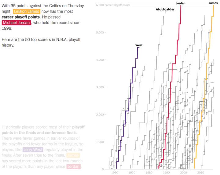
As a Golden State Warriors fan, I am obligated to dislike LeBron James, but there is no denying that he is a great basketball player. James recently passed Michael Jordan for playoff points with number 5,995, and he’s got plenty left in the tank it seems. Adam Pearce for The New York Times shows the point trajectory with a return of the scrolling visualization.


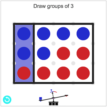 Gerrymandering is the practice of manipulating boundaries in such a way that favors a political party. If you slice and group in various ways, you can end up with different election results.
 Visualize This: The FlowingData Guide to Design, Visualization, and Statistics (2nd Edition)


