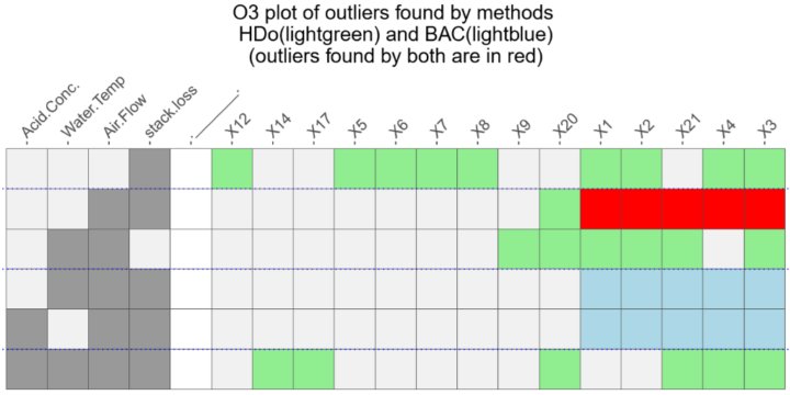
There are a lot of visualization methods to choose from, and it can be daunting finding the right visual for your data, especially for those just starting out. The Data Viz Project by ferdio is a work-in-progress catalog that aims to make the picking process a bit easier. Start with a bunch of chart types and filter by things like shape, purpose, and data format. If you’re stuck, this should help get the juices going.
-
In a collaboration between The Marshall Project and The Upshot, Daniel Lathrop and Anna Flagg analyzed data for 400,000 homicides between 1980 and 2014.
In almost 17 percent of cases when a black man was killed by a non-Hispanic white civilian over the last three decades, the killing was categorized as justifiable, which is the term used when a police officer or a civilian kills someone committing a crime or in self-defense. Overall, the police classify fewer than 2 percent of homicides committed by civilians as justifiable. The disparity persists across different cities, different ages, different weapons and different relationships between killer and victim.
-
Artist Dillon Marsh uses CGI balls of metal placed outside of mines to show how much was extracted from each location. The project is called For What It’s Worth.
These images combine photography and computer generated elements in an effort to visualise the output of a mine. The CGI objects represent a scale model of the materials removed from each mine, a solid mass occupying a scene showing the ground from which it was extracted. By doing so, the intention is to create a kind of visualisation of the merits and shortfalls of mining in South Africa, an industry that has shaped the history and economy of the country so radically.
The one above is for the Nababeep South Mine in Nababeep. Love the sense of scale the pieces provide, especially the ones for diamonds, which actually show quite little.
-
Using anonymized cell phone data from Here Technologies, Sahil Chinoy for The Washington Post mapped how far you can drive out of major cities during various times of the day. I used to do the kind of math — as I muttered in rage driving out of Los Angeles during rush hour, which by the way is four hours long.
-
I’ve never seen this Game of Thrones show, but I suspect this will be relevant to many. The Upshot made an interactive that asks readers to place characters on a two-axis chart. The x-axis spans evil to good, and the y-axis spans ugly to beautiful. The result is the above, plus contour plots for each character’s place in the space.
Like I said, I don’t anything about the show, but I like the contour plots that have a split decision about beauty. For example, most people agree that Hodor is ugly, but there’s a small group who place him at max beauty. Similarly, Joffrey Baratheon and Ramsay Bolton are clearly evil, but they have wide distributions on the ugly to beautiful scale.
-
From @aurelianrabbit, the bread bag alignment chart. Lawful neutral, right here.
-
Troy Griggs and Karen Yourish for The New York Times mapped the estimated range of North Korea’s current missiles. They might be able to reach the continental United States now. Ugh. Just typing that, I feel uneasy.
-
Last year, BuzzFeed News went looking for surveillance flight paths from the FBI and Homeland Security. Peter Aldhous describes how they did it. They used machine learning — a random forest algorithm to be more specific — to find the spy planes, which as you might expect tended to circle around more than normal flights.
-
This is how Airbnb visitors judge location, which provides a view into where city centers begin and end.
-
Beñat Arregi made a series of Airbnb maps with a simple premise. If you look at the average ratings for the location of listings in an area, you’ll see how the area is perceived by visitors. And that’s what he got.
-
Here’s a fun calculation from The Upshot.
The Labor Department keeps detailed and at times delightfully odd records on the skills and tasks required for each job. Some of them are physical: trunk strength, speed of limb movement, the ability to stay upright. Others are more knowledge-based: economics and accounting, physics, programming. Together, they capture the essence of what makes a job distinctive.
We’ve used these records to determine what each job’s polar opposite would be.
Type in your job, and you see what skills are typically used in yours and your opposite’s. So in case you’re looking for something really different in your work life, here’s about as different as you can go.
-
If you’re a parent, you’ll relate to this right away. The wife of reddit user jitney86 tracked when their infant slept and ate from 3 to 17 months. It’s a lot of noise and randomness in the beginning, and then hallelujah the schedule starts to converge to something predictable.
Read More -
How to Make a State Grid Map in R
Something of a cross between a reference table and a map, the state grid provides equal space to each state and a semblance of the country to quickly pick out individual states.
-
I have no idea how projection mapping works, so it kind of feels like magic to me. I like it. This work projects onto a martial artist, making him bigger than life.
[arve url=”https://vimeo.com/221538677″ /]
-
Travel to different parts of the country, and you hear different types of music on replay. Josh Katz for The Upshot mapped the regionality based on the popularity of artists on YouTube.
Of the artists on the Billboard Top 100 this spring, we looked at the 50 that were most watched on YouTube in the United States between January 2016 and April 2017. Each map shows relative popularity in different parts of the country. If one part of a map is lighter, it doesn’t mean people there weren’t watching the artist’s videos; it just means fans were more likely to listen to a variety of other artists.
Nice touch at the beginning: Enter a city or ZIP to listen to the corresponding area’s playlist of popular music as you browse.
See also Katz’s maps from last year for popular television.
-
We’ve seen faces as map projections before, but this is 63 projections on one page. Plus, you can click and drag to change the center points to see how different parts of the face change.
-
In a test flight, Boeing took the thing where you draw using your GPS path to a whole different level. They drew the outline of a plane that spanned the latitude of the conterminous United States.
-
-
From Rod Bogart, a Voronoi diagram of people sitting in Bryant Park. It’s a self-optimizing system to maximize sitting space.