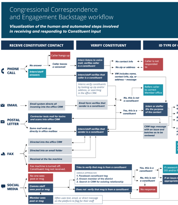
• Membership
  • Newsletter
  • Projects
  • Learning
  • About
  • Member Login
  • LaVar Ball trolling to the top, through a tweet count lens

    October 5, 2017

    Topic

    Infographics  /  basketball, LaVar Ball, Twitter

    I didn’t know who LaVar Ball was, and suddenly, it was non-stop sports news about the Ball family. If you’re unfamiliar, LaVar Ball is the father of a now professional basketball player. Before his son was drafted by the Los Angeles Lakers, Ball garnered attention for saying trollish things like he could’ve beat Michael Jordan one-on-one in his heyday.

    Anthony Olivieri for ESPN outlines the rise of the loud talker using a simple tweet count and line chart as the backdrop.

  • Triangulate a picture

    October 4, 2017

    Topic

    Statistical Visualization  /  Delaunay, images

    Triangulate, a fun tool made by Michael Freeman, lets you upload a picture and it randomly assigns points to output something that looks pixelated but with triangles. Give it a try.

  • How fake data goes viral

    October 4, 2017

    Topic

    Statistical Visualization  /  fake data

    BuzzFeed describes how an article on Daily Mail — that falsely reported claims and data about climate change — went viral. Seven months since publishing, the British site finally admitted they were wrong, long after they got all their clickbait traffic I am sure.

    This doesn’t surprise me, as I had poor experiences with Daily Mail, but it does surprise me that such a large site is allowed to keep chugging along as if they’ve done nothing wrong.

  • How I Made That: Interactive Beeswarm Chart to Compare Distributions

    The histogram is my favorite chart type, but it’s unintuitive for many. So I’ve been using the less accurate but less abstract beeswarm.

  • Nine rounds a second sonified

    October 2, 2017

    Topic

    Statistical Visualization  /  New York Times, shootings, sonification

    The New York Times used sonification along with a dot plot to demonstrate the speed of gunfire in Las Vegas. They compared it to the shooting in Orlando and an automatic weapon.

    It is possible that the Las Vegas gunman modified his gun to fire faster. This could include using a trigger crank, a mechanical add-on that is rotated like a music box handle and hits the trigger multiple times per second. Or, he may have had a bump fire stock, which uses the recoil of the rifle to fire quicker. Neither device is regulated by the National Firearms Act.

    Uggh.

  • Mass exodus at human scale

    October 2, 2017

    Topic

    Infographics  /  human, scale

    Big numbers are too abstract in our minds to fully understand the scale of things. So, to show the full gravity of the hundreds of thousands of Muslims fleeing Myanmar’s Rakhine state, Reuters starts with the individuals and builds your intuition towards the true scale.

  • Grid map variations

    September 29, 2017

    Topic

    Maps  /  grid map

    Grid maps are a useful way to show state-level data, as they give equal visual weight to each state and maintain a bit of geographic location for quicker referencing. Each news organization varies the grid locations ever so slightly. Jane Pong collected a number of them to show the differences in this fun little interactive.

  • Falling is Learning

    September 28, 2017

    Topic

    Guides  /  mistakes

    I’ve been teaching my three-year-old son how to ride his bike on two wheels. When I first took off the training wheels, he quickly lost his balance and felt discouraged. He thought he would be able to ride far and fast right away. He felt stuck, and gaining the skill to ride seemed out of reach.

    I told him it was okay to fall. I used to fall all of the time, and sometimes I still do.

    I said, “Falling is learning.”

    He asked incredulously, “You fall?”

    “Yep. It’s normal. That’s how you learn.”

    “Okay.” He hopped back on his bike with his eyes on the path. “I’m going to try again.”

    He can ride now. He rides farther every time we take the bike out, and I’m starting to lose my breath running alongside. He still falls, but every time he hops up and reassures me, “It’s okay. Falling is learning.”

    This is how I approach programming for visualization.

    I’m not great with code. I don’t know the best way to do everything. I just try to get things to work the best I can. I debug a lot. Especially in the beginning, when learning any new language, package, or framework, nothing seems to work, but eventually it does.

    Visualization beginners get stuck here. Is this the right language? Is there a better way to do this? The key is to fight off these questions in your head early on. The great thing about visualization is that you get instant, visual feedback and your wonderments will answer themselves.

    If the chart is wrong, then yeah, there probably is a better way to make it. Debug. Adjust. No big deal. You learn to avoid the mistake next time.

    You will fall a lot, especially in the beginning. But that is okay. That means you’re learning.

  • Hand-drawn short trip

    September 28, 2017

    Topic

    Miscellaneous  /  game, illustration

    Have you seen this yet? Illustrator Alexander Perrin experimented with bringing a hand-drawn quality to an interactive medium. It’s a breath of fresh air called Short Trip.

    (And brb, I need to take a walk outside.)

  • Given your income, most beneficial tax breaks

    September 27, 2017

    Topic

    Statistical Visualization  /  taxes, Washington Post

    With the release of the Republican proposed tax plan, Reuben Fischer-Baum and Kevin Schaul look at where deductions and tax credits are currently. Enter your adjusted gross income or click and drag a slider and the areas shift in the chart to show the most beneficial, given the income.

    Naturally, I now await to see how this contrasts with the plan.

  • LEGO world map

    September 27, 2017

    Topic

    Maps  /  LEGO

    Check out this five-foot long LEGO world map.

    [W]e wanted to have a big picture for our living room but couldn’t agree on a motive. At the end of 2015 my wife gave me some blue LEGO baseplates and said, I could build a big world map out of LEGO for the living room. So the idea was born and the starting point for countless evenings of planning was there.

    Color represents depth and elevation for oceans and land, respectively. Just 6,090 pieces and 22 hours of building time.

  • Data Underload  /  gender, income, work

    Who Earns More Income in American Households?

    Compared to 1970, a shift towards women making the higher income.

    Read More
  • Time map shows locations based on how long it takes to get there

    September 24, 2017

    Topic

    Maps  /  mapbox

    With the premise that we often search for locations based on how long it takes to get there rather than where they actually are in physical space, the time map by Mapbox sheds all of the latter. Placing yourself in the center, the time map shows locations in the direction you have to go and the minutes it takes to get there.

    By removing literal geography, we now have a map that more closely reflects the way we think about our environment: a cluster of restaurants “five minutes that way” versus “ten minutes the other.” We can watch our surroundings literally expand and contract with different means of travel. And only after choosing a destination do we think about roads, turns, and the specifics of how to get there.

    Give it a go.

  • Thermal structure of Hurricane Maria

    September 21, 2017

    Topic

    Maps  /  hurricane, NASA, weather

    Hurricane Maria touched down in Puerto Rico. This visualization by Joshua Stevens at NASA shows what the thermal structure of the storm looked like, based on data collected by the Terra satellite.

    Colder clouds, which are generally higher in the atmosphere, are shown with white. Somewhat warmer, lower clouds appear purple. The image reveals a very well-defined eye surrounded by high clouds on all sides—an indication that the storm was very intense.

    Ugh.

  • Stack Overflow salary calculator for developers

    September 21, 2017

    Topic

    Statistics  /  salary, Stack Overflow, work

    Stack Overflow used data from their developer survey to build a prediction model for salary, based on role, location, education, experience, and skills. The result was a salary calculator that you can use to gauge how much you should be making.

    In this salary calculator, we report a predicted salary for the location, education, experience, and other information you enter. We also report a 50% prediction interval. The specific statistical meaning of this interval is that we expect 50% of people with the same characteristics as you to have salaries within that range; it spans the 25th to 75th percentiles. The interval is just as important as the prediction itself (the 50th percentile), because it gives you an understanding of what the range of expected salaries could be.

    Nifty.

  • Looking for improbably frequent lottery winners

    September 20, 2017

    Topic

    Statistics  /  lottery

    After hearing the story of reporter Lawrence Mower, who discovered fraudsters after a FOIA request in Florida, a group for the Columbia Journalism Review and PennLive looked to expand on the analysis.

    Intrigued, we wanted to chart new territory: to find out whether these repeat winning patterns exist across the country. We decided to submit public records requests in every state with a lottery—an adventure in itself given that FOIA laws vary significantly by state. In all, we sent more than 100 public record requests to lotteries for information about their winners, game odds, and investigative reports. Getting those records wasn’t simple, as we outline below.

    See more details.

    This should be turned into a class project for Stat 101 courses.

  • Visual narrative of six asylum seekers

    September 20, 2017

    Topic

    Infographics  /  asylum, migration

    We often visualize migration and people movement as lines that go from point A to point B. While this can be interesting for overall trends, we lose something about the individuals leaving their home and traveling in hopes to find something some better. Federica Fragapane, in collaboration with Alex Piacentini, focuses in on six people leaving point A for point B to tell their stories.

  • LEGO color scheme classifications

    September 19, 2017

    Topic

    Statistics  /  color, LEGO

    Nathanael Aff poked at LEGO brickset data with some text mining methods in search for recurring color schemes in LEGO sets. This is what he got.

  • Computer uses wind to mine cryptocurrency and then fund climate research

    September 18, 2017

    Topic

    Data Art  /  climate, crytocurrency

    HARVEST is an art piece by Julian Oliver that consists of a 4G-connected waterproof computer connected to a wind turbine. While it is powered by the wind, the computer mines for for cryptocurrency, and earnings are then cashed out as donations to climate change research organizations. Yeah.

  • Page 155 of 392
  • <
  • 1
  • ...
  • 152
  • 153
  • 154
  • 155
  • 156
  • 157
  • ...
  • 392
  • >

Analyze, visualize, and communicate data usefully, beyond the defaults.

Become a member →

Recently for Members

May 15, 2025
Step Chart, Enhanced

May 8, 2025
When the data is not what it seems

May 1, 2025
Finding the Right Charts

April 24, 2025
Visualization Tools, Datasets, and Resources – April 2025 Roundup

April 17, 2025
Breaking Out of Chart Software Defaults

Browse by Chart Type See All →

Alluvial Diagram Streamgraph Strip Plot Small Multiples Spiral Chart Unit Chart Pyramid Chart Barcode Chart Parallel Coordinates Voronoi Diagram

Browse By Topic

  • Visualization

    Seeing data

  • Maps

    Seeing geographic data

  • Infographics

    Explaining data

  • Networks

    Connecting data

  • Statistics

    Analyzing data

  • Software

    Working with data

  • Sources

    Getting data

  • Design

    Making data readable

Get the Book

Visualize This: The FlowingData Guide to Design, Visualization, and Statistics

Available now.

Order: Amazon / Bookshop

Made by FlowingData

  • The Process

  • Data Underload

  • Chart Everything

  • Guides

  • Books

  • Shop

  • About
  • Contact
  • Newsletter
  • LinkedIn
  • Instagram
  • Bluesky
  • RSS
Copyright © 2007-Present FlowingData. All rights reserved.