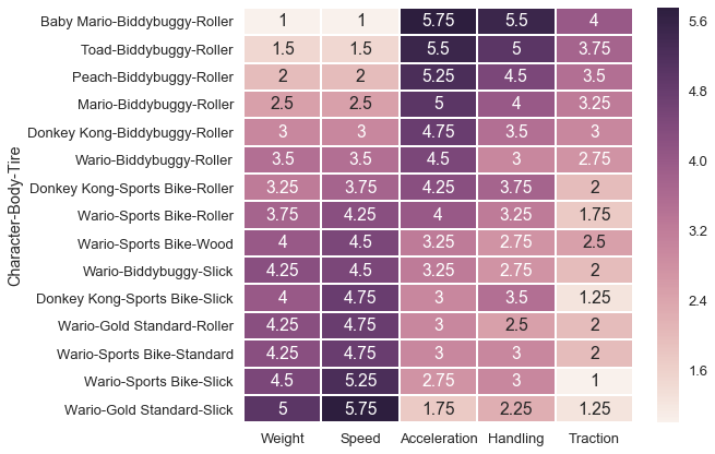
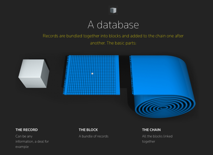
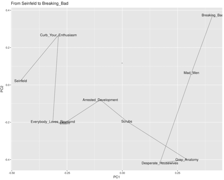
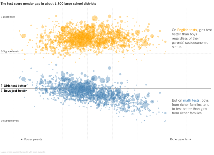
Gabriel Goh models momentum over at the new machine learning journal Distill. The visualization is not the focus, but it’s a nice supplement to help explain more complex concepts to a wider audience. More generally, if you haven’t checked out Distill yet, it’s worth your time.
-
NASA recently released composite images of the Earth at night based on 2016 data, which was a follow-up to similar images for 2012. John Nelson compared the two, specifically looking for new lights that came on (blue) and lights that went off (pink). The former, suggesting growth and the latter, suggesting decline.
-
I know, it’s only April 2017, but some senators and representatives have some extra planning to as they figure out how to persuade midterm voters to re-elect them when the voters went a different direction for the presidential election. Kevin Schaul and Kevin Uhrmacher for The Washington Post use a scatterplot and scrollytelling to explain.
-
You had me at craft beer. Russell Goldenberg for The Pudding looks for the capital based on three factors — number of breweries, quality of breweries, and location — under the premise that the whole process of picking the best is really subjective.
Don’t miss the second the chart, which is a scatterplot that shifts favorite cities based on your preferences.
-
NASA just released a composite map of the world at night using satellite imagery from 2016. This is the first nighttime map since 2012, but the team behind the work hopes for bigger things with a more real-time system.
For instance, daily nighttime imagery could be used to help monitor unregulated or unreported fishing. It could also contribute to efforts to track sea ice movements and concentrations. Researchers in Puerto Rico intend to use the dataset to reduce light pollution and help protect tropical forests and coastal areas that support fragile ecosystems. And a team at the United Nations has already used night lights data to monitor the effects of war on electric power and the movement of displaced populations in war-torn Syria.
Be sure to check out the high-res versions to see all the little pockets of light around the world.
-
We live in a time when personal data leaves digital traces of what we do, what we like, and who we care about. Quinn Norton makes a concerted effort to not leave behind such traces using layers of security and encryption, which ironically makes for an old-fashioned love story.
My love affair has taught me that the age of data makes time solid in a way that it didn’t used to be. I have a calendar and email archive that nails down the when/where/who of everything I’ve done. I know when my kid was here; the last time I saw a friend in New York; exactly what my last email exchange with my mother was. Not so with my lover. Time is a softer thing for us. Sometimes it seems like he’s always been there, sometimes it seems like we’re a brand new thing. Every other relationship in my life is more nailed down than this one.
Soft time. I like it.
-
The Climate Change Coloring Book by Brian Foo makes data tactile and interactive. “The goal is to encourage learning, exploration, and reflection on issues related to climate change through act of coloring.” It’s in the early days of a Kickstarter campaign, but I suspect it’ll be funded in no time. Pledged.
-
When you first get a CSV file, sometimes it’s useful to poke at it a bit to see what’s there. Sometimes you need to restructure the data or sort it in some non-straightforward way. Tad is a lightweight desktop application that helps with this early stage of data gathering, “designed to fit in to the workflow of data engineers and data scientists.” It’s free and open source.
I played around with it a little bit, and it’s still a little rough around the edges, but it seems like a promising start, especially for larger datasets. For small datasets, you’re probably better off just firing up R, Excel, or whatever software you use already.
-
Facial hair styles change with the years. One year it might be more fashionable to be clean shaven and another year the trend might veer towards big beards. Reddit user Mystic_Toaster sifted through old university yearbooks to manually tabulate the trends from 1898 to 2008.
Obviously there’s some self-selection going on here. It’s only a sample of yearbooks from four universities, and yearbook photos don’t always match everyday styles, but it’s a fun peek into long-term changes.
See also the older 1976 study.
Oh, and here’s the spreadsheet for the chart above in case you want to make your own charts.
-
The most recent Data Stories episode with Elijah Meeks is worth a listen if you visualize data at work, want to visualize data for work, wish your work would value your visualization more, or all of the above.
-
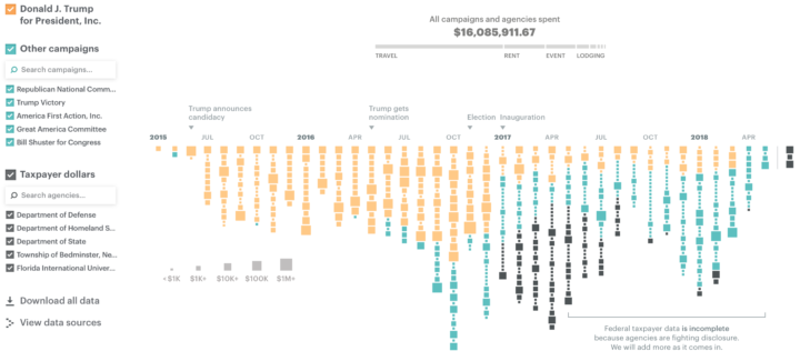
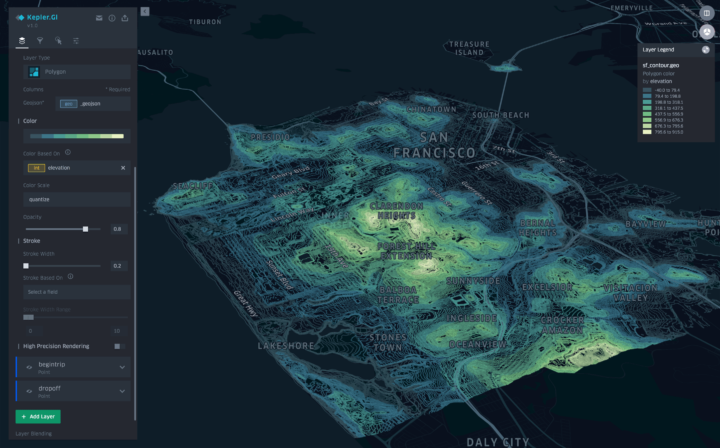
deck.gl is an open source framework developed by Uber to visualize large datasets (mainly geospatial ones, naturally). It started as an internal tool but was released to the public in November last year. Uber just released the next iteration of the package, which handles a bunch more use cases. Bookmarked it.
-
On April Fool’s Day, Reddit launched a blank canvas that users could add a colored pixel every few minutes. It ran for 72 hours, and the evolution of the space as a whole was awesome.
What if you look more closely at the individual images, edits, and battles for territory? Even more interesting. sudoscript looks closer, breaking participants into three groups — the creators, protectors, and destroyers — who fight for the ideal Place. In the process, among the Dickbutt variations, penis jokes, and Pokémon characters, it’s a story of humanity. [via Moritz]
-
Mapping geographic data in R can be tricky, because there are so many…
-
FedEx (yes, the shipping company) put up an interactive piece that audiolizes a package’s journey, based on its origination and where it passes through. Either put in your own tracking number or just enter your own locations. I’m not sure I get a ton out of the sound variation, because I don’t know what I’m listening to exactly, but I like the aesthetic. Plus it’s fun.
-
The annual Malofiej Awards is the big one for infographics in the news. The 25th one just passed, and you can browse all the winners here. There’s a lot of great work that you should associate with infographics — and not the spammy stuff that fills my inbox.
-
Plug in any dataset into a magic box and it spits out a lovely visualization you can show all of your co-workers, friends, and family. That’s the promise of a lot of startups, but it doesn’t quite work that way. Ian Johnson explains by comparing visualization the medium to other forms of communication.
I want to take a deeper look at why this pursuit of automation is misguided, and in the process hope to point out potentially more fruitful paths. I intend to do this by looking at how other communication mediums have come about via technology, what the authorship tools look like and how they evolved. We will start with the most recent medium and go back in time, getting deeper into the essence of augmenting human communication with technology.
Some (many?) might argue that automated visualization is a worthwhile pursuit. And I would agree that some parts of visualization certainly should be automatic, such as standard chart types and recurring geometries. Pieces of visualization, such as annotation and axis construction can be automatic. There are plenty of tools to make our lives easier.
But full on automation where insight fountains out from any dataset is farfetched at this point, because this requires automatic analysis. Analysis is context-specific and requires more than boilerplate statistics. The most interesting visualization is context-specific.
-
Dual axes, where there are two value scales in a single chart, are almost never a good idea. As a reader, you should always question the source when you see a chart that uses such scales. Zan Armstrong explains with a recent example.
Read More -
Lena Groeger for ProPublica describes when the designer shows up in the design, not just in the visualization part but also in collection, selection, and aggregation. Our perspective always comes to play.
Read More -
Mapping at the precinct level of detail is tough because there isn’t a central place where all the geography files reside. If you want a national precinct map, there’s going to be a lot of manual labor involved, and so that’s what Ryne Rohla did.
After spending most of my spare time in 2015 working on a global religion map, the 2016 Presidential Primaries rolled around, and I decided to go for it: I would do everything in my power to create a national precinct map. I didn’t have a team of researchers. I didn’t have aides. I didn’t have much extra money. I didn’t have connections. But for some reason, I thought I could do it anyway.
Hundreds of emails and phone calls and months of work later, here’s what I came up with
-
Phew. Close call.
New York Times graphics editor Gregor Aisch noted during a talk that 85 percent of readers didn’t click on the buttons of a popular interactive. So Dominikus Baur pondered the usefulness of interaction. The answer was yes. It’s all about purpose.
To clarify, Aisch recently came back to the 85 percent figure.
Read More