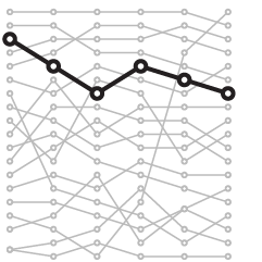
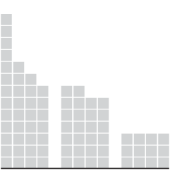
• One year into these tariffs, Ana Swanson for the New York Times has the charts. On prices:

    Unsurprisingly, tariffs pushed up the prices of imported goods last year. Economic tracking shows that prices began climbing particularly after Mr. Trump announced sweeping global tariffs in April, reversing a trend of falling prices in previous months.

    The price effects from tariffs have, however, been somewhat smaller than many originally anticipated, partly because companies have been hesitant to raise prices for fear of losing customers.

    That’s… good? I wonder how long businesses and investors will be able to tolerate decreased margins.

  • Ben Casselman reporting for the New York Times:

    The Bureau of Labor Statistics will not release monthly jobs numbers on Friday as scheduled because of the partial government shutdown, said Emily Liddel, an associate commissioner for the bureau. The report, one of the most closely watched economic indicators each month, would have provided data on job growth, unemployment and wages in January, as well as annual revisions to employment estimates from 2024 and 2025.

    The report “will be rescheduled upon the resumption of government funding,” Ms. Liddel said. A report on job openings and turnover in December, scheduled for release on Tuesday, will also be delayed.

    Pfft. We just run on vibes now anyways.

  • The next version of Firefox will have controls to turn off AI features.

    AI is changing the web, and people want very different things from it. We’ve heard from many who want nothing to do with AI. We’ve also heard from others who want AI tools that are genuinely useful. Listening to our community, alongside our ongoing commitment to offer choice, led us to build AI controls.

    Starting with Firefox 148, which rolls out on Feb. 24, you’ll find a new AI controls section within the desktop browser settings. It provides a single place to block current and future generative AI features in Firefox. You can also review and manage individual AI features if you choose to use them. This lets you use Firefox without AI while we continue to build AI features for those who want them.

    I originally thought they meant you could turn off AI on websites, but it’s just AI features in Firefox. The way we’re headed, it seems like one day a browser to shut out AI features across the full browsing experience would be useful. Baby steps, I guess.

  • In January, the scale for U.S. healthcare subsidies changed, which reintroduced a cliff. If your household makes even a dollar more past the cutoff, you get zero subsidies. For NYT’s the Upshot, Irena Hwang, Josh Katz, and Margot Sanger-Katz take you through an area chart of the changes and how we got to where we are now.

    This is geometrically a simple stacked area chart with two categories for government and individual share. Income is on the x-axis and the amount of government subsides is on the y-axis.

    But the financial cliff metaphor and the changes as you scroll highlight what happened in January when subsidies were cut. This seems like it would’ve been a useful chart during the government shutdown a few months ago.

  • Under the supposed premise of saving money, the administration proposes that US postal workers assume the role of Census workers to count people at home. Hansi Lo Wang reports for NPR:

    “I think that looking to the Postal Service as a replacement for the Census Bureau and census takers is an effort to find a silver bullet that just doesn’t exist,” Lowenthal says. “The cost savings that Secretary Lutnick believes might be there for the taking simply are based on wildly inaccurate numbers and assumptions.”

    For example, the 2020 census cost $13.7 billion, about a third of the $40 billion Lutnick cited in the interview as the cost he claimed the federal government could save.

    In 2011, the GAO concluded that using mail carriers to interview households for the census “would not be cost-effective.” The watchdog agency’s report pointed to higher average wage rates for mail carriers compared to those for temporary census workers, as well as the large number of hours needed to follow up with households that don’t respond to the census on their own.

    Hey, if the USPS thing doesn’t work out, we could just make all the food delivery services count how many chicken wings people are ordering and extrapolate for the whole country. We’ll call it the chicken wing index. If you include your household in the decennial, you get a coupon for one free chicken wing family meal. Done.

  • Speaking of SimCity, Isometric NYC by Andy Coenen is part curiosity and part AI exercise.

    Growing up, I played a lot of video games, and my favorites were world building games like SimCity 2000 and Rollercoaster Tycoon. As a core millennial rapidly approaching middle age, I’m a sucker for the nostalgic vibes of those late 90s / early 2000s games. As I stared out at the city, I couldn’t help but imagine what it would look like in the style of those childhood memories.

    So here’s the idea: I’m going to make a giant isometric pixel-art map of New York City. And I’m going to use it as an excuse to push hard on the limits of the latest and greatest generative models and coding agents.

  • In 2000, measles in the United States was declared eliminated by the World Health Organization, because vaccination coverage was high enough. This year, vaccination rates are down and cases are up. There was outbreak in Texas last year, and now there’s another in South Carolina. CNN shows the difference compared to 2023 and 2024, when more children were vaccinated.

    As a reminder, vaccines help to stop the spread of infectious diseases. Vaccine good. Measles bad.

  • To show shifts in net support for the president, the New York Times used a U-turn metaphor. The x-axis represents net support. The arrows start in 2020, move higher in 2024, and then turn back in 2026.

    The alternative, more standard chart choices, such as a dot plot or bar chart, would have worked fine, but this approach gets to the point better.

  • Most states gained population, but a few saw more people move out than move in, based on the newest estimates from the Census Bureau.

  • If you’re a fan of SimCity, then you’ll appreciate IsoCity, an open source simulation game. The premise is the same. Start with land, build infrastructure, and try to maintain a thriving city. From the GitHub:

    IsoCity is a open-source isometric city-building simulation game built with Next.js, TypeScript, and Tailwind CSS. It leverages the HTML5 Canvas API for high-performance rendering of isometric graphics, featuring complex systems for economic simulation, trains, planes, seaplanes, helicopters, cars, pedestrians, and more.

    I’ve never been big into video games, but I spent many hours in high school playing SimCity 2000, building up my city of the future. I installed the game from a single floppy disk on the family 486. My city was eventually sustainable with those robot-looking Energy Domes, and I thought our own future looked bright. If I could do it in the game, then surely we could do it in real life.

    IsoCity, which runs in the browser, is not as expansive, but it’s a fun throwback.

  • Roblox is a game mostly for kids. In an effort to make the game safer, the Roblox company integrated an AI-based age verification system. For Wired, David Gilbert, describes a mess of a system.

    But players are already in revolt because they can no longer chat to their friends, developers are demanding Roblox roll back the update, and crucially, experts say that not only is the AI mis-aging young players as adults and vice versa, the system does little to help address the problem it was designed to tackle: the flood of predators using the platform to groom young children.

    In fact, WIRED has found multiple examples of people advertising age-verified accounts for minors as young as 9 years old on eBay for as little as $4.

    I don’t think my kids will be playing Roblox much any time soon.

  • The administration cut science funding, withheld grants, and eliminated jobs in research areas that did not align. Nature, with visualization by Kim Albrecht, show the total impact so far.

    A treemap with a broken glass metaphor leads the article. I’m into it. But you can see the sudden drop in staffing for the government science agencies in the chart above, which says most of what you need to know.

  • The National Weather Service has current and historical snowfall data in various file formats and segments of time. The map could be improved, but the data is easy to access to analyze and make your own maps. Just select the file format from the menu and download.

    I hope you east coasters are staying warm. Remember to pace yourself with the snow shoveling.

  • In 2023, most of the family’s wealth, about 79% of it, was tied to real estate. These days, a growing portion belongs to cryptocurrency endeavors. For Bloomberg, Annie Massa and Tom Maloney report on the shifting assets.

    Despite the new projects, the family’s overall net worth looks remarkably similar to last year at $6.8 billion, according to the Bloomberg Billionaires Index. Even as crypto made the Trumps richer, the gains were offset by the plunging value of his social media company, Trump Media & Technology Group Corp. Its shares are down 66% over the past 12 months, despite efforts to diversify into finance, crypto and most recently, fusion power.

    Circular voronoi treemaps, scaled by total assets, show the composition. There was an initial swell in the total and then mostly flat.

  • From the New York Times editorial board, an animated big pile of money:

    A review by the editorial board relying on analyses from news organizations shows that Mr. Trump has used the office of the presidency to make at least $1.4 billion. We know this number to be an underestimate because some of his profits remain hidden from public view. And they continue to grow.

    Money rains down, each stack representing the median household income in the United States. You scroll, and more money falls on to the pile. The pile gets too big for the screen, so the view zooms out. The pile grows.

  • We focus on the bad, because that’s where it can and will get better. It’s good to remind ourselves sometimes.

  • There is a dashboard for pizza places around the Pentagon.

    The Pentagon Pizza Index (PizzINT) is a real-time dashboard that monitors pizza shop popularity around the Pentagon area in Arlington, Virginia. Based on the famous “Pentagon Pizza Theory,” this project tracks potential correlations between late-night pizza orders and military activity.

    Originally a Cold War-era observation that pizza deliveries to government buildings might indicate crisis activity, the theory gained internet fame during recent geopolitical events. Our dashboard brings this concept into the digital age using publicly available data.

    I’m torn because this is centered around crypto and memecoins, but a good dashboard built for the right audience and purpose is a good dashboard.

  • For the New York Times, Chris Buckley, Agnes Chang, and Amy Chang Chien analyzed and mapped the location of 1,400 ships that suddenly left their fishing locations and home ports to fill an area 200 miles long. Then they just stayed in place for 30 hours. In all likelihood it was a state-directed military exercise at a large scale.

    The lead animation on the article reminds of the study on ants building a bridge across an empty space.

  • Members Only

    If you know who you’re talking to, you can design based on what they know, what they’re looking for, and what you want to show.