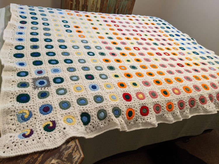
Reddit user quantum-kate used daily high and low temperatures in Denver in 1992 as the basis of this blanket. I feel like I should learn to knit crochet.
Reddit user quantum-kate used daily high and low temperatures in Denver in 1992 as the basis of this blanket. I feel like I should learn to knit crochet.

DR used a 3-D model to recreate King Frederick the 9th’s ink:
King Frederick the 9th was famous for his tattoos. But until recently — noone knew much about them. By examining hundreds of old photographs and films we have recreated the Kings’ ink in order to get a sence of who he was — both on the inside and the outside.
The scrolly touring works really well here. I went in knowing nothing about the king and came out more educated on the other side.
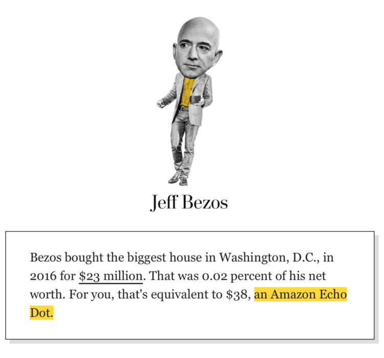
We hear about billionaires spending millions of dollars on ads, acquisitions, etc. It seems like a ridiculous amount of money, but that’s partially because us common folk think of the millions of dollars in the context of our own net worth. When Jeff Bezos spends a few multiples of what we will never make in a lifetime, it seems like a lot.
For The Washington Post, Michelle Ye Hee Lee and Youjin Shin made an interactive that instead looks at the spending as a percentage of net worth. The purchases suddenly seem less crazy (sort of).
It’s simple math but a nice way to make the spending scales more relatable.
From @haru_cchii on the Twitter:
Local German Gets Bored And Tries To Name All American States
i think i did pretty well
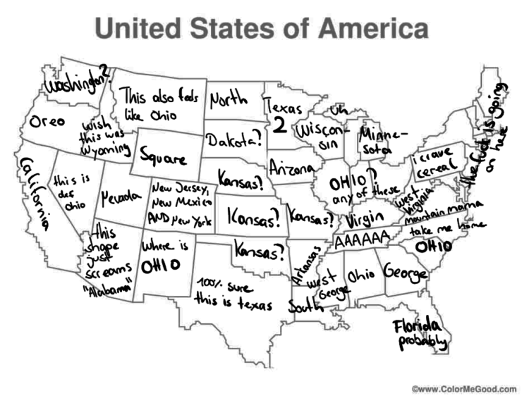
Seems right to me.
It wasn’t just issues with an app. There appears to be many more problems with the Iowa caucus results. The Upshot broke it down with a closer look at the data:
Some of these inconsistencies may prove to be innocuous, and they do not indicate an intentional effort to compromise or rig the result. There is no apparent bias in favor of the leaders Pete Buttigieg or Bernie Sanders, meaning the overall effect on the winner’s margin may be small.
But not all of the errors are minor, and they raise questions about whether the public will ever get a completely precise account of the Iowa results. With Mr. Sanders closing to within 0.1 percentage points with 97 percent of 1,765 precincts reporting, the race could easily grow close enough for even the most minor errors to delay a final projection or raise doubts about a declared winner.
When did voting get so complicated?
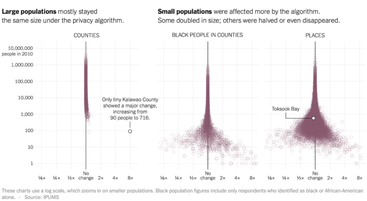
To increase anonymity in the Census records, the bureau is testing an algorithm that removes real people and inserts imaginary people in various locations. As you can imagine, this carries a set of challenges. Gus Wezerek and David Van Riper for New York Times Opinion ask what effects this could have on small towns. [Thanks, Gus]
Welcome to another episode of Misleading or Not? where we look at a chart and decide if it’s misleading or not.
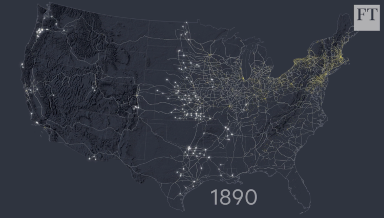
For the Financial Times, Alan Smith and Steven Bernard traced the history of railroad construction in America and mapped it over time. Literally. Bernard used digitized versions of old maps and traced each new segment by hand. Tedious, but the result is impressive.

From Lusion, CineShader is a fun editor for those who are familiar with Shadertoy:
CineShader is a real-time 3D shader visualiser. It leverages the Shadertoy.com API to bring thousands of existing shader artworks into a cinematic 3D environment.
The whole project was started as an idea of using a web demo to explain what procedural noise is to our clients at Lusion. After sending out the demo to some of our friends, we were encouraged to add the live editor support and we decided to release it to the public.
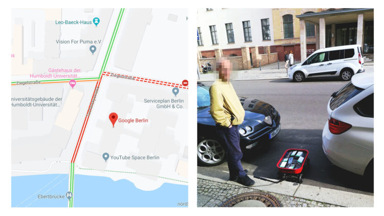
Google Maps incorporates data from smartphones to estimate traffic in any given location. Artist Simon Weckert used this tidbit to throw the statistical models off the scent. With a wagon of 99 smartphones, he turned roads red on Google Maps just by walking around.
Nice.
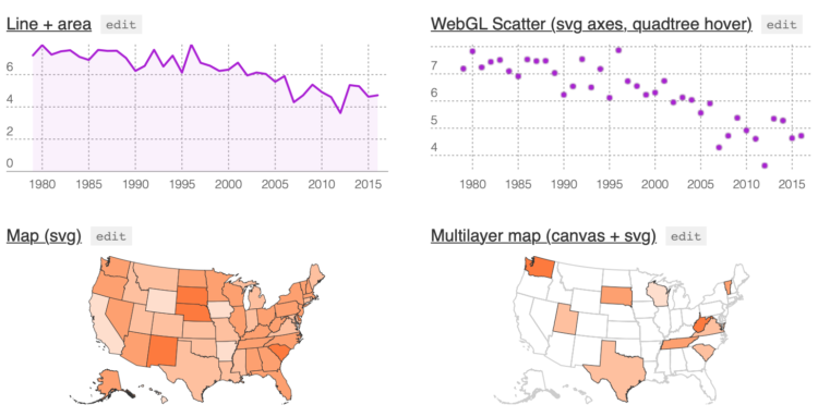
Michael Keller released a new version of Layer Cake:
Layer Cake is a graphics framework built on top of Svelte. It measures your target div and your data and creates scales that stay synced on layout changes. Use these scales to organize multiple, mostly-reusable Svelte components, whether they be SVG, HTML, Canvas or WebGL. Since they all share the same coordinate space, you can build your graphic one layer at a time.
I’m intrigued. (And I feel like I need to learn more about this Svelte.)
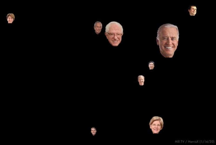
I know you don’t get enough election coverage these days and are probably like, “I wish there was a way I could be reminded of who’s running with bouncing heads across my screen whenever I come back to my computer. That would be super.” Well, look no more. The Presidential Hopefuls screensaver by Robert Tolar Haining is what you’re looking for.
Every month I collect resources and tools to help you better visualize data. Here’s the good stuff for January 2020.
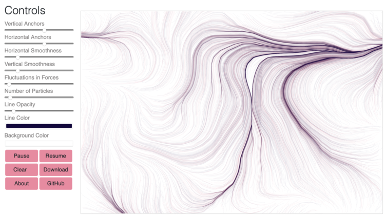
Flow Fields, a generative art tool by Michael Freeman, lets you adjust various parameters, such as color, smoothness, and fluctuations, and the flows just keep coming. Pretty.
The code is up on GitHub and is based on Daniel Shiffman’s Coding Train tutorials.
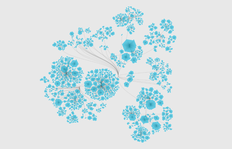
Network graphs are a good way to find structure and relationships within hierarchical data. Here are several ways to do it.
For ProPublica, Ellis Simani and Ken Schwencke compiled an interactive database that you can search:
ProPublica reporters spent months collecting the lists as they were originally released by each diocese. They then made them searchable via a public database in order to provide victims of clerical abuse and members of the public a way to search across all of the released lists.
More than 6,700 names are included in the database, and over 5,800 of them are unique. A little more than half of the people named were listed as being deceased. ProPublica did not have the data necessary to merge records with the same name across dioceses, though our reporting on specific clergy indicates that some have surfaced on as many as eight lists.
Unsettling.
The data is also available for download.
Noah Veltman just posted a dataset of 23,463 personalized license plate applications that were flagged for additional review by the state of California from 2015 to 2016. Casually scrolling through, for the plates people request and why they are flagged, this is a goldmine of amusement.
Veltman writes:
This data was parsed from a set of 458 Excel workbooks that the DMV prepared for someone else’s public records request. I received the files as a consolation prize in response to my own related records request, which I was told would cost $2,000 to fulfill otherwise.
Just on this information alone, I think we are obligated to do something with this dataset.
Sometimes illustrating scientific findings is a challenge. Sometimes the illustrations are published anyways, because there are no more options. Sometimes those illustrations end up on a Twitter feed called Science Diagrams that Look Like Shitposts.
Over a year ago, Google released Dataset Search in public beta. The goal was to index datasets across the internets to make them easier to find. It came out of beta:
Based on what we’ve learned from the early adopters of Dataset Search, we’ve added new features. You can now filter the results based on the types of dataset that you want (e.g., tables, images, text), or whether the dataset is available for free from the provider. If a dataset is about a geographic area, you can see the map. Plus, the product is now available on mobile and we’ve significantly improved the quality of dataset descriptions. One thing hasn’t changed however: anybody who publishes data can make their datasets discoverable in Dataset Search by using an open standard (schema.org) to describe the properties of their dataset on their own web page.
I haven’t tried it in a while, but the last time I did, there weren’t that many sources yet, because the indexing partially relies on others to use a standard to provide metadata. Kicking the tires on it now, it still kind of feels like an index of other dataset aggregators, but I’m interested.

Using one of my recent projects as an example, I describe my non-elegant process of making a quick chart.
 Visualize This: The FlowingData Guide to Design, Visualization, and Statistics (2nd Edition)
New tools, refined process.


