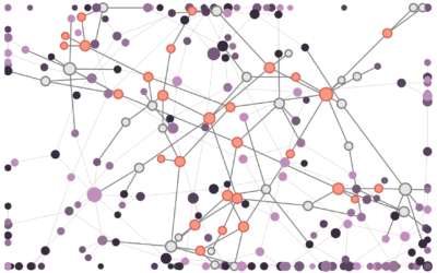
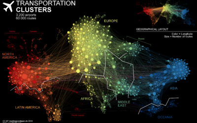
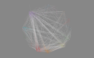
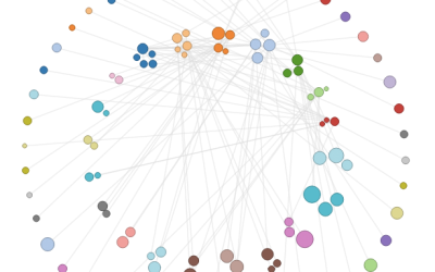
Network Graph
Nodes and edges show connections, typically positioned to show strength of relationships.
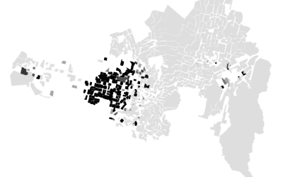
Racial Divide
It's hard to think of much else. These maps show the racial divide between black and white people in major cities.
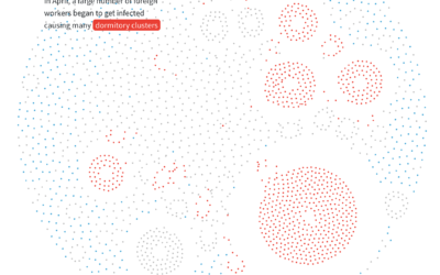
Anatomy of an outbreak
For Reuters, Manas Sharma and Simon Scarr animated a coronavirus outbreak in Singapore…
How to Visualize Hierarchical Graphs in R, with ggraph and tidygraph
Network graphs are a good way to find structure and relationships within hierarchical data. Here are several ways to do it.
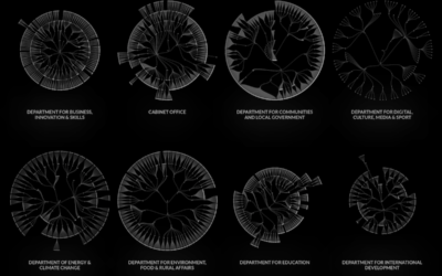
UK government org charts
When I think government structure, I tend to think in general overviews where…
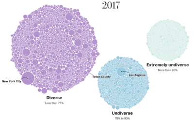
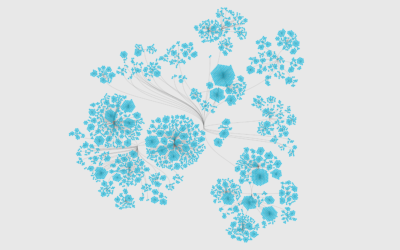
School diversity visualized with moving bubbles
The Washington Post visualized 13,000 school districts to show the change in diversity…
How to Make a Moving Bubble Chart, Based on a Dataset
Ooo, bubbles... It's not the most visually efficient method, but it's one of the more visually satisfying ones.
The Stages of Relationships, Distributed
Everyone's relationship timeline is a little different. This animation plays out real-life paths to marriage.
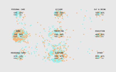
A Day in the Life: Women and Men
Using the past couple of years of data from the American Time Use Survey, I simulated a working day for men and women to see how schedules differ. Watch it play out in this animation.
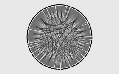
How to Make Chord Diagrams in R
Show connections in the circular layout for a more compact presentation.
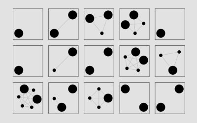
Getting Started with Network Graphs in R
Add the vertices. Connect them with edges. Repeat as necessary.
A Day in the Life: Work and Home
I simulated a day for employed Americans to see when and where they work.
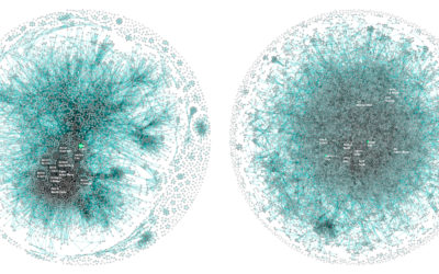
How disinformation spreads in a network
Disinformation is kind of a problem these days, yeah? Fatih Erikli uses a…
Apple vs. Google company structure, as seen through patents
For Co.Design, Periscopic compared patent ownership between Apple and Google, which ends up…
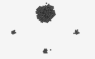
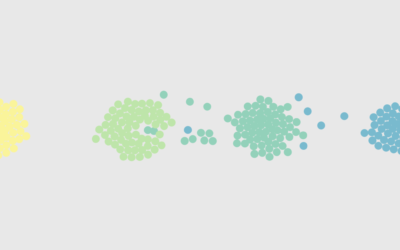
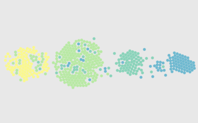
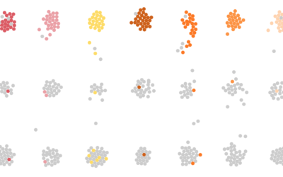
Make a Moving Bubbles Chart to Show Clustering and Distributions
Use a force-directed graph to form a collection of bubbles and move them around based on data.
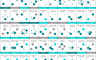
Most Common Family Types in America
Nuclear is still the most common, but there are millions of households in the United States with a different family structure.
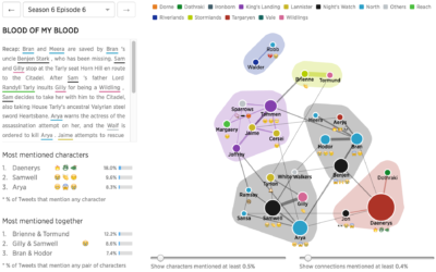
Game of Thrones discussions for every episode, visualized
I hear there’s some show called “Game of Thrones” that’s kind of popular…

Shakespeare tragedies as network graphs
Martin Grandjean looked at the structure of Shakespeare tragedies through character interactions. Each…
A Day in the Life of Americans
I wanted to see how daily patterns emerge at the individual level and how a person's entire day plays out. So I simulated 1,000 of them.
How to Make an Interactive Network Visualization
Interactive network visualizations make it easy to rearrange, filter, and explore your connected data. Learn how to make one using D3 and JavaScript.