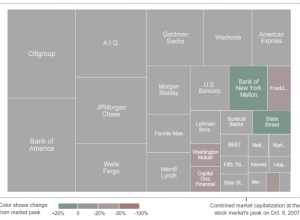
From Karl Russel and Shan Carter of The New York Times is this…
Infographics
Telling stories with data and graphics.
-
Watch the Giants of Finance Shrink… Then Grow
-
Infographic Music Video on the Elements – They Might Be Giants
It’s not often you get a Grammy-winning band to play a song for…
-
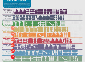
Food Assistance on the Rise
GOOD magazine, in collaboration with Gavin Potenza, takes a look at food assistance…
-
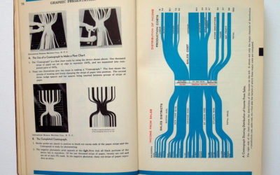
Vintage Infographics From the 1930s
Someone needs to get me a paper copy of Willard Cope Brinton’s Graphic…
-
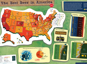
Best Beer in America 2009
Following up from last year’s beer graphic, Mike Wirth looks at medal winners…
-
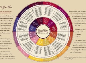
What is Your Wine Personality Profile?
The Texas in a Bottle guide to Texas Wine [pdf] reads:
Ever listen… -
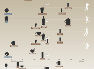
Caffeine vs Calories – Buzz vs Bulge
David McCandless from Information is Beautiful plots the calories in popular beverages versus…
-
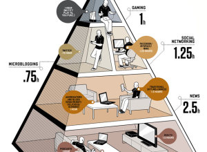
Balance Life With the Media Diet Pyramid
In the August issue of Wired are the New Rules for Highly Evolved…
-
Choose Your Own Adventure – Most Likely You’ll Die
Remember those choose your own adventure books that you used to read as…
-
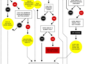
Step-by-Step Guide On How to Get Shot by the Sartorialist
The Sartorialist is a unique fashion blog that highlights people’s hot styles on…
-
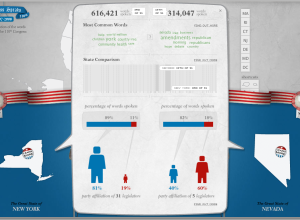
Compare What Your Senators and Reps are Talking About With Congress Speaks
There’s a lot of talking in congressional meetings, but what are your state…
-
Animated Infographics for the Eat Local, Eat Real Campaign
I love food. I love infographics. Put them together, and this is what…
-
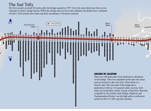
Suicides by Location on the Golden Gate Bridge
This graphic from SF Gate is a good four years old, well before…
-
Gauge Your Distraction While You Text and Drive in the Distracted Driving Game
From Gabriel Dance, Tom Jackson, and Aaron Pilhofer of the New York Times…
-
Death and Taxes Poster 2010 – 50% Off for FlowingData Readers
Jess Bachman of WallStats just released his annual Death and Taxes Poster for…
-
Comparing the Human and Chimpanzee Genomes
As part of the Explore Evolution exhibit at the University of Nebraska State…
-
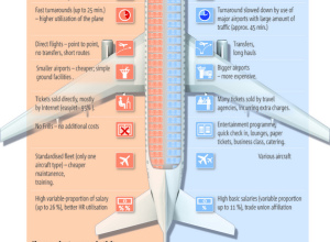
Why Are Cheap Airlines So Cheap?
5W Graphics, whose work you’ve seen by now, compares lower-cost airlines to “regular”…
-
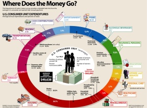
How Does the Average Consumer Spend His Money?
Add another graphic to the list of ways to show consumer spending. Visual…




 Visualize This: The FlowingData Guide to Design, Visualization, and Statistics (2nd Edition)


