I can’t count how many times I’ve googled a programming-related question and found…
Apps
Software that makes a part of your data job easier.
-
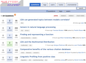
Stack Overflow for data geeks
-
Facebook users who don’t know they are sharing
I’m pretty sure all this Facebook stuff will blow over soon enough. Most…
-
Build Online Visualization for Free with Tableau Public
Tableau Software, popular for making data more accessible, mainly in the business sector,…
-
Build Statistical Graphics Online With ggplot2
Statisticians are generally behind the times when it comes to online applications. There…
-
Nebul.us Shows You Your Activity on the Web
Nebul.us is an online application, currently in private beta, that aggregates and visualizes…
-
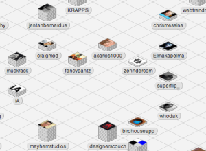
Data Interface Iterations: Designing webtrendmap.com’s Stacks
This is a guest post by Craig Mod, who collaborated with Information Architects,…
-
Collect Data About Yourself with Twitter – your.flowingdata is Live
your.flowingdata (YFD), a Twitter application that lets you collect data about yourself, is…
-
Google Fusion Tables Helps You Visualize and Manage Your Data
As the newest release from Google Labs, Fusion Tables is a tool that…
-
Indieprojector Makes it Easy to Map Your Geographical Data
Axis Maps recently released indieprojector, a new component to indiemapper, their in-development mapping…
-
Google Adds Search to Public Data
Google announced today that they have made a small subset of public datasets…
-
A Couple New Looks for Google News
The ever popular newsmap (above), a tree map view of Google News, got…
-
News at a Glance with New York Times Article Skimmer
The New York Times homepage has a lot of news to report. While…
-
Open Thread: Is Google Latitude Dangerous?
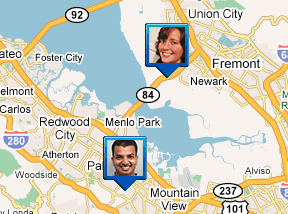
Google recently released Google Latitude, which is an online application that lets you…
-
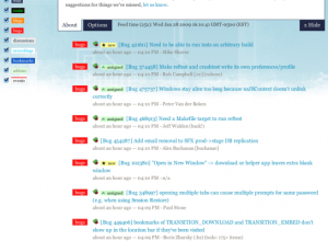
Open Call to Designers: Visualizing Mozilla Community
The Mozilla group is starting to dig into visualization to participation within the…
-
Tools You Need to Track Energy Consumption – WattzOn
“Climate change is a global problem. But it’s individuals who will create the…
-
Discover Your Future for 2009 – CookieSays Fortunes
First off, happy new year! I’m back from my short hiatus from blogging…
-
Magically Reformat Data to Get it How You Need it
One of the more painful parts of analysis or visualization is that you…
-
Read Your Feeds Like a Newspaper with Tabbloid
Tabbloid is a free service that lets you receive your feeds in newsletter,…
-
Google Visualization API Opens Up
When Google first launched their visualization API, you could only use data that…
-
Compare Media Coverage of Presidential Candiates with Everymoment Now
I keep stumbling on rants about how media coverage of presidential candidates is…




 Visualize This: The FlowingData Guide to Design, Visualization, and Statistics (2nd Edition)


