Open data is great, but it’s useless if you don’t know what to…
Maps
Intuitive to look at spatial patterns and great for distributing geographic data.
-
Sunlight Labs releases mapping framework, ClearMaps
-
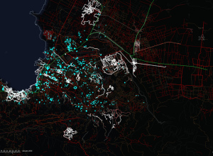
OpenStreetMap Edits Towards Haiti Relief
ITO world, who you might remember from a year of OpenStreetMap edits, come…
-
Data.gov.uk Gearing Up For Launch, er, Does Launch
Update: I had scheduled this post for next week, but apparently, Data.gov.uk launched…
-
The Very First Thematic Maps
I’m admittedly not very good with historical precedent, but I think we can…
-
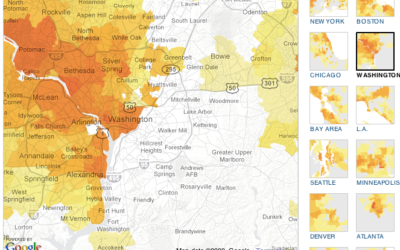
The Geography of Netflix Rentals
Some movies are popular everywhere. Others are popular only in certain regions. The…
-
The Universe as We Know It
The Known Universe from the American Museum of Natural History shows a view…
-
The Geography of AIDS Around the World
It was World AIDS Day last week and UNAIDS published the latest estimates…
-
Can You Guess What These Maps Show?
I’m no doubt still under massive food coma at this time, but in…
-
What’s Cooking on Thanksgiving, Mapped and Ranked
Food-wise, Thanksgiving is different across the country. In some places you’re going to…
-
Battle of the Coverage Maps: Verizon vs. AT&T
Verizon has been running these ads lately that compare their 3G coverage to…
-
Make Thematic Maps With Cartographer.js
Like it or not, Google Maps mashups continue to be a Web favorite.…
-
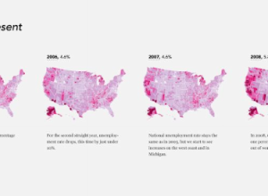
Unemployment, 2004 to Present – The Country is Bleeding
The Bureau of Labor Statistics released the most recent unemployment numbers last week.…
-
Using Flickr as a Paintbrush
Andy Woodruff from Cartogrammar uses average color in Flickr photos to map the…
-
This Would Be Perfect for a Roomba Commercial
You know the Roomba from iRobot? It’s the robot vacuum cleaner that is…
-
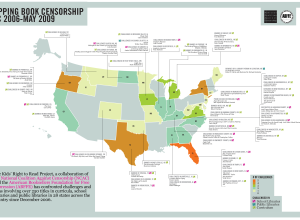
You Are Not Allowed to Read this Book
What would a freshman English class be without Of MIce and Men? No…
-
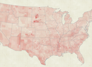
The Geography of Job Loss
While on the topic of job loss and unemployment, here’s an animated map…
-
Trendsmap Shows Twitter Trends Geographically
Twitter shows trending topics, but it’s for the entire user base. You can…
-
Earth Through the Eyes of Astronauts
Bella Gaia, or Beautiful Earth, is a unique view of earth through the…


 Visualize This: The FlowingData Guide to Design, Visualization, and Statistics (2nd Edition)


