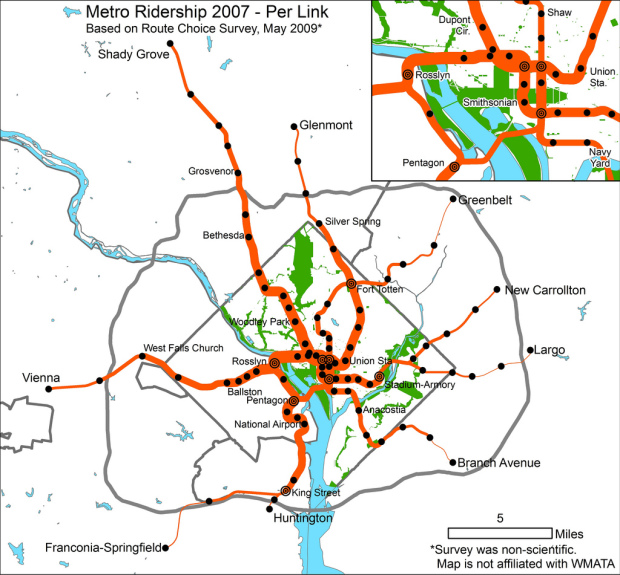
Greater Greater Washington maps rider flow for the DC Metro. As you might guess, the thicker the path, the greater the estimated number of riders in that given area.
As the author notes, the data collection process was an unscientific one, so it should be taken with a few grains of salt, but this makes me wonder. These types of subway maps seem to be getting fairly common, in both the static and interactive/animated variety – but the visualization always seems to come from estimates.
Have any metro systems released their full data? I am sure there are tons of data logs sitting somewhere, growing every time someone swipes their metro card or drops in a subway coin. And more importantly, are metro systems using these types of visualizations to figure out how to distribute trains at different times per day? Do they use something better?
[Thanks, Jamie]
 Visualize This: The FlowingData Guide to Design, Visualization, and Statistics (2nd Edition)
Interesting. The DC Metro actually does (or should) have all the data, because their system is variable-fare, which means you have to swipe a farecard when you get on *and* when you get off. NYC, to take a contrasting example, can’t connect exits from their system with entrances. (On the other hand, they could at least get all the data from the counters in the turnstiles, and that could give them a pretty good picture of the people flow.)
How I wish we had better access to public transportation data.
In Paris, the new passes are RFID-enabled, so they can track you wherever you go, including your trajectories within the station (which are almost never the shortest route from entrance to platform).
but for a general view, having the official, überdetailed data won’t help much.
The MTA does release ridership numbers. I believe they are counts of entries at a station. Search the forums of straphangers.org and I’m sure you can find them – they’re big Excel spreadsheets.
well we don’t have trains where I live, but I did a viz on some real data supplied by the authority that runs the bus network.
http://www.timgraham.net/tg/blogs/data/index.php/on-the-bus-in-ballarat/
In Philadelphia (like NYC) we only have entry data. Also muddling is the fact that there are some free transfers between lines in certain places.
Go Red Line to Shady Grove! It would be great to see directionality inbound/outbound as well…
there’s also this one for nyc subway: http://diametunim.com/shashi/nyc_subways/
Pingback: Interesting Articles for August 19th
Here’s some data that might prove useful: http://www.swivel.com/data_sets/spreadsheet/1010688
It’s the number of riders from each station. Doesn’t specify whether they’re coming/going (or at least I didn’t see it mentioned).