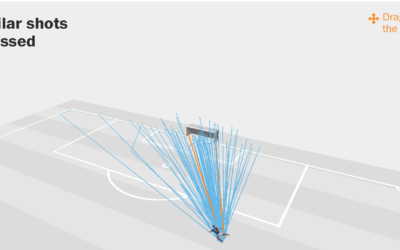
Benjamin Pavard from France made a low-probability goal the other day. Seth Blanchard…
Infographics
Telling stories with data and graphics.
-
Expected versus actual goals in the World Cup
-
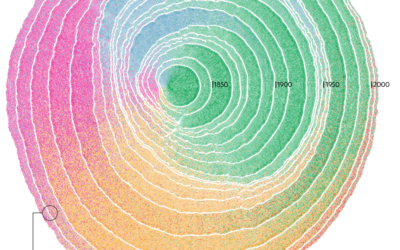
Immigration in the United States visualized as rings of tree trunk
Pedro M. Cruz, John Wihbey, Avni Ghael and Felipe Shibuya from Northeastern University…
-
$16.1m in political and taxpayer spending at Trump properties
ProPublica compiled spending data from a wide range of sources to calculate the…
-
Blockchain visually explained
I feel like I was supposed to know what blockchain is a while…
-
Little League baseball analytics that would change the game forever
Oh. So that’s why I was always placed in right field that one…
-
History of the health meter in video games
The health meter in video games wasn’t always so commonplace. It took time,…
-
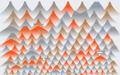
All the volcano eruptions
Slowly becoming the person who charts the past century of natural disaster events,…
-
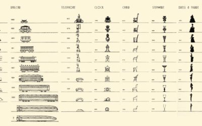
Vintage chart shows the evolution in design of everyday objects
By Raymond Loewy, this chart from 1934 shows the shifts in design of…
-
Nigel Holmes new illustrated book on Crazy Competitions
Nigel Holmes, the graphic designer known for his playful illustrated graphics, has a…
-
What’s in a food truck
Food trucks are the real deal these days. The best ones serve a…
-
Subway delays visually explained
Adam Pearce for The New York Times describes the sad state of affairs…
-
Get all caught up with The Avengers using this timeline
It’s been a decade since the first Iron Man movie, and some 30…
-
Waiting Game, through the steps of asylum seekers
Sisi Wei for ProPublica and Nick Fortugno of Playmatics made a game to…
-
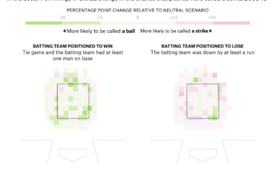
Umpire strike zone changes to finish games earlier
When watching baseball on television, we get the benefit of seeing whether a…
-
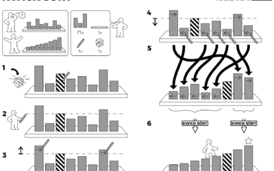
Algorithms drawn as IKEA furniture instructions
Learning algorithm steps can be a challenge when viewed only through code or…
-
Day of the year companies stop paying women
One way to think about gender pay gap is to imagine women receive…
-
A musical journey in 1939, retold with visualization
In 1939, John and Ruby Lomax traveled through ten southern states in three…
-
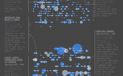
Apollo 11 conversations on the way to the moon
As you can imagine, there was plenty of conversation between Earth and Apollo…







 Visualize This: The FlowingData Guide to Design, Visualization, and Statistics (2nd Edition)


