Data Underload
People worry about data overload. Fooey. Charts and musings by Nathan Yau.

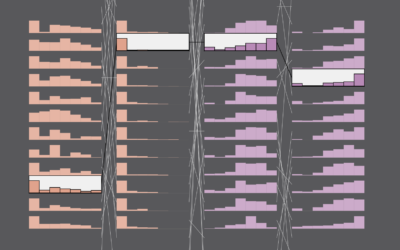
Income Sources
Most people have a job and receive wages in return, but that starts to change when you get into the higher income groups.
Single Parents
In the 1950s, less than 10% of families with children were single-parent. In 2022, among families with children, 31% were single-parent — more than three times as common.
More Dual Income, No Kids
People are waiting longer to have kids or not having kids at all, which leads to more dual income households with no kids.

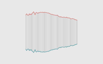
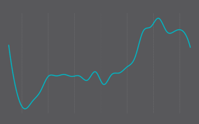
Bank Failures in the United States, Since 2001
These are all the failures since 2001, scaled by amount of assets in 2023 dollars.
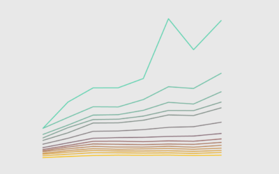
Wealthy Percentiles Rising
The rich continue to get richer, and everyone else either only kind of earns more or stays where they're at.
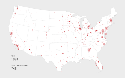
Growth of Target, an Animated Map
Watch the growth strategy behind Target stores, starting with the first location in 1962 in Minnesota.
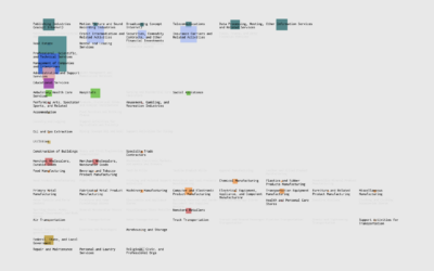
Where Else You Can Work
If you're searching for a new job, it's worth looking in different industries instead of doing more of the same elsewhere.
Mixed Feelings of Happiness and Meaning
Happiness and meaning do not always travel together. Sometimes we need to pursue meaning without the happiness, and vice versa.
Happiness and Meaning in What We Do
There are things that make us happy. There are things where we find meaning in the everyday. What are the things that give us both?

Feelings at Work
We spend a lot of time working. It seems worth thinking about how we feel during all those hours.

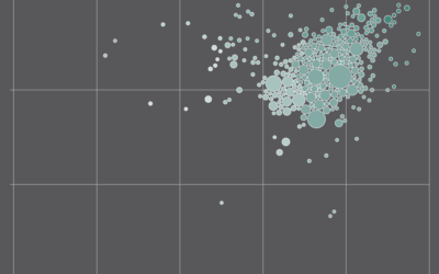
Where We Find Meaning in the Everyday
Meaningfulness scores from the American Time Use Survey provide a hint of what we value.

Pizza Exchange Rate
This is a story about pizza, geometry, and making sure you get what you paid for.
Commonness of Divorce in America
I wondered how common it is for someone to get a divorce. While I’ve touched on the topic before, I’ve never calculated it directly, so I gave it a go.