Three graphs, same data from different angles [via]
Nathan Yau
-
Link
A Case Study In How Infographics Can Bend The Truth →
-
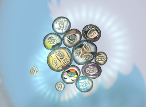
Your personal networks visualized as microbiological cells in Biologic
Data exists in digital form, on our computers and spreadsheets, but the exciting…
-
Fast and slow thinking for maps
James Cheshire ponders the difference between fast and slow thinking maps, and the…
-
Link
Interactive visualization with D3 + ggplot2 →
Choppy but a good start
-
Kartograph aims to make interactive vector maps easier
Gregor Aisch wanted a better way to make maps online that allowed something…
-
Link
D3 introduction →
Great slide deck from Mike Bostock’s D3 workshop; a must for anyone new to the library
-
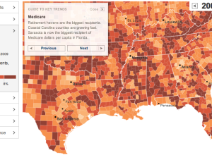
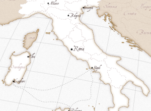
Geography of government benefits
I missed this one a while back, but The New York Times had…
-
Link
Plotting Differences →
Do the math yourself and save readers the trouble; also more informative a lot of the time
-
Link
Nicholas Felton on the Verge →
His annual report came out recently; the interviews follow
-
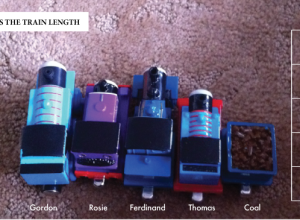
Thomas the Tank Engine and Friends, accidental chart
This came via Twitter from @christopferd:
Will @flowingdata caption my 2 yr old’s… -
Data in a human context
Jer Thorp, a data artist in residence at The New York Times, shows…
-
Link
Visualization tutorials list →
How-tos from around the Web for R, D3, and the now-defunct Protovis [via]
-
Link
ESPN API →
“APIs are for nerds (Nerds who build freaking awesome sports stuff.)” [via]
-
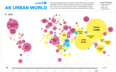
Growing urban populations
In this simple interactive animation by Periscopic, in partnership with UNICEF, we see…
-
Link
Open Data Handbook →
Why, what and how of open data from Open Knowledge Foundation
-
Link
Data for the Public Good →
Free ebook on making use of open government data [via]
-
Taxonomy for interactive visual analysis
Interactive visualization continues to grow more useful and prominent in every day analysis.…
-
Link
ggplot2 0.9.0 →
Newest version of the R graphics package contains a lot of new features and updates
-
Link
What is a data scientist? →
Guardian asks actual data scientists what data science is. Recurring theme is a blending.
-
Keeping track of yourself
The quantified self movement continues:
This may sound creepy, but tens of thousands…
Recently for Members
Second Edition
 Visualize This: The FlowingData Guide to Design, Visualization, and Statistics (2nd Edition)
 Visualize This: The FlowingData Guide to Design, Visualization, and Statistics (2nd Edition)
New tools, refined process.
Browse by Chart Type See All →


