Tips on visualization for advocacy [via]
Nathan Yau
-
Link
Data and Design How-tos →
-
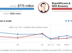
Presidential campaign finance explorer
Hey, I think it’s election season, and you know what that means. It’s…
-
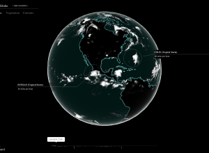
Global cloud coverage
In the latest Chrome experiment, Google mapped cloud coverage around the world in…
-
Bike patterns
Jo Wood, a professor of visual analytics, visualized five million bike rides using…
-
Link
Visually-weight regression code →
The statisticians are still gaga over this. Here’s more code to do it.
-
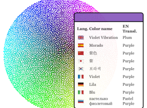
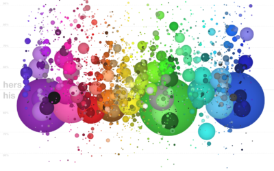
International color wheel →
Now that you know how color labeling changes by gender, I bet you’re…
-
Link
How to use your favorite fonts in R charts →
Not just Arial
-
Link
Forget your fancy data science, try overkill analytics →
“simple models can close the accuracy gap when applied to large data sets”
-
Show Me Something Good
Visualization is a great way to explain and describe data to people who…
-
Data for good, not bad
I’m so glad there are people like Jake Porway in the world. The…
-
Easy and customizable maps with TileMill →
I’m late to this party. TileMill, by mapping platform MapBox, is open source…
-

Data sculpture shows emotional response to Olympics
During the Olympics, Studio NAND, Moritz Stefaner, and Drew Hemment tracked Twitter sentiment…
-
Link
iOS 6 Maps blunders →
Locations that don’t exist, melting cities, and roads in the clouds
-
Color names plotted against gender
A couple of years ago, xkcd ran a survey that asked people to…
-
Link
A timeline that isn’t boring →
Some background on a connected scatterplot by Hannah Fairfield
-
Hiring a data scientist
Thomas H. Davenport and D.J. Patil give the rundown on what a data…
-
Level of arousal and armadillo population density
It’s another label-your-axes joke from SMBC. Yep, still funny.
See also: this, this,… -
Link
Hey Yahoo, You’re Optimizing the Wrong Thing →
Common sense is useful.
-
Link
Designing Data Apps with R →
Integral to the data design process
-
Link
A beginners guide to streamed data from Twitter →
Fetching tweets and metadata
Recently for Members
Second Edition
 Visualize This: The FlowingData Guide to Design, Visualization, and Statistics (2nd Edition)
 Visualize This: The FlowingData Guide to Design, Visualization, and Statistics (2nd Edition)
New tools, refined process.
Browse by Chart Type See All →


