Making of Perpetual Ocean. NASA interview on how they made this; surprisingly, they used Maya and RenderMan
Nathan Yau
-
Link
Making of Perpetual Ocean →
-
Long-exposure fireworks photos
Photographer David Johnson took long-exposure shots of fireworks. Fireworks already leave trails when…
-
Link
Show, don’t tell →
Having data is just the beginning
-
Link
Visual.ly Create for Brands →
“Prices starting at $4,000” sounds so not worth it
-
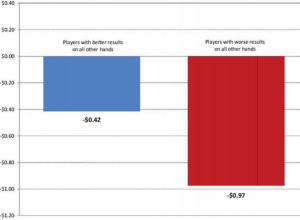
Poker is a game of skill, not luck
Randal Heeb convinced a New York City judge that poker isn’t a game…
-
Link
Republicans as elephants →
Five types, plus an endangered species; sized by party loyalty
-
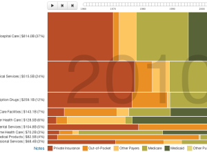
Who pays for healthcare, 1960 to 2010
Josh Cothran looked at who’s paid for healthcare over the past five decades,…
-
Link
Animation in R →
Using animation package, produce a lot of GIFs and string them together
-
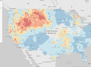
Fire forecasts across the United States →
As megafires in the Southwest are becoming the new normal, NPR reports in…
-
Link
knitr for fast report generation in R →
Not sure why some want to do everything in R, but here you go
-
Link
Data Art vs. Visualization? The Distinction is Unproductive →
Interview with artist Jer Thorp
-
Twitter vs. Facebook: What people share →
Edwin Chen, a data scientist at Twitter, took an in-depth look at what…
-
Link
Data paint →
Lev Manovich on painting data and the parallels between visualization and realist art. I like the metaphor. Although I’d argue that most data art does preserve relationships in the data.
-
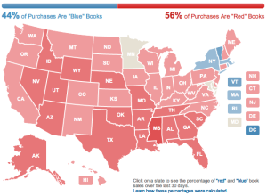
Amazon election map, based on book sales
Amazon used their book sales data to color a map red and blue.…
-
Link
Do You Really Need Big Data? →
It’s not how big, but how you use it
-
Link
Why Ratings Systems Don’t Work →
Patterns over averages
-
Water Light Graffiti
Water Light Graffiti is an installation by Antonin Fourneau that lets you use…
-
Link
Timeline of Computer Graphics →
Dating back to 1800s, made in 2005 [via]
-
Researchers store petabits of data with DNA
Using DNA as a storage device, Harvard researchers managed to store one million…
-
Link
Preventative Mapping in Uganda →
Using OpenStreetMap tasking manager to recruit volunteers to help map expanding area


 Visualize This: The FlowingData Guide to Design, Visualization, and Statistics (2nd Edition)


