Malke Rosenfeld uses percussive dance to teach math to her elementary students. The…
Nathan Yau
-
Teaching math through percussive dance
-
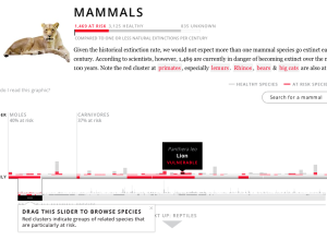
Extinctions and animal species at risk
Data journalist Anna Flagg for ProPublica reported on animal species at higher risk…
-
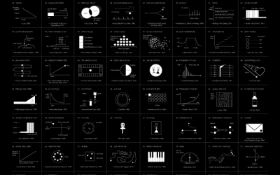
Chart-Topping Songs as Graphs and Diagrams →
Dreams, hope, and most importantly, love, mixed with some parties and dranking.
-
A Truncated Story of Infinity
A Truncated Story of Infinity, a short film by Paul Trillo, explores the…
-
Generative book covers
The New York Public Library is developing an eBook-borrowing system, which includes an…
-
Beat Blox
Beat Blox is a student project by Per Holmquist from Beckmans College of…
-
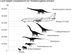
Dinosaurs versus airplane
Scientists found the fossils of a giant dinosaur that they estimate was 26…
-
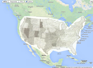
Old maps overlaid on Google Maps
The British Library georeferencing project places old maps, as far back as the…
-

Style over function for redesigned choking posters
In many parts of the country, the departments of health require that eating…
-
Cosmic map shows Milky Way at the edge of a supercluster
Nature highlights the research of R. Brent Tully et al, which defines a…
-
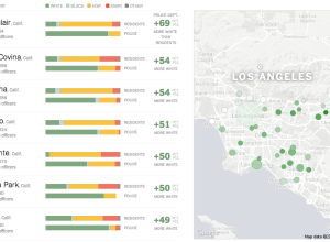
Race distributions of police departments versus residents →
When you compare distributions of race for police departments and for the residents…
-
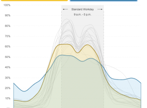
When people work, by job category
In another use of data from the American Time Use Survey, Planet Money…
-
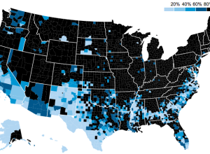
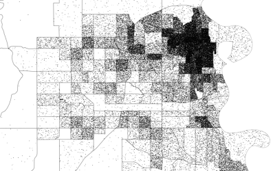
Segregated schools, still
The map above by MetroTrends shows the percent of white kids who attended…
-
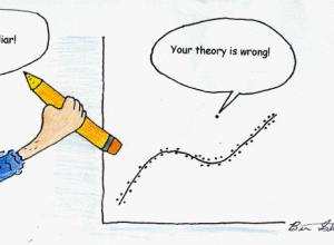
Out, liar.
By Ben Shabad, full-time graduate student and part-time cartoon-drawing person.…
-
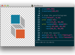
PlotDevice: Draw with Python
You’ve been able to visualize data with Python for a while, but Mac…
-
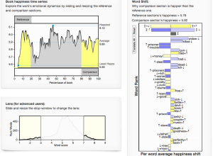
Emotional dynamics of literary classics
As a demonstration of efforts in estimating happiness from language, Hedonometer charts emotion…
-
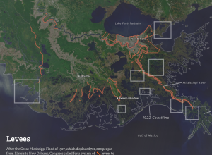
Louisiana is drowning
Louisiana is quickly losing much of its coast to the Gulf of Mexico.…
-
Members Only
How to Make Dot Density Maps in R
Choropleth maps are useful to show values for areas on a map, but they can be limited. In contrast, dot density maps are sometimes better for showing distributions within regions.
-
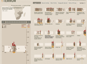
Interactive tool shows impact of terrorism
The Global Terrorism Database, maintained by the University of Maryland, is an open…
-
Graph-based video game
Last year, Metrico, an infographic-based puzzle game for the PlayStation Vita, was announced…
Recently for Members
Second Edition
 Visualize This: The FlowingData Guide to Design, Visualization, and Statistics (2nd Edition)
 Visualize This: The FlowingData Guide to Design, Visualization, and Statistics (2nd Edition)
New tools, refined process.
Browse by Chart Type See All →


