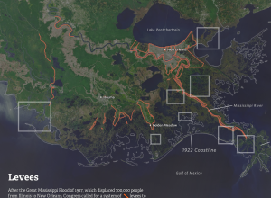
Louisiana is quickly losing much of its coast to the Gulf of Mexico.…
Nathan Yau
-
Louisiana is drowning
-
Members Only
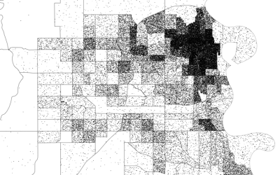
How to Make Dot Density Maps in R
Choropleth maps are useful to show values for areas on a map, but they can be limited. In contrast, dot density maps are sometimes better for showing distributions within regions.
-
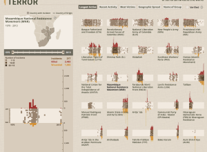
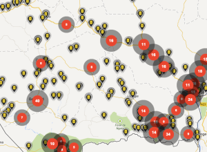
Interactive tool shows impact of terrorism
The Global Terrorism Database, maintained by the University of Maryland, is an open…
-
Graph-based video game
Last year, Metrico, an infographic-based puzzle game for the PlayStation Vita, was announced…
-
Face tracking coupled with projection mapping
Projection mapping — the use of projected images onto physical objects to turn…
-
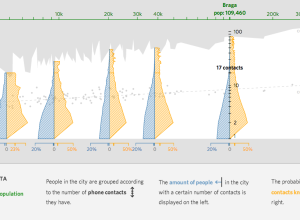
Finding small villages in big cities
Daily life in cities tends to differ from daily life in small towns,…
-
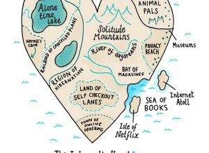
Introvert’s heart mapped
Cartoonist Gemma Correll mapped the introvert’s heart, from recluse corner to the town…
-
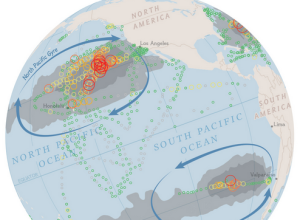
Mapping plastic in the ocean
In research efforts to understand marine debris, Andres Cozar Cabañas et al recently…
-
Track your sleep with Sense
Entering the market of self-surveillance for sleep, via Kickstarter, Sense promises to be…
-
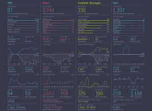
Feltron Annual Report 2013
In his ninth edition of the personal report, Nicholas Felton looks at communication…
-
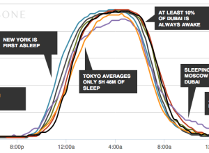
When the world sleeps
An additional hour of sleep can make a huge difference in how you…
-
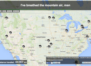
Everywhere Jonny Cash went, man
Johnny Cash says he went to a lot of places in his song,…
-
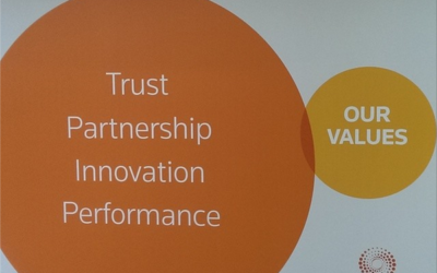
Unintentional Venn diagram suggests opposite meaning
Most people probably wouldn’t think much about this poster that shows the values…
-
Not automatic
It’s an absolute myth that you can send an algorithm over raw data…
-
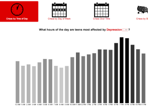
Crisis Text Line releases trends and data
Crisis Text Line is a service that troubled teens can use to find…
-
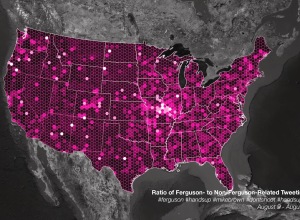
Talking Ferguson on Twitter and localness
For trending topics, Twitter likes to show an animated map of how a…
-
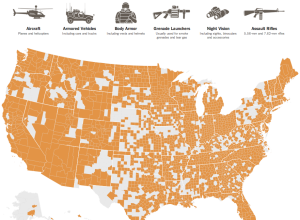
Map of military surplus distribution
With the situation in Ferguson, the New York Times mapped the distribution of…
-
FuelBand Fibers visualizes daily activities beautifully
Leading up to a Nike women’s 10k run, design studio Variable made FuelBand…
-
How charity: water uses data to do more good
Scott Harrison, the founder and CEO of charity: water, describes how the organization…
-
Variance be damned
Daniel Colman won $15.3 million in the The Big One for One Drop…




 Visualize This: The FlowingData Guide to Design, Visualization, and Statistics (2nd Edition)


