Best Data Visualization Projects of 2019
Visualization is a relatively new field, but we seem to be developing an understanding of what it is and what it can be used for. This year, we refined existing methods. With less emphasis on novelty of visual forms, we focused more on what we wanted to communicate.
I’m looking forward to what the next decade brings.
As I do every year, I picked my ten favorite visualization projects. Here they are in no particular order.
Best Blend of New and Vintage
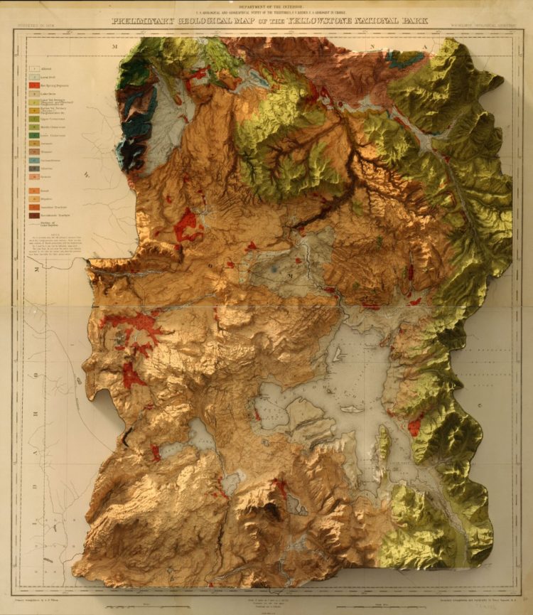
3D elevation + 1878 USGS Yellowstone Geology Map
Just look at it. It’s a blend of tools and a blend of new data and vintage documents. Scott Reinhard found the perfect balance. [See the Project / On FlowingData]
Best Font Doubling as Commentary On Gerrymandering
Gerry
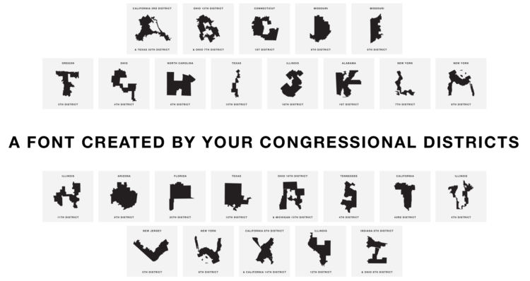
Gerrymandering is often presented as a technical topic that sometimes makes people’s eyes glaze over. Gerry, a font by Ben Doessel and James Lee that used actual district boundaries for letters, distilled the topic down to its WTF-ness. [See the Project / On FlowingData]
Best Climate Change Alarms
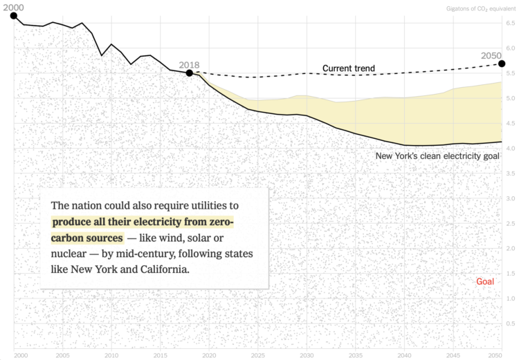
Climate Coverage by The New York Times
Climate change is difficult to cover for many reasons, but from a data point of view, you have to deal with scale, reader preconceptions, relatability, and immediacy. The New York Times came at it from many angles. I hope they keep going. [See the Project / On FlowingData]
Best Comic Chart
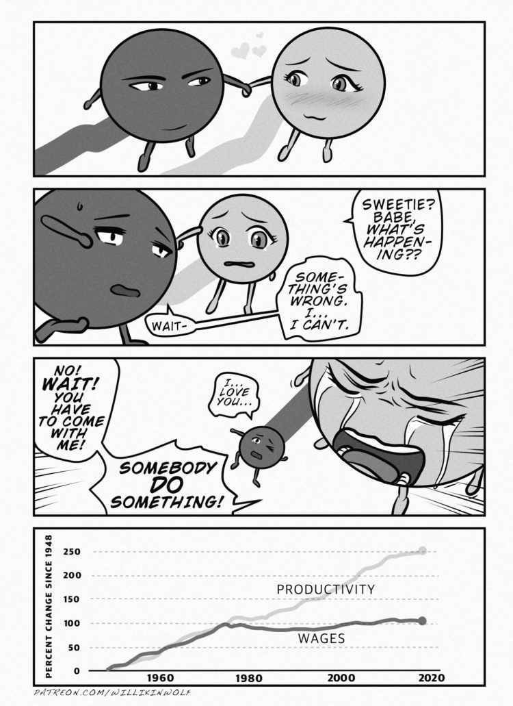
Something’s wrong
Willikin Wolf personified two data points moving along a line chart. Yes. [See the Project / On FlowingData]
Runner-up — Closeness Lines by Olivia de Recat [See the Project / On FlowingData].
Best Test of Statistical Concept
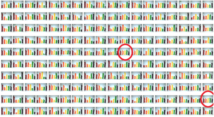
Taste the Rainbow
Skittles packages say the following: “No two rainbows are the same. Neither are two packs of Skittles. Enjoy an odd mix.” Possibly Wrong was like, yeah right. They did the math and put it to the test. [See the Project / On FlowingData]
Runner-up — How random can you be? [See the Project / On FlowingData]
Best Knitting to Represent Data
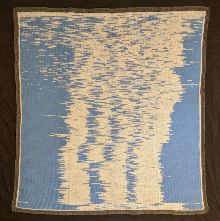
The Sleep Blanket
Seung Lee collected sleep data for his son’s first year. Then he knitted a blanket to visualize the data. [See the Project / On FlowingData]
Runner-up — Train Delay Scarf [See the Project / On FlowingData]
Best Natural Disaster Aesthetic
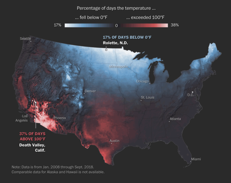
Mapping America’s wicked weather and deadly disasters
For The Washington Post, Tim Meko made a series of maps, each conjuring the aesthetic of the natural disaster it represented. [See the Project / On FlowingData]
Best Atlas of Things in Space
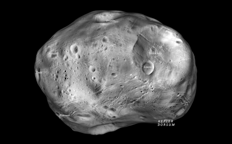
The Atlas of Moons
National Geographic went all out to show the interesting moons in our solar system. Spinning things, orbits, craters, oh my. You might want to run this on a modern browser and a good computer for maximum effect. [See the Project / On FlowingData]
Best County-to-Bubble Transition
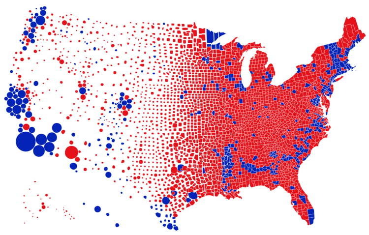
Try to impeach this? Challenge accepted!
There was an election map going around that was meant to represent strength in numbers. Karim Douïeb used an apt shape transition to show a different perspective. [See the Project / On FlowingData]
Best Unexpected Use of R
Genesis
I thought I knew what you could do with R visually. Thomas Lin Pedersen’s generative art experiments surprised me. [See the Project / On FlowingData]
My original plan was to pick my favorites for the decade, but I just couldn’t bring myself to do it. There’s too much good work. It felt too permanent, and my favorites can easily change based on when you ask me. If I liked something, I posted it.
So instead, here are all of picks from previous years: 2008, 2009, 2010, 2011, 2013, 2014, 2015, 2016, 2017, and 2018.
Become a member. Support an independent site. Make great charts.
See What You Get
