To show a catalog of almost 100 million books in one view, phiresky…
Infographics
Telling stories with data and graphics.
-
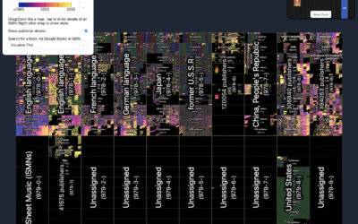
Visualizing all the books in the world
-
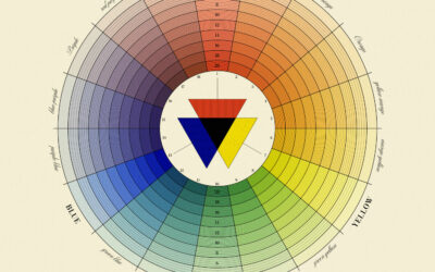
Natural System of Colours, a recreation of 18th century color wheels
In 1766, Moses Harris published The Natural System of Colours to demonstrate that…
-

Possible field of vision from the helicopter seat
From the outsider point of view, a path towards collision might seem obvious,…
-
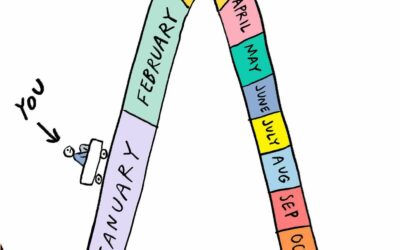
How time works
Cartoonist Becky Barnicoat illustrates the passing of time over a year. Seems right:…
-

Try to cut $2 trillion from the federal budget
The “Department of Government Efficiency” wants to cut $2 trillion from the federal…
-
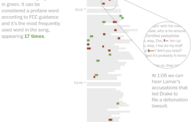
Leaving out keywords in a halftime show
I missed this one last week, pre-Super Bowl, but for The Washington Post,…
-
Book chart showing Barnes & Noble opening new stores
I assumed that Barnes & Noble was on its way out, but I…
-
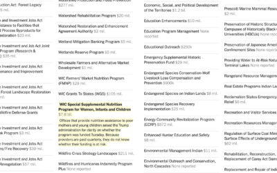
Federal programs under review
A spreadsheet of 2,600 grant and loan programs circulated to federal agencies, alongside…
-

Cozy game about cozy games
Cozy games are casual games that give you a warm, fuzzy feeling when…
-
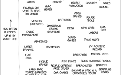
Expectations of adulthood as a child vs. actual adulthood
xkcd charted topics that seemed like they’d come up often with grown ups…
-
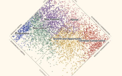
Imagining a multiparty system in the US
In the United States, a two-party system means that candidates, who are supposed…
-
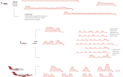
Fighting fire from the sky
For Reuters, Simon Scarr, Vijdan Mohammad Kawoosa, and Sudev Kiyada use flight data…
-
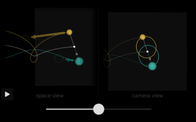
Phases of the Moon, visually explained
Bartosz Ciechanowski used his style of interactive essay, with many sliders, graphics, and…
-
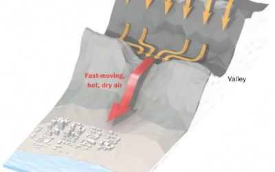
Hot winds fueling the fires
The Washington Post illustrates how air flows from the Great Basin, over the…
-
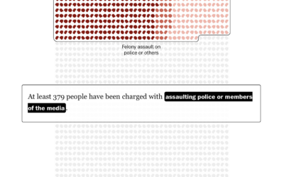
January 6 defendants, a breakdown
1,580 people were charged with federal crimes for the riot at the U.S.…
-
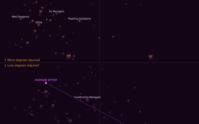
Sitting vs. standing jobs
Some jobs require a lot of standing, crouching, and climbing, whereas other jobs…
-
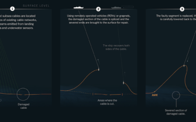
When internet cables break under the sea
The network that connects the world still relies on surprisingly thin wires that…
-
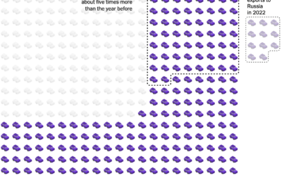
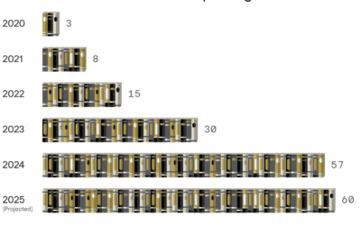
China jumps to car exports leader in just a few years
China exported next to zero vehicles in 2010, but from 2020 to 2024,…
Recently for Members
Second Edition
 Visualize This: The FlowingData Guide to Design, Visualization, and Statistics (2nd Edition)
 Visualize This: The FlowingData Guide to Design, Visualization, and Statistics (2nd Edition)
New tools, refined process.
Browse by Chart Type See All →


