Voter turnout and political leanings for various demographic groups play an important role…
Upshot
-
Voting habits for various demographic groups
-
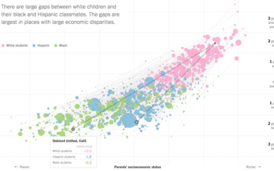
Lower socioeconomic status linked to lower education attainment
The Upshot highlights research from the Stanford Center for Education Policy Analysis that…
-
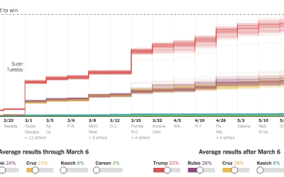
Super Tuesday simulation to show uncertainty
As we know, there are various outcomes during election season, with uncertainty in…
-
Possible paths for a Trump nomination loss or win
It pains me to imagine a time when Donald Drumpf earns a Republican…
-
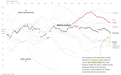
Supreme Court shifts in power
The Upshot has been doing a good bit on the Supreme Court dynamics…
-
Amanda Cox is new editor of The Upshot
So great and well-deserved.
-
Discrimination algorithms
Claire Cain Miller for the Upshot on when algorithms discriminate:
There is a… -
Problem solving game teaches statistics lesson →
From the Upshot, A Quick Puzzle to Test Your Problem Solving. Play it.…
-
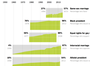
Comparison of shifted public opinion
David Leonhardt and Alicia Parlapiano compared public opinion over time for various social…
-
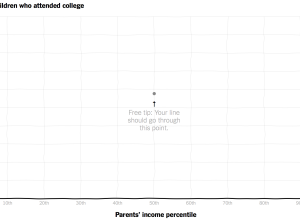
Compare your curve to reality for income versus college attendance
Those who grow up in poorer families are less likely to go to…
-
Upward mobility and the potential for a better life
An analysis by Raj Chetty of Harvard University and Nathaniel Hendren of NBER…
-
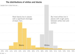
Far fewer black men than black women
Justin Wolfers, David Leonhardt, and Kevin Quealy for the Upshot explore the gender…
-
3-D chart for economy’s future
People like to poke fun at 3-D charts, mostly because they don’t work…
-
NCAA bracket game that rewards risk-taking
Unlike traditional bracket-picking, the Upshot’s bracket game has a twist. You still want…
-
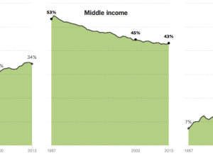
Shrinking middle class
The Upshot has a detailed, chart-filled summary of the shrinking middle class, categorized…
-
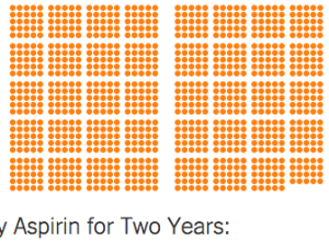
Chances that a drug treatment helps
It’s a common belief that if someone has a medical condition, a patient…
-
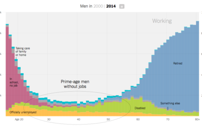
Increasing rates of men who don’t work
Recent data from the Census Bureau suggests the rate of non-working men has…
-
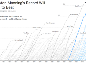
Touchdown passing record
Peyton Manning, quarterback for the Denver Broncos, passed up Brett Favre’s career record…
-
Senate results maps →
The New York Times pushed out super-detailed, precinct-level maps for the Senate election.…
-
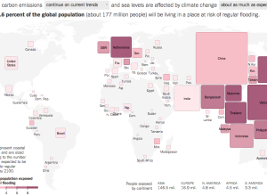
Flooding risk cartogram
As you may or may not know, climate change could bring with it…








 Visualize This: The FlowingData Guide to Design, Visualization, and Statistics (2nd Edition)


