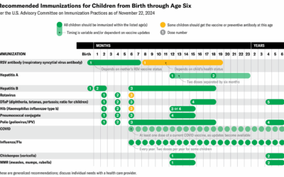
Jen Christiansen and Meghan Bartels provide a quick reference for Scientific American:
Kennedy’s…
science
-
Table for science-backed vaccine recommendations
-
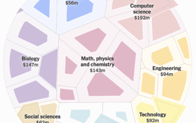
Lower science funding so far in 2025
With a circular voronoi diagram, NYT’s the Upshot shows a much slower rate…
-
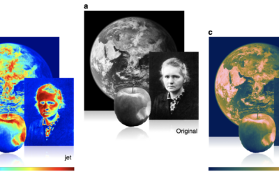
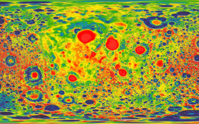
Misuse of the rainbow color scheme to visualize scientific data
Fabio Crameri, Grace Shephard, and Philip Heron in Nature discuss the drawbacks of…
-
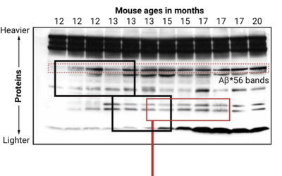
Looking for falsified images in Alzheimer’s study
Charles Piller, for Science, highlights the work of Matthew Schrag, who uses image…
-
Scientists with bad data
Tim Harford warns against bad data in science:
Some frauds seem comical. In… -
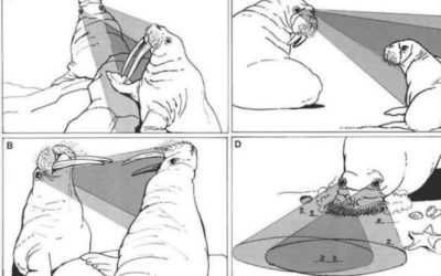
Questionable science diagrams
Sometimes illustrating scientific findings is a challenge. Sometimes the illustrations are published anyways,…
-
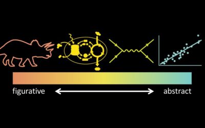
Why scientists need to be better at visualization
For Knowable Magazine, Betsy Mason looks at the state of (not so good)…
-
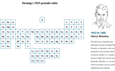
Evolution of the periodic table of elements
As more elements were discovered, the table grew and changed layout. For Science…
-
Visualizing science
Jen Christiansen spoke about her extensive experience as a graphics editor for Scientific…
-
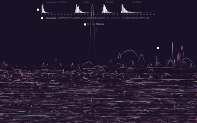
Randomness of scientific impact
A group of researchers wondered if there was a trend or predictability for…
-
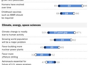
Conflicting views: Public versus scientists
Pew Research Center released a report that compares the public and scientists’ views…
-
Rising R usage in the sciences
R continues its growth, and usage in the sciences is no exception. Nature…
-
Graphs, from paper to pixels
Brian Hayes for American Scientist discusses science publications’ roots in print and the…
-
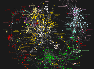
High-resolution maps of science
While we’re on the topic of academic papers and how they’re linked, Johan…
-
Science as metaphor
In this article from Science from July 1998, award-winning journalist John Banville on…
-
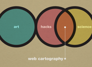
Art, science, and cartography
Similar discussions going on in the cartography branch among UW Madison geography folks.…
-
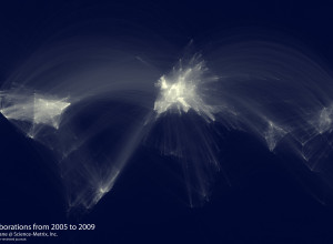
Map of scientific collaboration between researchers
In the spirit of the well-circulated Facebook friendship map by Paul Butler, research…
-
Review: Atlas of Science, Visualizing What We Know
Katy Börner, professor of information science, catalogs visualization and science in Atlas of…



 Visualize This: The FlowingData Guide to Design, Visualization, and Statistics (2nd Edition)


