 Graphwise launched a few weeks ago, but I’m just hearing about it now, so I guess there hasn’t been a whole lot of buzz about this new application.
The Graphwise group has got a spider crawling the Web for data in HTML data tables and as a result, has accumulated a pretty big data warehouse. There’s currently 2,766,560 extracted tables in the Graphwise database. That’s pretty good, and I think they’re building on a pretty good idea. However, Graphwise advertises itself as three pieces of a three-piece puzzle — get data, visualize, and share.
To say the least, the visualize and share portions need work. Here’s a visualization from the front page:
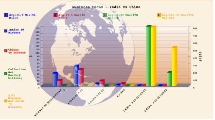
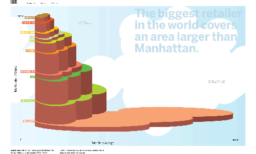
I…I…don’t know what to say. Why the 3-d bars with the gradient background and the giant, semi-transparent Earth in the foreground blocking everything? It makes me want to throw up. It seriously looks like someone threw up data on the screen — data vomit. The javascript-enabled graphs seem to be making the browsing experience pretty sluggish too.
Am I being too harsh? My conscious is yelling at me for calling the graphs regurgitated food.
OK, OK. So to sum things up — the data warehousing and Web crawling are great. The spiders are clearly doing their job, so thumbs up for that. As for the visualizations, I, well, uh, it needs work (along with all the other junk that comes with running these types of data-centric applications).
[via Swivel]
 Eyebeam, an art and technology research center, has posted

 I thought Robert was just thinking out loud when he wrote
 Technology Innovations in Statistics Education (TISE) is a new e-journal that was just announced yesterday. The use of technology (e.g. data visualization) has become extremely important in teaching statistical concepts to newbies, and so this new journal will be really useful; computers have allowed students to explore and experiment in ways students couldn’t do with just paper and pencil. TISE explores these alternatives.
 Visualize This: The FlowingData Guide to Design, Visualization, and Statistics (2nd Edition)