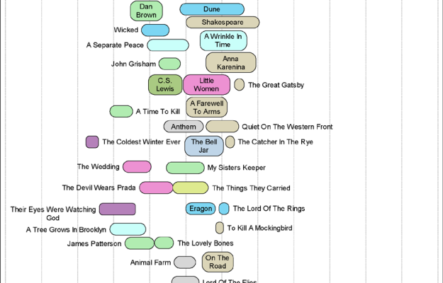
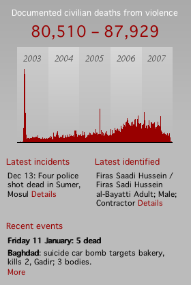
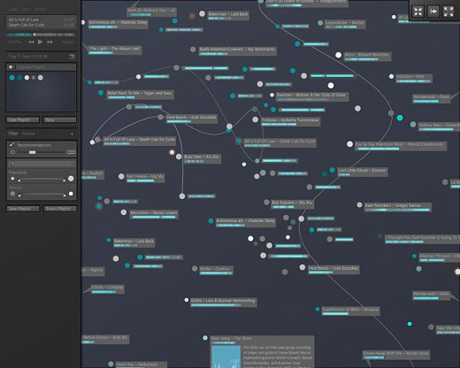
Jared Pool had a chat with Andrew (multimedia) and Steve (graphics) at The New York Times. I’m sure you’re familiar with their work. They chat about the design process of the interactive pieces on The Times site like the transcript analyzer, the home run chart, and plenty of other specific examples. They also go into a bit about where they get inspiration from (e.g. old Fortune magazines, photographs, advertisements) as well as how they go about creating their more innovative pieces.
Keep in mind it’s on the User Interface Engineering blog, so it’s mostly focused on, well, the user interaction and design and less on where data comes from, the journalistic process, etc, but still, it’s a pretty good listen.
[via Visual Methods]


 In its continued efforts for absolute power over all information ever created in the world, Google will be hosting open-source scientific datasets at its
 You’ve probably already noticed (unless you’re


 With the start of a new year, it only seems right to open with John Tukey and his work with interactive graphics. In 1972, when computers were giant and screens were green, John Tukey came up with PRIM-9, the first program to use interactive dynamic graphics to explore multivariate data. PRIM-9 allowed picturing, rotation, isolation, and masking. In other words, PRIM-9 allowed users to see multivariate data from different angles and identify structures in a dataset that might otherwise have gone undiscovered (kind of like the more recent
  Visualize This: The FlowingData Guide to Design, Visualization, and Statistics (2nd Edition)


