Vivek Wadhwa talks government data and the (financial) opportunities ripe for the picking:
What is happening with the opening up of government data is nothing less than a silent revolution. There are literally thousands of new opportunities to improve government and to improve society—and to make a fortune while doing it. Unlike the Web 2.0 space, which is overcrowded, Gov 2.0 is uncharted territory: a new frontier to explore, grow things on, and settle on. It’s fresh soil for unlikely seedling ideas that, if they take root, could lead to very successful ventures. So I encourage entrepreneurs to stake their claims as soon as they can.
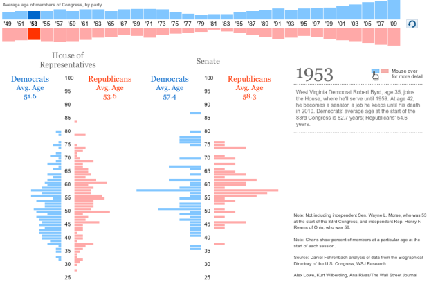
Wait a minute. Hold up. You can do more with government data than awkward dashboards? Bring it.
[TechCrunch via @ucdatalab]


 Visualize This: The FlowingData Guide to Design, Visualization, and Statistics (2nd Edition)


