• Membership
  • Newsletter
  • Projects
  • Learning
  • About
  • Member Login
  • Rectangular subdivisions of the world

    September 22, 2011

    Topic

    Maps  /  Eric Fischer, Flickr, subdivision

    Eric Fischer, who continues his string of mapping fun and doesn’t even do it for his day job, maps the world in binary subdivisions. Each bounding box contains an equal number of geotagged tweets. Read More

  • Musical spectrum analysis

    September 22, 2011

    Topic

    Data Art  /  music, spectrum, video

    Jon-Kyle Mohr visualizes the musical spectrum of a song in this mesmerizing video. As the song plays, frequencies bubble up in the 6-o-clock position, and the trace remains as the circle rotates.

    [Video Link via feltron]

  • Imager shows cross-sections of everyday objects – analog version

    September 21, 2011

    Topic

    Visualization  /  GE, imager, slices

    GE shows how their body imaging technology can take detailed pictures of insides without cutting, using fruit, a baseball, engine motor, and violin to demonstrate.

    Many body imaging devices follow a principle called tomography (the ‘T’ in CT, PET and SPECT systems), which take images of body “slices” using everything from projection data to powerful magnets. But have you ever wondered how such routine procedures can help clinicians see things that used to require a sharp knife? Watch how GE’s body imaging technology can paint a bigger picture of what’s happening beneath our skin.

    Update: I wasn’t paying close enough attention, and it turns out that these are actual, physical sliced objects. Like, with a saw. Now I’m left wondering what the point is.

  • Quick time series visualization with Cube

    September 21, 2011

    Topic

    Software  /  Cube, Mike Bostock, time series

    Seeing how things change over time can be important for a business so that you can figure out what works best. Square, the company that turns your iPhone into a credit card reader, just released Cube, an open-source system to help you visualize time series data. It’s built on MongoDB, Node, and D3.
    Read More

  • How do Americans spend their days?

    September 20, 2011

    Topic

    Projects  /  D3, interactive, time use

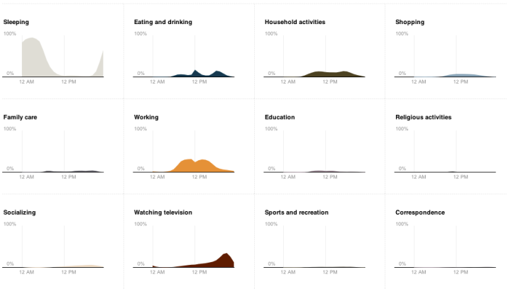
    One of my favorite data graphics is an interactive piece by The New York Times that shows how Americans spend their day, based on the American Time Use Survey (ATUS). I’ve also been wanting to play with Mike Bostock’s Data-Driven Documents, or D3 for short, for a while now. So put the two together, and this is what I got.

    Main takeaway: we spend most of our time sleeping, eating, working, and watching television.
    Read More

  • Explore large image collections with ImagePlot

    September 18, 2011

    Topic

    Software  /  exploration, images, Lev Manovich

    When we make charts and graphs, we usually think of the data abstractions in terms of bars, dots, and other geometric shapes. ImagePlot, from UCSD-based Software Studies, instead makes it easier to use images to understand large collections.
    Read More

  • Yoda pie chart

    September 18, 2011

    Topic

    Miscellaneous

    “Do or do not. There is no try.” — Yoda [via]

  • World population densities mapped

    September 16, 2011

    Topic

    Maps  /  density, population

    National Geographic has a look at where and how we live:

    The map shows population density; the brightest points are the highest densities. Each country is colored according to its average annual gross national income per capita, using categories established by the World Bank (see key below). Some nations — like economic powerhouses China and India — have an especially wide range of incomes. But as the two most populous countries, both are lower middle class when income is averaged per capita.

    It’s interesting, but the map is a little wonky, because the income levels and population densities differ in granularity. It kind of works. Kinda doesn’t. There seems to be a lot of missing data — or does population density in northern Africa really drop off that quickly (it is desert land, albeit)? A little more explanation in the description or the legend would have been useful.
    Read More

  • Smart people talk about art and data

    September 16, 2011

    Topic

    News  /  eyeo, talks

    A few months ago, a packed crowd gathered in Minneapolis for the Eyeo Festival to hear some of the best in data art, visualization, and creative code talk about what they do and how they do it. I didn’t get a chance to go, but from all the chatter online during the event (and the stellar speaker lineup), I get the sense I missed something good. Luckily, some of the talks are available online.

    For starters, Ben Fry and Casey Reas talk about Processing, their grad school grown programming language; Aaron Koblin presents some of the work from the Google Data Arts team; and Nicholas Felton discusses the process behind his annual reports.

    Catch a few more on the Eyeo Vimeo channel or to stay updated for when new videos are uploaded.

  • BBC Knowledge

    September 15, 2011

    Topic

    Infographics  /  BBC, motion graphics

    This is totally sunshine and lollipops, but it has a good flow to it, and well, I totally wanted to know more about BBC Knowledge. Too bad it’s not available in my region that is America.

    [Video Link via datavisualization]

  • PDF data woes

    September 14, 2011

    Topic

    Data Sharing  /  old, PDF

    We do not provide these tables in Excel or CSV format. You will have to cut and paste from the pdf.

    — A government group that provides a lot of data

    If you’re going to provide a dataset to the public, or anyone for that matter, please don’t use PDF as your one and only format. At the very least, provide it in Excel. You can easily export spreadsheets to PDF. I don’t hold anything against the person who sent me this message. She was just doing her job. But organizations need to get with the times and provide data in a way that is actually usable.

  • The United Kingdom of McDonald’s

    September 14, 2011

    Topic

    Maps  /  McDonald's, Stephen Von Worley

    In a follow-up to his ever popular McMap that showed distance to the nearest McDonald’s in the United States, Stephen Von Worley does the same for the United Kingdom and Ireland.
    Read More

  • Freight railroad mergers

    September 14, 2011

    Topic

    Infographics  /  mergers, railroad

    Not many people ride the train anymore, but a lot of inventory is still moved via freight. It turns out that 90 percent of that freight market belongs to just four companies in the country, and since deregulation in the 1980s, the number of total railroads has gone down from 50 to just 7. Nicolas Rapp, graphics director at Fortune Magazine, explains. The railroad coverage maps are interesting, too.

    [The battle of the rails]

  • Breast cancer conversations

    September 14, 2011

    Topic

    Visualization  /  breast cancer, interactive, Periscopic, Twitter

    With Breast Cancer Awareness Month coming up in October, data visualization firm Periscopic teamed up with GE to explore the conversations about breast cancer on Twitter. Yes, believe it or not, people actually talk about other things besides Justin Bieber with the service.
    Read More

  • Last.fm scrobbles as calendar heat map

    September 13, 2011

    Topic

    Statistical Visualization  /  Last.fm, scrobbling

    Martin Dittus, a former Last.fm employee, grabbed listening data for staff, moderators, and alumni, and visualized 8.7 million scrobbles in an extended calendar format.
    Read More

  • Data-ish job openings

    September 12, 2011

    Topic

    News  /  jobs

    If you’re good with data and looking for a job, you’re in luck. There seem to be quite a few jobs out there. Here are a handful of positions that have showed up on my radar recently.

    SENSEable City Lab at MIT — “The SENSEable City Laboratory is seeking exceptional candidates to fill positions involving research on the process of data visualization. Candidates should have a sound experience in the process of visualizing data both in static as well as dynamic form.”

    Front-end Engineer at GeoIQ — “[Y]ou will be a key member of our growing platform engineering team building dynamic, interactive visualizations, maps and mobile applications. You will be working directly with our JavaScript and ActionScript components to create compelling interfaces that use cutting edge technology and web standards.”

    Front-end Developer at Periscopic — “A passion for dealing with data, making sense of large amounts of disparate information, or statistical analysis would be lovely.”

    Stamen Developer — “You’re excited by the possibility of cutting and bending data to fit it through the thin straw of the internet. You can look at a source of information and model it as resources, rows and columns, messages and queues.”

    News Developer Jobs — A pretty good list started by Matt Waite that others can edit. Includes openings at the Chicago Tribune, New York Times, Boston Globe, and others.

    Got a job you need to fill? Feel free to post it in the forums.

  • FlowingData is brought to you by…

    September 12, 2011

    Topic

    Sponsors

    My many thanks to the FlowingData sponsors. I had to upgrade my server for the second time this year, so without these fine groups FlowingData would be a blank screen with a progress wheel most of the time. Check them out below. They help you make sense of and tell stories with data.

    InstantAtlas — Enables information analysts and researchers to create highly-interactive online reporting solutions that combine statistics and map data to improve data visualization, enhance communication, and engage people in more informed decision making.

    IDV Solutions Visual Fusion — Business intelligence software for building focused apps that unite data from virtually any data source in a visual, interactive context for better insight and understanding.

    Tableau Software — Combines data exploration and visual analytics in an easy-to-use data analysis tool you can quickly master. It makes data analysis easy and fun. Customers are working 5 to 20 times faster using Tableau.

    Column Five Media — Whether you are a startup that is just beginning to get the word out about your product, or a Fortune 500 company looking to be more social, they can help you create exciting visual content – and then ensure that people actually see it.

    Want to sponsor FlowingData? Send interest to [email protected] for more details.

  • Girl Scout cookie pie chart

    September 9, 2011

    Topic

    Statistical Visualization  /  cookies, Girl Scouts, Wired

    With Girl Scout cookie season around the corner, Wired pies it up with cookies showing percentage of sales. It’s all about the Caramel deLites. [Thanks, Elise]

  • Cost of 9/11

    September 8, 2011

    Topic

    Infographics  /  9/11, Amanda Cox, NYT, Shan Carter

    This Sunday will be 10 years since the attacks on September 11. Amanda Cox and Shan Carter of The New York Times look at the financial tally, an estimated $3.3 trillion:

    Al Qaeda spent roughly half a million dollars to destroy the World Trade Center and cripple the Pentagon. What has been the cost to the United States? In a survey of estimates by The New York Times, the answer is $3.3 trillion, or about $7 million for every dollar Al Qaeda spent planning and executing the attacks. While not all of the costs have been borne by the government — and some are still to come — this total equals one-fifth of the current national debt. All figures are shown in today’s dollars.

    A single cube in each stack represents $1 billion. The initial view is money spent in five categories. Click on any stack for a subcategory breakdown. Sobering.

    [New York Times via @shancarter]

  • Page 306 of 392
  • <
  • 1
  • ...
  • 303
  • 304
  • 305
  • 306
  • 307
  • 308
  • ...
  • 392
  • >

Analyze, visualize, and communicate data usefully, beyond the defaults.

Become a member →

Recently for Members

May 8, 2025
When the data is not what it seems

May 1, 2025
Finding the Right Charts

April 24, 2025
Visualization Tools, Datasets, and Resources – April 2025 Roundup

April 17, 2025
Breaking Out of Chart Software Defaults

April 15, 2025
Line Chart with Decorative Neon Accents

Browse by Chart Type See All →

Mosaic Plot Parallel Sets Word Cloud Pie Chart Frequency Trails Gantt Chart Square Pie Chart Radar Chart Bar Chart Race Baseline Chart

Browse By Topic

  • Visualization

    Seeing data

  • Maps

    Seeing geographic data

  • Infographics

    Explaining data

  • Networks

    Connecting data

  • Statistics

    Analyzing data

  • Software

    Working with data

  • Sources

    Getting data

  • Design

    Making data readable

Get the Book

Visualize This: The FlowingData Guide to Design, Visualization, and Statistics

Available now.

Order: Amazon / Bookshop

Made by FlowingData

  • The Process

  • Data Underload

  • Chart Everything

  • Guides

  • Books

  • Shop

  • About
  • Contact
  • Newsletter
  • LinkedIn
  • Instagram
  • Bluesky
  • RSS
Copyright © 2007-Present FlowingData. All rights reserved.