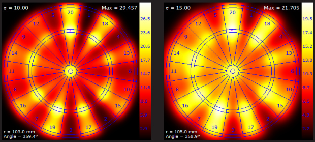
• Membership
  • Newsletter
  • Projects
  • Learning
  • About
  • Member Login
  • Space launches over time

    October 11, 2011

    Topic

    Infographics  /  launches, space

    With the end of NASA’s human spaceflight program, Tommy McCall and Mike Orcutt for Technology Review explore space launches, since Sputnik 1 went into orbit in 1957. While humans won’t be going up in space for NASA anymore, that doesn’t mean there won’t be anything launching into space.

    Of the 7,000 spacecraft that have been launched into orbit or beyond, more than half were defense satellites used for such purposes as communication, ­navigation, and imaging. (The Soviet Union sent up a huge number, partly because its satellites tended to be much shorter-lived than those from the United States.) In the 1970s, private companies began increasingly adding to the mix, ­launching satellites for telecommunications and broadcasting.

    The stacked bar turned rocket blast aesthetic is a nice touch. Time runs on the vertical and launches are split by country, where USSR/Russia and the United States of course lead the way. The bigger the blast, the more launches for a given country. Color represents purpose of launch. I like it.

    [Technology Review via @pitchinteractiv]

  • Nobel laureates by country and prize

    October 10, 2011

    Topic

    Infographics  /  forbes, Nobel Prize

    Nobel Prizes have been awarded every year since 1901. Where are all the winners from? Jon Bruner from Forbes puts it in a graphic. It’s a simple yet effective approach where dots represent a won award, and countries are sorted by number of prizes won. The United States has clearly dominated the field since 1950, although many winners were foreign-born:

    The United States is also unique in the scale on which it attracts human capital: of the 314 laureates who won their Nobel prize while working in the U.S., 102 (or 32%) were foreign born, including 15 Germans, 12 Canadians, 10 British, six Russians and six Chinese (twice as many as have received the award while working in China). Compare that to Germany, where just 11 out of 65 Nobel laureates (or 17%) were born outside of Germany (or, while it still existed, Prussia). Or to Japan, which counts no foreigners at all among its nine Nobel laureates.

    Before World War II, it was a different story. Germany led the way.

    [Forbes | Thanks, Jon]

  • #thankyousteve

    October 7, 2011

    Topic

    Data Art  /  Steve Jobs, Twitter

    Twitter engineer Miguel Rios pays tribute to the man, the legend. Zoomed out you see the portrait of Steve Jobs. Zoom in, and you see public tweets tagged with #thankyousteve sent out over a four and a half hour period on the evening of October 5. Tweets are ordered by number of retweets, left to right and top to bottom.
    Read More

  • A global mood ring called Twitter

    October 7, 2011

    Topic

    Statistics  /  mood, Twitter

    In a follow-up to their mood maps, Scott Golder and Michael Macy of Cornell University look at mood cycles during the hours of the day:

    They found that, on average, people wake up in a good mood, which falls away over the course of the day. Positive feelings peak early in the morning and again nearer midnight, while negative feelings peak between 9pm and 3am. Unsurprisingly, people get happier as the week goes on. They’re most positive on Saturdays and Sundays and they tend to lie in for an extra two hours, as shown by the delayed peak in their positive feelings. The United Arab Emirates provide an interesting exception. There, people work from Sunday to Thursday, and their tweets are most positive on Friday and Saturday.

    It’s strange that good mood peaks around midnight. Maybe the people who are in a bad mood slowly go to sleep, leaving only those in a good mood to tweet. Then again, negative mood also seems to peak around midnight. Peculiar. I don’t have access to the full article, so if anyone does, I’d be interested to hear Golder and Macy’s interpretations.

    [Discover Magazine via @albertocairo]

  • Picturing the creative process

    October 6, 2011

    Topic

    Infographics  /  process

    The creative process changes by person and project, but there are obstacles and steps along the way that you tend to pass with each. Graphic designer Melike Turgut maps his own process. Start from the inside (research, reading, and learning), and make your way out (questions, ideas, and refinement).

    [Melike Turgut via @brainpicker]

  • Twitter users as organisms, Tweetures

    October 6, 2011

    Topic

    Data Art  /  creatures, Twitter

    Twitter is a bustling place of tweets, retweets, and replies, and the growth and spread of news can be very organic. After all, there are actual human beings using the service. Kunal Anand, Director of Technology at the BBC, played on this idea of Twitter as an ecosystem and created Tweetures.
    Read More

  • Kill Math makes math more meaningful

    October 5, 2011

    Topic

    Statistical Visualization  /  interactive, iPad, Kill Math, video

    After a certain point in math education, like some time during high school, the relevance of the concepts to the everyday and the real world seem to fade. However, in many ways, math lets you describe real life better than you can with just words. Designer Bret Victor hopes to make the abstract and conceptual to real and concrete with Kill Math.
    Read More

  • All numbers lead to one

    October 4, 2011

    Topic

    Network Visualization  /  Collatz, conjecture

    In 1937, mathematician Lothar Collatz proposed that given the following algorithm, you will always end at the number 1:

    1. Take any natural number, n.
    2. If n is even, divide it by 2.
    3. Otherwise, n is odd. Multiply it by 3 and add 1.
    4. Repeat indefinitely.

    Developer Jason Davies puts it into reverse and shows all the numbers that fall within an orbit length of 18 or less. Press play, and watch the graph grow. Mostly a fun animation for nerds like me.

    [Collatz Graph]

  • Submarine cable system connecting the world

    October 3, 2011

    Topic

    Maps  /  bandwidth, interactive, submarine

    TeleGeography maps underwater cables that connect countries and continents:

    TeleGeography’s free interactive submarine cable map is based on our authoritative Global Bandwidth research, and depicts 188 active and planned submarine cable systems and their landing stations. Selecting a cable route on the map provides access to data about the cable, including the cable’s name, ready-for-service (RFS) date, length, owners, website, and landing points. Selecting a landing point provides a list of all submarine cables landing at that station.

    Just imagining cables that stretch that far seems pretty amazing.

    [Thanks, Harvey]

  • Flowchart: Which of NPR’s top 100 science fiction and fantasy books should you read?

    September 30, 2011

    Topic

    Miscellaneous  /  books, flowchart, NPR

    SF Signal constructs a big arse flowchart to help you sift through NPR’s listener-picked top 100 science fiction and fantasy books. It’s big and scrolltastic. Check out full and printable version here. I end up at The Time Machine by Wells. You?

  • Most popular infographics generalized

    September 30, 2011

    Topic

    Miscellaneous  /  generic, humor

    Yep, still amusing. [via]

  • The Many Words for Visualization

    September 29, 2011

    Topic

    Discussion  /  terminology

    There are a lot of words to describe visualization and visualization-related things. It can be confusing. You just came across this thing with data and stuff, but what do you call it? Here I define what all those words mean. Keep in mind, I’m not so, uh, good with words and, uh, stuff, so yeah.

    Disclaimer: This is how I perceive the words. They are not official dictionary or academic definitions. Don’t use these in your next report or paper, unless you want to be laughed at.
    Read More

  • Live data wall and immersive film at THINK exhibit

    September 28, 2011

    Topic

    Data Art  /  event, IBM

    The THINK exhibit from IBM just opened up at Lincoln Center in New York, complete with data wall and immersive film. The former visualizes surrounding data in real-time, such as traffic, solar energy, and air quality. The formers puts you in a place with 40 seven-foot screens.
    Read More

  • The Fortune 500, 1955 to 2010

    September 28, 2011

    Topic

    Statistical Visualization  /  Ben Fry, Fortune 500, interactive

    Since 1955, Fortune Magazine has published a list of America’s 500 largest companies. What companies have risen to the top? Which ones have fallen? Ben Fry, of Fathom Information Design, visualizes the companies of past and present and how their rankings, revenue, and profit have changed.
    Read More

  • Deleted Geocities archive visualized as city

    September 27, 2011

    Topic

    Visualization  /  city, Geocities

    In a time long ago, there existed a place on the Internet called Geocities. People created pages and pages of blinking icons, brightly colored background, and everyone loved it. There was even MIDI music to set the mood. In 2009, Geocities was deleted, but the memories lived on thanks to the Archive Team. Information designer Richard Vijgen visualized these pages in an interactive piece called The Deleted City.
    Read More

  • Who does all the text messaging? Young adults by far.

    September 26, 2011

    Topic

    Projects  /  featured, Pew Research, texting

    The Pew Internet and American Life Project published the results of their texting study, showing that young adults text more than anyone else. The report refers to a lot of averages across demographics, but it seems that there were a lot of heavy texters driving up those averages. The medians are a lot lower. The chart above shows the latter.

    Even the median for young adults is still high though relative to other groups.

    At 29, I’m right at the edge of that young adult group, and I text maybe once or twice a month on average. Forty per day seems outrageously high. Kids these days.

  • Guides  /  beginners, census, pitfalls, Q&A

    5 misconceptions about visualization

    Last month, I had the pleasure of spending a week at the Census…

    Read More
  • Page 305 of 392
  • <
  • 1
  • ...
  • 302
  • 303
  • 304
  • 305
  • 306
  • 307
  • ...
  • 392
  • >

Analyze, visualize, and communicate data usefully, beyond the defaults.

Become a member →

Recently for Members

May 8, 2025
When the data is not what it seems

May 1, 2025
Finding the Right Charts

April 24, 2025
Visualization Tools, Datasets, and Resources – April 2025 Roundup

April 17, 2025
Breaking Out of Chart Software Defaults

April 15, 2025
Line Chart with Decorative Neon Accents

Browse by Chart Type See All →

Glyph Chart Table Baseline Chart Line Chart Stacked Bar Chart Mosaic Plot Bubble Chart Parallel Coordinates Connected Scatter Plot Heatmap

Browse By Topic

  • Visualization

    Seeing data

  • Maps

    Seeing geographic data

  • Infographics

    Explaining data

  • Networks

    Connecting data

  • Statistics

    Analyzing data

  • Software

    Working with data

  • Sources

    Getting data

  • Design

    Making data readable

Get the Book

Visualize This: The FlowingData Guide to Design, Visualization, and Statistics

Available now.

Order: Amazon / Bookshop

Made by FlowingData

  • The Process

  • Data Underload

  • Chart Everything

  • Guides

  • Books

  • Shop

  • About
  • Contact
  • Newsletter
  • LinkedIn
  • Instagram
  • Bluesky
  • RSS
Copyright © 2007-Present FlowingData. All rights reserved.