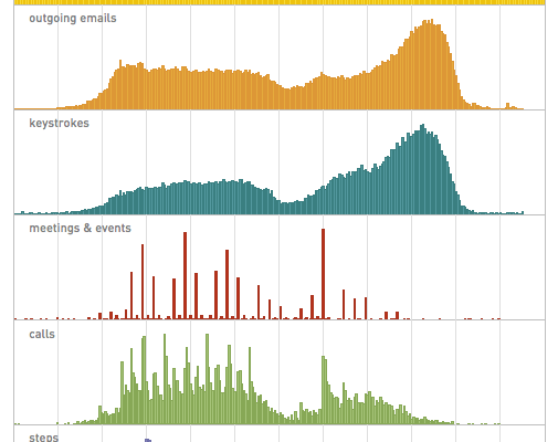
Stephen Wolfram examines his archive of personal data from emails to keystrokes to phone calls, going all the way back to 1990. Above shows the hourly distribution of his activities.
Read More
Stephen Wolfram examines his archive of personal data from emails to keystrokes to phone calls, going all the way back to 1990. Above shows the hourly distribution of his activities.
Read More
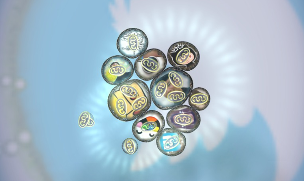
Data exists in digital form, on our computers and spreadsheets, but the exciting part about data is what it represents in the real world. Bits are people, places, and things. This is especially true with social data from places like Twitter and Facebook, where ideas flow and people talk to interact with each other in different ways. It’s not just retweets and likes. Bloom Studio, the folks who brought you Planetary, embrace this idea in their just released iPad app, Biologic.
The basic concept: choose a social network from the Twitter, Facebook or LinkedIn blobs on the opening screen. You will have to authenticate each one you try (only the first time) and then you will transition into a view of the people you follow represented as microbiological cells.
Glowing shapes inside the cells are activities (tweets, pictures, etc). The bigger the activity, the newer it is. The more the activity is moving, the more retweets/favorites/likes it has. Once you have read an item it gets darker so you can tell what’s new.
It looks like another great blend of data, generative art, and game dynamics. I don’t have an iPad though, so I’ll live vicariously through your comments. Grab Biologic (for free) on iTunes.
[Bloom Studios | Thanks, Tom]
James Cheshire ponders the difference between fast and slow thinking maps, and the dying breed of the latter.
So do the renowned folks at the NY Times Graphics Dept. prefer fast or slow thinking visualisations? I asked them what they think makes a successful map. Archie Tse said what I hoped he would: the best maps readable, or interpretable, at a number of levels. They grab interest from across the room and offer the headlines before drawing the viewer ever closer to reveal intricate detail. I think of these as rare visualisations for fast and slow thinking. The impact of such excellent maps is manifest by the popularity of atlases and why they inspire so many to become cartographers and/or travel the world.
A graphic that takes a little while to understand doesn’t always mean it was a failure in design. It might mean that the underlying data is hard to understand. Likewise, a graphic that isn’t what you expect might let you answer different questions than from the usual standby.

Gregor Aisch wanted a better way to make maps online that allowed something other than the Mercator projection, so he developed his own. The result is Kartograph, a lightweight framework “for building interactive map applications without Google Maps or any other mapping service. It was created with the needs of designers and data journalists in mind.” No more tiles.
The framework is still in its infancy, with not much documentation, but the map-making process seems to be straightforward. It’s basically a two-step process. First you generate an SVG map with Kartograph’s Python component, and then you load the SVG with the JavaScript component, which is built on top of Raphael.
Check out the showcase for a sense of what it can do. You’ve got your choropleth, chart symbols, and 3-dimensional projections. The star however is clearly the map of Italy, complete with a cute little ferry that follows a geo path.
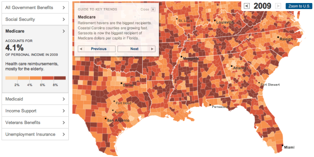
I missed this one a while back, but The New York Times had a look at the growth of government benefit programs, such as Medicare, Medicaid and Social Security, in the United States. On the surface, it looks like your standard choropleth map that shows percent of income from government benefits, but there’s a lot going on here that makes the piece really good.
First, the arrows on the top right let you browse through decades, going back to 1969. Roll over counties to see a time series for the corresponding region against the national average. The sidebar on the left lets you view breakdowns for different programs. And finally, the guide to key trends provides a narrative for noteworthy regions and patterns.
Now that’s some good data journalism.
[New York Times | Thanks, Jordan]
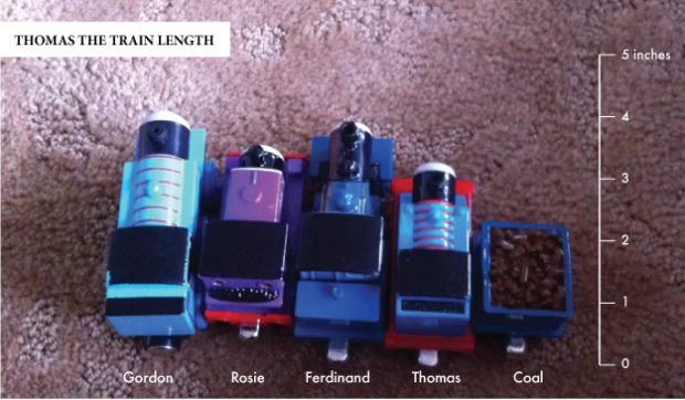
This came via Twitter from @christopferd:
Will @flowingdata caption my 2 yr old’s first [accidental] chart with his #thomas trains?
How could I resist? You gotta get ’em while they’re young. I added the labels, mostly to show off my expansive knowledge of Thomas the Train Tank Engine and Friends.
Jer Thorp, a data artist in residence at The New York Times, shows off some of his work (like this and this) and speaks about the connection between the real world and the mechanical bits we know as data. Worth your 17 minutes.
People often miss this point about data — that it’s a representation of the physical world — and because of that, things like uncertainty and complexity come attached to the numbers. There are also actual human beings associated with a lot of data. So while optimization, maximization, and efficiency are well and good, stories, ethics, and lessons are pretty good takeaways, too.
Update: Don’t miss the unexpected discussion around data and capitalism.
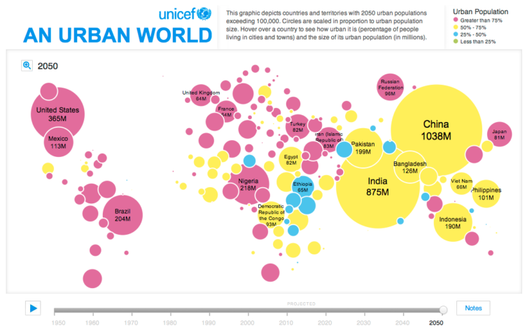
In this simple interactive animation by Periscopic, in partnership with UNICEF, we see the changes in urban population from 1950 up to present, through projections for 2050. Circle size represents urban population and color is an indicator for the percentage of people living in cities or towns.
The color choice for the continuous scale is not ideal, but I think they were working within the bounds of the existing print report.
For the map project, we were working with pre-existing content. They had produced the map for their print report, so we had to make it look as similar as possible to that. I know they didn’t use a Dorling cartogram, but I think their intention was to be similar to one. Certain sacrifices were made in order for it to fit the 2-page spread in the report. Unfortunately, the online version had to keep the same locations.
[UNICEF | Thanks, Dino]
Interactive visualization continues to grow more useful and prominent in every day analysis. Jeffrey Heer and Ben Shneiderman offer a taxonomy for the budding field.
Visualization provides a powerful means of making sense of data. By mapping data attributes to visual properties such as position, size, shape, and color, visualization designers leverage perceptual skills to help users discern and interpret patterns within data. A single image, however, typically provides answers to, at best, a handful of questions. Instead, visual analysis typically progresses in an iterative process of view creation, exploration, and refinement. Meaningful analysis consists of repeated explorations as users develop insights about significant relationships, domain-specific contextual influences, and causal patterns. Confusing widgets, complex dialog boxes, hidden operations, incomprehensible displays, or slow response times can limit the range and depth of topics considered and may curtail thorough deliberation and introduce errors. To be most effective, visual analytics tools must support the fluent and flexible use of visualizations at rates resonant with the pace of human thought.
 Visualize This: The FlowingData Guide to Design, Visualization, and Statistics (2nd Edition)
New tools, refined process.


